HOME | DD
 RalphHorsley — Thousand Thrones
Published: 2007-08-22 12:37:47 +0000 UTC; Views: 48556; Favourites: 563; Downloads: 1399
Redirect to original
Description
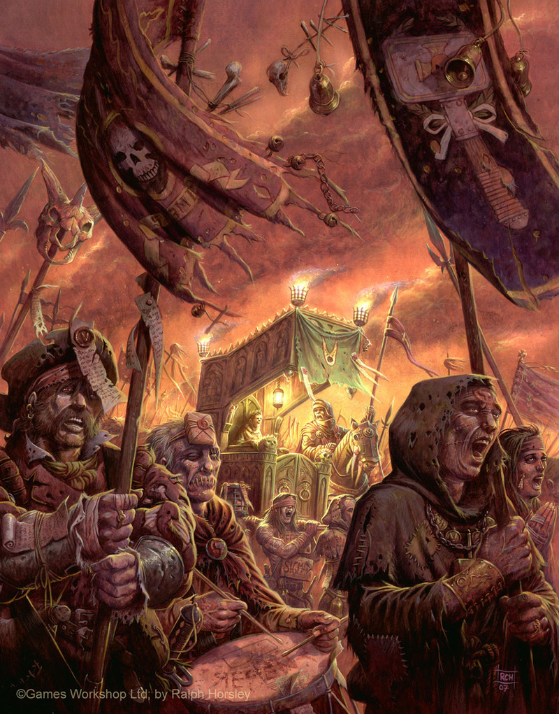
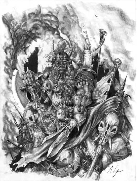
Thousand ThronesWarhammer Fantasy Roleplay cover artwork.
Acrylic, approx 14" x 18"
© Black Industries, Games Workshop Ltd.
They had paraded for countless miles, yet still their cracked voices rang out in worshipful song.
This was a recently completed cover for the forthcoming WFRP supplement. I wanted to capture the classic grimy Warhammer feel, and mood.
I choose a palette that ranged form yellow to deep purpley-reds. I felt this was suitably atmospheric. Then to emphasis the focal point of the picture I put a green shade on the palanquin, and also centred the light source here, consequently becoming the lightest part of the picture.
Further details of the book can be found here:
www.blackindustries.com/?templ…
Related content


Comments: 202

Yes, I can't give too much away. It involves very long pilgrimage....
👍: 0 ⏩: 0


WOW it's so complex and hardcore! all acrylics? maaaaan
👍: 0 ⏩: 1

Once again I'm astounded by your ever developing skills in portraying different fabrics. Absolutely brilliant. The choice of colours is spot-on.
👍: 0 ⏩: 1
Very pleased you think I am developing. Thanks a lot
👍: 0 ⏩: 0


but but i only see one throne  (Wink)")
oh and tell that wife of yours we miss her art here
👍: 0 ⏩: 1
Thanks. Yeah I enjoyed doing the messed up folks
👍: 0 ⏩: 0

I really like what you did with that color scheme. Wouldn't normally think of those colors together, least I wouldn't, but I really think it brought out the best in this scene  (Smile)")
👍: 0 ⏩: 1

Brilliant. I get a great feeling of corrupt majesty - the guy in the light and gold in the middle, surrounded by all those slightly mouldering soldiers. Great work.
👍: 0 ⏩: 1
Thanks. Very pleased I seemed to convey what I wanted
👍: 0 ⏩: 1

I love how you did the flags, and its a great work overall
👍: 0 ⏩: 1

I really love yellow-red-purple palettes. Usually because they can make an image feel magical and warm... but this time because it's more mysterious and hard. You really captured the feeling I want to have with the picture.
👍: 0 ⏩: 1
Yeah, I wa strying to make it look dirty and messed up
👍: 0 ⏩: 0

Cool, zomibe Jesus-Botherers
👍: 0 ⏩: 1

great piece, thanks for posting it.
👍: 0 ⏩: 1
Thanks for commenting, pleased you like it
👍: 0 ⏩: 0


I really like the fact that you explain how and why you chose a certain focus in the image. Such insights in an artists mind are valuable
Also, you put in a lot of detail, without overdoing it (without making the eye not know where to go. Great work!
👍: 0 ⏩: 1
Thanks. Glad the info is useful
👍: 0 ⏩: 0

Excellent! Do you get to hang these on your walls when they´re done or foes GW keep them for copyright reasons?
👍: 0 ⏩: 1
Yes, I get to keep the originals, but sadly cannot make prints of any GW pieces
")
👍: 0 ⏩: 1

Yes, quite a few artists grumble about it.
👍: 0 ⏩: 1
I can imagine... that´s too bad
👍: 0 ⏩: 1

Love the lighting and choice of pallate. This piece has a genuinely creepy mood to it. I think it's the zoned out zombie look in the peoples eyes.
👍: 0 ⏩: 1

Man, you're crazy. You eat super-cereal or something in the morning? The details. The details are everywhere.
You've managed to capture the essence of the decadent yet zealous Sigmarite faith. They really look like they've been marching for a loooong time.
The color palette gives it a nice sickly sweet feeling with the sour rotten green in the center hogging all the attention.
👍: 0 ⏩: 1
Thanks. Very pleased you like it, and that it conveyed the mood I was aiming for
👍: 0 ⏩: 0

Shockingly good Ralph! I'm still amazed at the details that you put on every single inch of the canvas.
Hal's asked me to work on this book and with my newfound confidence hopefully I'll do something decent at last... better late than never
👍: 0 ⏩: 1
...and I thought I was being looser at the edges and putting less in!
I hope you do work on it, there is no reason for you to lack confidence. I play WFRP every Tuesday evening and I always enjoy looking at your career pieces
👍: 0 ⏩: 1
Putting less in? No chance
Thanks for the bump up.. I reckon those characters were probably the best things I did in those books.. I kinda lost it after that. But I'm finding my feet again. Go Ralph!
👍: 0 ⏩: 1
Well, if not less at least rendered looser. Trying to keep the focal point without distraction.
Keep at it Ccott.
👍: 0 ⏩: 0


Great. I'm very pleased you like it
👍: 0 ⏩: 1
")

<= Prev | | Next =>