HOME | DD
 randomjunk123 — WIP
Published: 2009-04-15 22:07:19 +0000 UTC; Views: 812; Favourites: 3; Downloads: 22
Redirect to original
Description
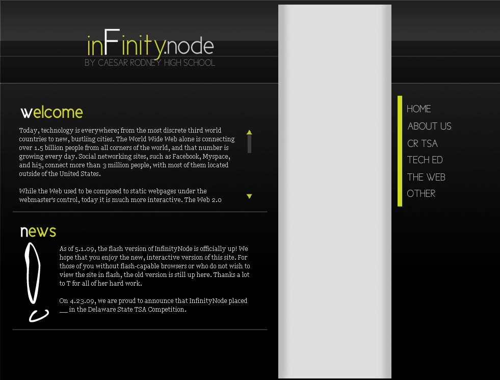
To watch again, click refresh!It's a flash website - my first serious one. It's for a project that I'm involved with.
Feedback would be great!
Sorry for the suckisk preloader . . .
Also, it's not done yet, so don't be too harsh.
All done with Flash cs4 + Photoshop cs4. All done by hand. Took about 2 hours.
Updated: learned how to tranisiton between pages, added more stuff! <3
Updated again: A lot of little changes, nothing major. Changed the logo, shifted the text under "the web", etc.
Related content


Comments: 40

As already mentioned this is very well done both considering your age and your first time working with Flash. I've been working with Flash for 8 years now and if you keep up with the tutorials you should be able to fully grasp it in about a year or two.
Transitions would look a bit smoother if you kicked the frame rate up to 30. Also IMO the transitions would look better you eased into your transitions. (click anywhere in the middle of a "Motion Tween" and then in properties adjust your "Ease:". I usually use 80-100)
Make sure your key frames don't "jump" Noticed your background page jumps 20 pixels to the right after coming in.
"Home", "About Us" and "The Web" all spell out but the rest of the menu options just pop in. IMO the spelling out looks better so it's best to keep it uniform, if creating that look letter by letter I'd shorten the titles.
Overall it looks clean and professional

👍: 0 ⏩: 0

Very cool. Looks proffessional. I love the choice of colors and the clean-cut buttons and frames. Lovely job
👍: 0 ⏩: 1


That's nice ^^ but should add more (simple) BG graphics (like line or curve - something), cause I would be tired to read all of them without any graphics to 'interest' me more ^^ -*just opinion
Over all that's great
👍: 0 ⏩: 1

Thanks a lot ")
👍: 0 ⏩: 0

Wow!.. this is a really great job... I love the design and armony... is so professional (Wink)")
👍: 0 ⏩: 1
Thanks
I'm actually very pleased with the result for my first flash site!
Thank god for tutorials
👍: 0 ⏩: 1
lol!... is an exelent site
👍: 0 ⏩: 1
Really? Wow. Compared to most of the other really young artists on this site, I thought that I pretty much suck!
👍: 0 ⏩: 2

Absolutely not, this is actually very good, and REALLY good to be your first site, from your age, I can't guess, I foretell.. you've got some seriously good works coming up in the future, and I mean seriously good.. If you keep on practicing and making things, in a couple of years you'll look back at this and see huge gap of difference. And believe me I'm not exaggerating a single bit in that.
As for some things in the site I noticed (don't know if someone else mentioned them cause I didn't read everyone's comments..) there is some little inconsistence in the paragraphs, for example in "THE WEB" section the paragraph is moved a bit to the left when all the others start right underneath the section name's first letter.
Then, I don't feel very comfortable with the grammar in the section titles, for example in "CR TSA" there's a proper name, and it's not capitalized, when right next to it, TSA is, I feel that regardless of the originality intended in that, the site should maintain a nice grammar line, the graphic style gives it a nice neat, sharp, edgy feeling, and good grammar is sharp and edgy, having those 2 things separated here kind of doesn't fit for me, I'll respect that "rule breaking" for the logo though and won't suggest changes on that, but the slogan right underneath it does need to fit within the boundaries of the logo, and it's a bit out on the left, I also feel a bit uncomfortable with the lower part of the "y" in the logo touching the capitals "E" and "Y" in "RODNEY", I would pull the slogan down a bit, the logo looks nice, but those little things make me feel like it still has a "7" out of it's own "10".
The choice of colors is beautiful, I really like it.
And as I said, this is really good to be your first site, or Flash site, it's not like you bumped into the room taking the door down, you brought the whole wall down..
Great job.
👍: 0 ⏩: 1
That is most definitely the longest and most helpful comment that I have ever received! Everything that you pointed out will most definitely be fixed, since they are all little “uh-oh”s. I'm really glad that you like it so much, especially since you are an accomplished graphic designer yourself. Thank you once again for the advice and the encouragement
👍: 0 ⏩: 1
you are not right... this page is so professional... When i saw your profile I was hopping a 24 years person^^
👍: 0 ⏩: 1
Really? Awesome  (Smile)")
👍: 0 ⏩: 1
Dont mention it
👍: 0 ⏩: 0

This is pretty cool, but the big gray stripe kinda throws me off from the text, since the eye is naturally attracted to light space and the text is on a black background. But, I could never do anything like this, so, cheers, it's very accessable, and easy to navigate.
👍: 0 ⏩: 1
Thank you
You are right about the grey stripe thing - I will probably end up toning that down!
👍: 0 ⏩: 0

great job...I love your color scheme, works real well...easy to navigate too!
👍: 0 ⏩: 1

nicely executed in regards to navigation. i like that certain things havent followed the norm like the menu placement. the black and white is nice and the touch of yellow stands out, but it still feels, well flat visually. it still needs something to make the visual art of the page design pop out a bit. in my opinion anyway.
👍: 0 ⏩: 1
Thanks! It's not quite done yet, and I will be sure to take that into consideration as I finish up
👍: 0 ⏩: 1


Looks great to me! I have to design a website for a final this semester (though I'm a print major... not sure how that works 
👍: 0 ⏩: 1
Thanks a lot. I hope you do well on your project. You should try using flash; it seems really complicated but it's actually the easiest thing ever, there are great tutorials out there.
I didn't even notice the thing about the menu until you pointed it out! Its a little wierd, but they can deal
👍: 0 ⏩: 0

Nice design, you don't have to search for what you want, it's laid out really well.
👍: 0 ⏩: 1

the color combination is well chosen the whole design feel "comfortable" to me as an user
even though i dont know anything about this kind of stuff i admire the work gone into it and the outcome
👍: 0 ⏩: 1
Thanks a lot for the kind comment!
👍: 0 ⏩: 0


Nice and sleek - very very nice design. The colors are just the right combination of eye-catching and classy.
How long did something like this take you?
👍: 0 ⏩: 1
About two hours, mostly because I made it wayy too big for most people at first. It's actually quite easy as long as I have the content of the website
👍: 0 ⏩: 1
Highfive on your sig, btw.
👍: 0 ⏩: 1
Thanks
👍: 0 ⏩: 0