HOME | DD
 rasice — intermezo studios

Published: 2004-11-01 08:25:53 +0000 UTC; Views: 8080; Favourites: 54; Downloads: 2928
Redirect to original
Description
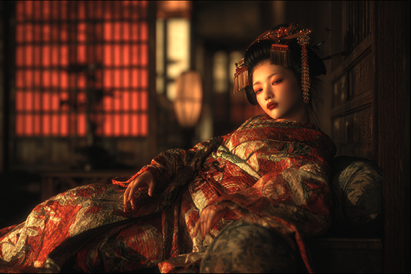
bit of an experiment. i have wanted to use these colors together of ages. hope you like it
*there will be mouse overs for the menu to make it easier to see.
 (Smile)")
Related content


Comments: 51


Ah! Lovely style.
Good to see people tryout new colors.
👍: 0 ⏩: 0

haha, that´s century gothic font on the logo
the BG might be eye-confusing for some people
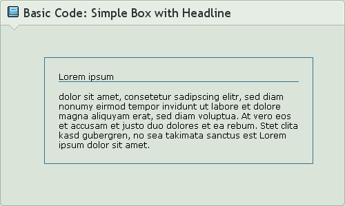
the BOX is AWESOME, pure HTML code only, but don´t like the little gray glow...
👍: 0 ⏩: 1

its not century gothic, i forgot the name i think its euforence (probably wrong spelling) or lane but definetely not century gothic. interesting comment

👍: 0 ⏩: 0

really nice, but i don't like the logo (4 points)
👍: 0 ⏩: 1
")
")

I like the contrast a lot. A really nice experiment.
👍: 0 ⏩: 1
yay! someone likes it!
👍: 0 ⏩: 0

enjoying the fonts loads.. thanks very much. enjoying learning css even more (if thats possible!)

👍: 0 ⏩: 0

Great layout mate. But I say make the background pattern less opaque... It's giving me a headache is it is.
")
👍: 0 ⏩: 1
hehe. i agree with you, when i open ps next time ill change it. thanks for pointing that out!
👍: 0 ⏩: 0
its not that major.. its yet __another__ great peice, congrats
ps - Fainaru-Enkin, you say its too birhgt, but its only a tad less birght than your avatar
congrats

👍: 0 ⏩: 1
thank you man, enjoying those fonts or what?
👍: 0 ⏩: 0

great. shud just tone down the colour a bit. just abit too many white bits in my opinion... maybe u could chuck some more writing or even (if possible) a picture in the background, or even the logo enlarged?
👍: 0 ⏩: 1

Very nice but the blue is just a bit too bright for me.
👍: 0 ⏩: 1
hehe. I yeh defintely seems like a problem for some. is it major?
👍: 0 ⏩: 0


very nice background pic...
The menu with light blue and white is not very visible, but the general layout is great!
👍: 0 ⏩: 1
thanks. i was thinking of incorporating some rollovers for the menu hopefully that will make it easier to see.
👍: 0 ⏩: 0
hehe thanks. know any more good songs? i dont know what to get lol.
👍: 0 ⏩: 1

YES!! abandoned pools - monster, abandoned pools - sunny day, abandoned pools - suburban muse, armor for sleep - slip like space, armor for sleep - dream to make believe, armor for sleep - phantoms now, chevelle - vitamin r, chevelle - closure, closure - look out below, taproot - mine, coldplay - warning sign, coldplay - sparks, tantric - broken down, simple plan - welcome to my life, rooney - if it were up to me, rooney - you're on the edge, rooney - blue side, relient k - getting into you, relient k - pressing on, relient k - sadie hawkins dance, acdc - ride on, acdc - thunderstruck, acdc - rocker, (you better have those anyway  (Wink)")
i know there's more, but i gotta get ready for class lol so i'll say more later!!
👍: 0 ⏩: 1
wow i have so many: acdc - thunderstruck, acdc - rocker chevelle - vitamin r, chevelle - closure(love chevelle - have you heard "the red"?), coldplay - warning sign, coldplay - sparks, tantric - broken down, simple plan - welcome to my life, rooney - if it were up to me, rooney - you're on the edge, rooney - blue side incubus - talk shows on mute. I will defintely checkout abandoned pools.
If you like rooney do you like the strokes? im a big fan.
i finally know someone with good taste! thanks for these
👍: 0 ⏩: 1
yeah the strokes are pretty good!! i mean i secretly only know "last night" by them, but i highly enjoy that song. yes and i have heard the red, lol it would be a shame not to have heard of it. love em. OH YEAH!! you MUST download a perfect circle stuff!!
a perfect circle - thinking of you, a perfect circle - outsider, a perfect circle - hollow, a perfect circle - blue, a perfect circle - 3 libras, a perfect circle - weak and powerless
alkaline trio - continental,
alkaline trio - radio,
something corporate - globes and maps,
something corporate - fall,
something corporate - i want to save you,
better than ezra - good,
better than ezra - scared are you?,
breaking benjamin - so cold,
caviar - tangerine speedo,
chumbawumba - amnesia,
chumbawumba - top of the world (ole ole ole), <---hahaha that song is so funny.. umm what else..
copeland - california,
collective soul - the world i know,
course of nature - caught in the sun,
cranberries - linger,
cranberries - dreams,
cranberries - salvation,
cranberries - zombie,
crossfade - cold,
default - deny,
default - live a lie,
default - throw it all away,
default - sick and tired,
default - taking my life away,
puddle of mudd - heel over head,
puddle of mudd - control,
puddle of mudd - away from me,
puddle of mudd - drift and die,
dishwalla - counting blue cars,
the flys - got you where i want you,
our lady peace - innocent,
our lady peace - clumsy,
our lady peace - not enough,
ours - sometimes,
ok go - get over it,
orgy - blue monday,
memento - nothing sacred,
lost prophets - last train home,
lost prophets - last summer,
korn - ya'll want a single,
korn - thoughtless,
korn - alone i break,
korn - here to stay,
korn - word up,
led zepplin - black dog,
led zepplin - kashmir,
led zepplin - whole lotta love
hm. lol wow i think i've given you like 33947.5346 songs. hahaha
👍: 0 ⏩: 1
hehehehe. i goto have at least 75% of those songs, ill fill in the gaps soon. pfft as if i dont have those APC songs my favourite is Pet though.
lol. thanks
👍: 0 ⏩: 0

I like this alot, simple but effective, nice job! (Personal Rate: 8/10)
👍: 0 ⏩: 1
thanks man. I think deviantart should have a rating system for deviations, how awesome would that be.
👍: 0 ⏩: 1
")


you are very good at the clean style - i like the colors a lot - nice work!
👍: 0 ⏩: 1
i think your recent vector inspired me to choose this scheme, i have always wanted to use it but i didnt think it will work out. you pulled it off really well so i gave it a shot. thanks for the comment.
👍: 0 ⏩: 1
he he thanks! i think you did a damn good job!
👍: 0 ⏩: 0

well done again, i agree this has great organisation, and i agree agian that it is a little bright.. try toning down the colours a bit, love the image and the grey box and cool logo although simple
👍: 0 ⏩: 1
thank you. toning the colors means changing the color it self lol i like it alot. It see what the people say about it, they might ahte it but they are pretty stylish.
👍: 0 ⏩: 0

The gray bar in the lower area adds a nice touch to it. I also like how the image has the same height as the text area.
👍: 0 ⏩: 1


niiiice. I like ur style... clean, organized.. very professional!
👍: 0 ⏩: 1
why thanks. your icons have really come uselful these days. what are these cds called? lol
thanks for the comment
👍: 0 ⏩: 1
they are called 'Remnants from old designers'
someday my stuff would also be a part of it!


👍: 0 ⏩: 0

yes, i like it, maybe the brightness is just a bit too much for me.
👍: 0 ⏩: 1
thanks. yeh i did expect that people would have probs with the color. but i personally do like it. thanks for commenting.
👍: 0 ⏩: 0