HOME | DD
 Raven30412 — 2nd complete logopack
Published: 2008-10-04 18:19:11 +0000 UTC; Views: 33184; Favourites: 320; Downloads: 1244
Redirect to original
Description
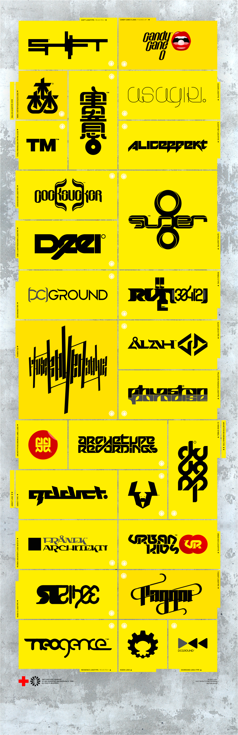
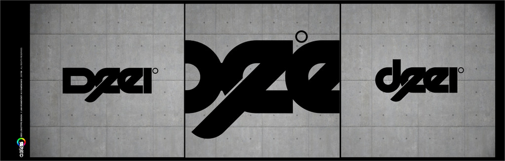
2nd complete logopack:the summary of logos done during last year, + few older which I liked.
yes, you saw almost all of them here on dA allready, but I think it's healthy to do some recapitulation time to time and show the works in mutual context, together...
NO FONTS USED, everything is done from sketch.
hope you like them
 (Smile)")
10/14 08 - edited
Related content


Comments: 92


Hi! Sorry for this kind of spam)
Your work was featured @ The Department™ [link]
Congratulations & Cheers!
👍: 0 ⏩: 1

wow, thanks a lot mate! Much apprecitated
👍: 0 ⏩: 1


I love all of them.
+fav
Just wondering, would it be possible to have the name of the typeface used to say what each logo is for; it's awesome!
👍: 0 ⏩: 1
thanks... it's FF DIN medium and FF DIN light
👍: 0 ⏩: 0


really glad you like it, much appreciated.
and thanks for the fav...
👍: 0 ⏩: 0

 (Wink)")

tak to me opravdu nenapadlo...
👍: 0 ⏩: 1


diky
ale opravdu jsem jen zmenil layout...
👍: 0 ⏩: 0

ten samej, akorat jsem zmenil layout komplet. a funguje to jak vidis, vytriskal sem z tebe fav
")
👍: 0 ⏩: 1

No lebo to ma taku pritahujucu zltu farbu
👍: 0 ⏩: 0


This is IMPRESSIVE! And I like the way you put all those in one place...with grungy wall background and orange squares with black logos
Great!
👍: 0 ⏩: 1
👍: 0 ⏩: 0


unbelievably slick!!! some killer work, and that SUPER logo, so damn sexy.
These would all be amazing even they were just edited fonts, but for all the typo to be created from scratch is unreal. Absolutely love your work!
👍: 0 ⏩: 1
thanks a lot mate, much appreciated...
👍: 0 ⏩: 0

super8, archetype recordings, and dc ground are my faves. Great work!
👍: 0 ⏩: 0

Very FreSsh logos.. and all from sketch.. huhh, salutes!
..that Super8 is a personal fav amongst, kinda "eye-catching"
👍: 0 ⏩: 1
thanks
yes that one came out quite nice i think...
👍: 0 ⏩: 0


To bring some negative element here in case you are looking for a way to improve - they are all nice work of art, but I am not sure if they fulfill the purpose of a logotype. Most of them are not simple enough to remember and the font is too hard to read, so you need to look at the logotype longer to actually understand what it is saying.
👍: 0 ⏩: 2
jo a omlouvam se za pravopis toho commentu, psal jsem to pozde v noci a byl jsem uz trochu mimo
👍: 0 ⏩: 0
ztížené čitelnosti mnoha z nich jsem si vědom, a, ač to může znít třeba divně, je to záměr. Rozhodně si nemyslim, že jednoduché znamená zapamatovatelné, svět je totálně přesicen minimalistikými logy a až hysterickou střídmností, a já říkám, že totální minimalismus jen jednou, a to hodně vyčerpatelnou cestou. Logotypy u kterých byla čitelnost z obchodních důvodů opravdu podstatná (třeba Candy Cane O) čitelná myslím jsou, zbytek jsou více či méně typografické experimenty, snažící se vyhnout přílišné jednoduchosti.
rád taky vidím logotyp jako něco, co se z původního napisu "zvrhne" do polo až plně abstraktní formy, když se původní verbální sdělení přeformuje do obrázku, a to abstraktního. Když to prostě není polopatické... V určitých připadech může být ztížená čitelnost žádoucí, i když samozřejmě jen specifických. Ale já nedělám CI komerčních podniků a produktů (v tomto logopacku až na Candy Cane), já se snažím experimentovat a hledat ideální estetiku a sdělení skrz formu...
👍: 0 ⏩: 1
Jestli to bereš jako cvičení, pří

👍: 0 ⏩: 0

thanks a lot mate, comments and favs from you are always much appreciated...
👍: 0 ⏩: 0

| Next =>