HOME | DD
 Raven30412 — shift logotype

Published: 2008-02-28 20:11:12 +0000 UTC; Views: 8911; Favourites: 71; Downloads: 227
Redirect to original
Description
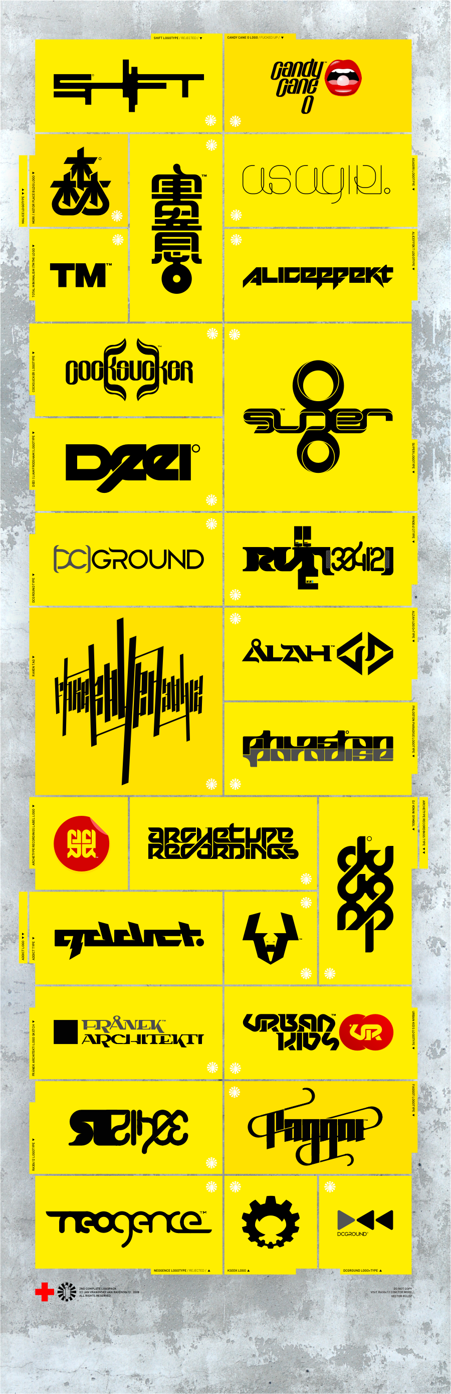
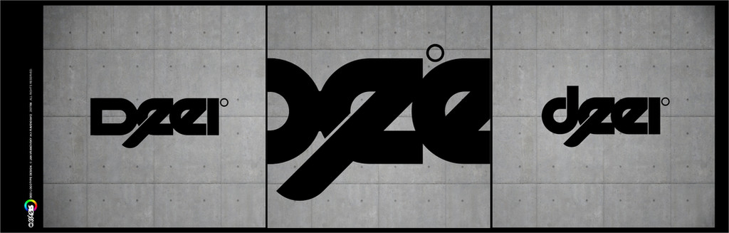
my shift logo competition entry.trying to find 100% pure form, no "artificial", added style. it should work the way it is, on it's own. basic shape and rhythm based on golden section proportions.
[link]
Related content


Comments: 30

really nice...could you like make it wallpaper size i would use it as my wall
👍: 0 ⏩: 0


 (Smile)")


thanx... yeah the gradient is a matter of taste I guess... But it's only part of the presentation layout, not part of the logo itself.
👍: 0 ⏩: 0

I don't quite like how the 'i' is created from the shape, but the rest I do.

👍: 0 ⏩: 1
thank you... well the "I" is created the same way as all other letters, it's only condensed, "traped" between H and F. The whole logotype basically works thanx to this, without it, it would be boring as hell and not really visually compact.
👍: 0 ⏩: 1
Yeah, I get what you mean. Thanks for the comeback.
👍: 0 ⏩: 0

simpe but nice.. it would be more great if u make a curve shape.
👍: 0 ⏩: 1
thanx. well, curve shapes cannot be used in this particular design, it's based on certain strickness, 90° angles and lack of round shapes. I did few round shaped shift logotypes before, but it never looked very good, this one goes better with the message I wanted it to carry.
👍: 0 ⏩: 0

yo man... this one have some special style on it... very impressed
👍: 0 ⏩: 0

wow yours is quite a bit more straight forward and simple than the one they have on their homepage.
👍: 0 ⏩: 1
yes I wanted to do something straight forward and simple... Actually, maybe it doesn't look like that way, but I was inspired by SANAA's newest building, the new museum of contemporary art in new york ( [link] ). I wanted to kind of capture that feeling and put it into logo.
👍: 0 ⏩: 1
yeah i can see how it works, geometrical yet dis-jointed. it works
👍: 0 ⏩: 0


tak mi ho dej ")
ne, jsem rad ze se libi...
👍: 0 ⏩: 1

už by tam měl bejt, nějako mě to blblo, asi 20x sem musel aktualizovat stránku aby se mě to načetlo vubec
👍: 0 ⏩: 1


thanx .)
i'll send you the logos in few hours, they're saved on another PC...
👍: 0 ⏩: 1