HOME | DD
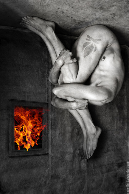
 Raventhird — Prometheus Unbound
Published: 2006-10-12 18:25:11 +0000 UTC; Views: 26821; Favourites: 689; Downloads: 10631
Redirect to original
Description
Something quite new.Related/Similar works in my gallery:
What Will Rise: [link]
The Hyperion Paradox: [link]
Nature's Awakening: [link]
Source Images: Thanks a lot for the personal stock from ^arachnid15 ; fire is from my friend `wroth and our kick ass-collection at =resurgere ; own textures and some other personal stock
Related content


Comments: 202


this is simple sooooooooooooooo bazaar !!!!!!!!!! amazing
👍: 0 ⏩: 0

That's Crazy!, reminds me of album art on the cd: aenima.
👍: 0 ⏩: 0

THIS IS THE KINDA STUFF I SEE WHEN I GAZE AT SOMTHING FOR TEN SECONDS TO GET AWAY FROM NOISE RATHER THAN SOUND..
👍: 0 ⏩: 0

That's really amazing, I feel like I could look at it for hours at a time.
👍: 0 ⏩: 0


Something interesting as well! Is this creative or something? Great piece of art!
👍: 0 ⏩: 0


great job  (Smile)")
👍: 0 ⏩: 0


omg, that's insane. Im new to manipulation, would you mind explaining how you did that? I'd love to be able to work photos like that.........def. a fav!
👍: 0 ⏩: 0

brilliant...
in darkness we learn to seek the light,
in all wrongs we find the right,
shadows cast on streams of tears,
moments pass to feed our fears,
we light the fire inside with,
desire, rage and love,
seek deaths hand
to know it's kiss
and slowly
rise
above.
I don't know what else to say other than that I love this piece, like a lot of your others, and hope you continue to make more like it. The emotion is so raw it's unmeasurable. Fantastically sad and lonely.. it almost rips you in two.
👍: 0 ⏩: 0

It mirrors Bellmer's doll series from the thirties very closely, in particular the one with legs coming out of the body from both sides.
👍: 0 ⏩: 0


Wow, this is great. In some sort of alien dimension that's the primary snack of the unfathomable horrors that dwell there. Crunchy.
👍: 0 ⏩: 0


very giger like.. upside down though
👍: 0 ⏩: 0


schöne farben, das rot sticht halt gut raus...die seltsame perspektive ist auch gut, das herabhängende beinpaar passt gut zu der verkehrten welt..das tattoo ist lustig, aber ein bisschen kindisch  (Wink)")
👍: 0 ⏩: 1

Mein ganzes Leben ist beeinflusst von Kongressen ")
👍: 0 ⏩: 0


stealing fire..
outstanding piece, as the rest of your gallery.
i shall definitely watch you
👍: 0 ⏩: 0

This must be one of the strangest, yet compeling piece I've seen in a while.
When I first saw the thumb in the forum, I didn't think much of it. Well, it's a good thing I looked at the full view because I love this piece.
👍: 0 ⏩: 1
You're correct: The full view is way better than the thumb in this case. Thanks
👍: 0 ⏩: 0


...and quite interesting, no doubt. Just some (minor) crits a-I see a bit too much contrast on the whites (burned) of the body and not enough on the shadows –that makes it a little unbalanced, and b-the upper “tongue” of the fire has too much transparency so it looks ‘added’… but as I said, just minor stuff and personal opinion. Terrific creative work as usual.
👍: 0 ⏩: 1
Thanks a lot for this advanced critique, very much appreciated. I do agree to the few little problems that you mentioned
👍: 0 ⏩: 1
Anytime –indeed just minor stuff that don’t diminish the creative and tech value of the piece.
It’s now common opinion that DA is sort of decaying –maybe it is. But as long as I am able to view, enjoy, comment, critique pieces like this one I think DA’s health is just fine.
👍: 0 ⏩: 0

disturbingly beautiful.
you would be a cool person to meet in real life i think.
👍: 0 ⏩: 0


oh...this is impressive...excelent work...congrats.
👍: 0 ⏩: 0
oh...this is impressive...excelent work...congrats.
👍: 0 ⏩: 0

Seamless - had to look for a while just to realise what particular cuts and pastes had been employed. So his 30,000 years are over... and we, his benefiters, rejoice
👍: 0 ⏩: 0

"Ein gutes Bild ist ein Bild, auf das man länger als eine Sekunde blickt."
Ich weiß nicht, wie lange ich darauf gestarrt habe... einfach nur genial, auf jeden Fall ein
👍: 0 ⏩: 1

Looks good, I'd only fix some light issues, you should use the fire as a light source and simply pull lines from the center of it to see where shadows should go and then you'll see that the shadow on the ceiling part would go more into the upper right corner. Also how the light is being caught by the lower feet should be slightly different, and the fire would also lit the surrounding frame/wall. I know I'm nitpicking but you asked for it
I'm picking on details right now, overall the piece looks good and that's most important; it looks like a whole which is a really good job. I think you're improving quite well. Thumbs up for the masking as well, very clean job.
👍: 0 ⏩: 1
I'd only fix some light issues, you should use the fire as a light source and simply pull lines from the center of it to see where shadows should go and then you'll see that the shadow on the ceiling part would go more into the upper right corner. Also how the light is being caught by the lower feet should be slightly different, and the fire would also lit the surrounding frame/wall.
Light and shadows are my weakest points, I guess... the idea with the lines is excellent, that tip alone would be worth having asked you for critique. In which way do you think that the light would be visible on the wall? Making some orange glow or something like that?
I'm also not sure about the coloring/saturation of the fire, it kinda distracts, my eyes don't know where to look first, if it should be the body or the fire, this might be a choice yours side to have focal points like that, so it just depends what your intentions are, I did stuff like that on purpose as well.
Aahh... yes. Glad to see that it works
Last thing, I'd get rid of that tattooish thing and just leave the leg as it is, perhaps you wanted to break the big surface of the leg but I think it's distracting in a way, you could perhaps make it more subtle.
I thought that, too, but some of my friends assured me that the version with the tattoo would work better... I think it's a bit easier to understand my concept here with that symbol... but maybe you're correct and I should rather listen to myself than the audience...
Anyway: Thank you VERY MUCH for that in-depth critique und excellent analysis... this was somehow what I expected when asking you for it.
👍: 0 ⏩: 0


wicked.
im doing a yearlong series on greek mythology.
the title caught my eye right away.
What was the other play that was lost? prometheus the fire bearer?
👍: 0 ⏩: 0

This one is great, surreal, toolish with nice colours usage. I like such a mirroring ;] once again excellent, regards! ;]
👍: 0 ⏩: 0

wow this is amazing..i dont have any more sophisticated words for this,im just in awe
👍: 0 ⏩: 0
<= Prev | | Next =>