HOME | DD
 rcardoso530 — Color Sample v2.0 by rcardoso

Published: 2011-03-14 16:49:10 +0000 UTC; Views: 1361; Favourites: 17; Downloads: 27
Redirect to original
Description
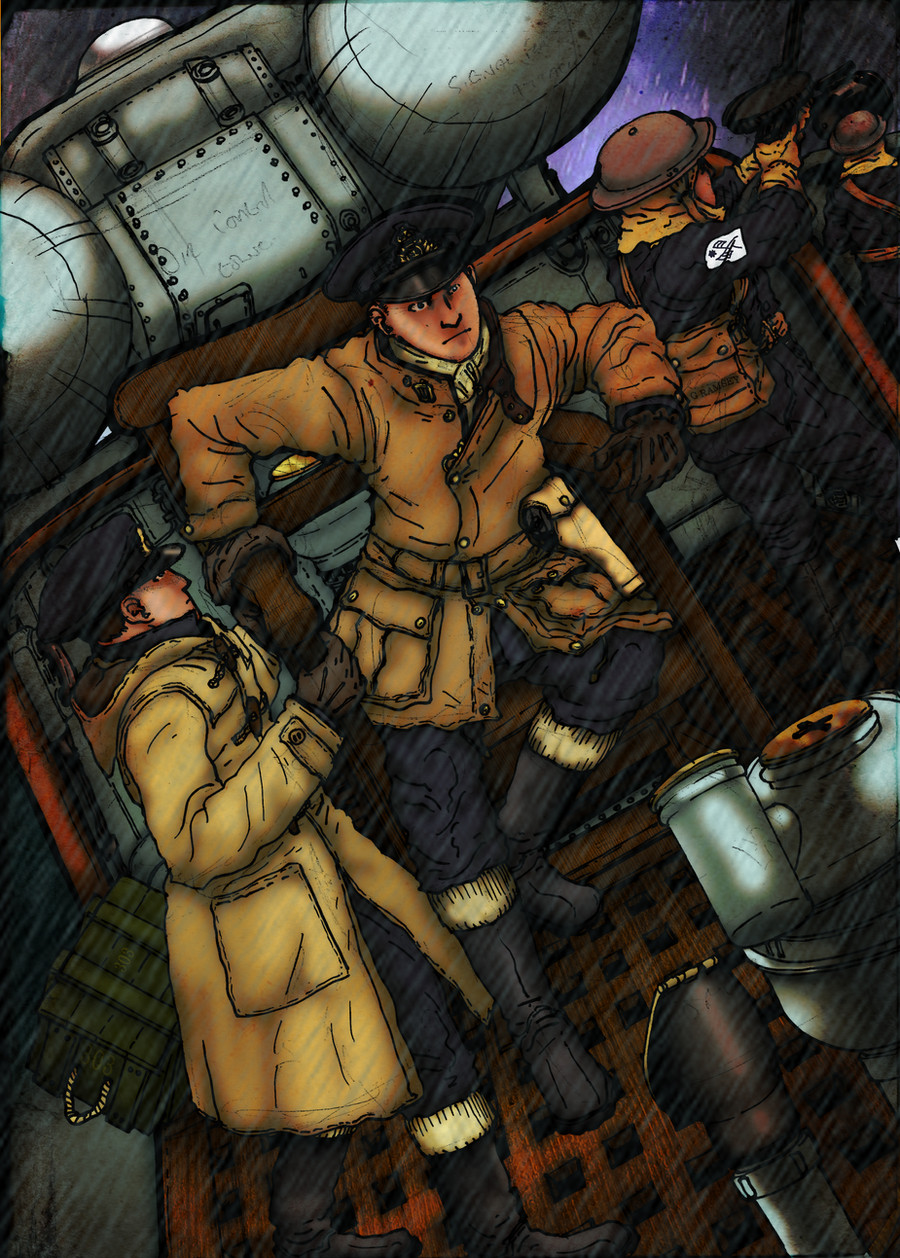
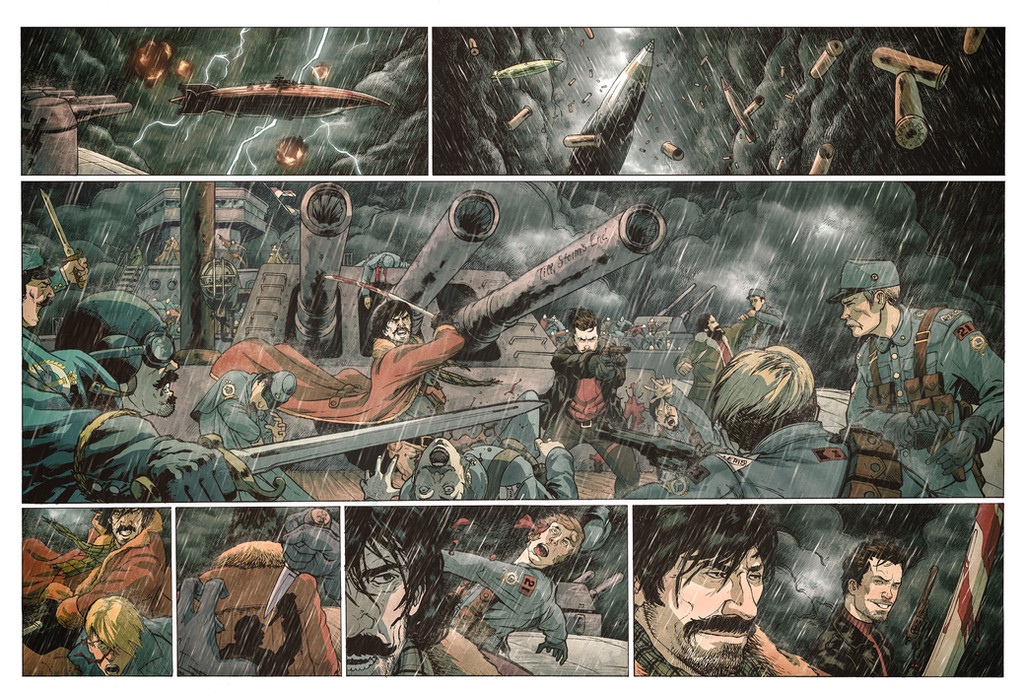
alrighty guys and gals...so this is the second version of my color sample to ~3113-studios you know it funny after i posted i wasn't really sure if i went with wat was right for the page... i kinda gambled alittle just to see what you all thought and i have been getting alot of messages, comments, and even notes saying all the same thing that the middle didn't feel like or look like it belonged to the same page sooooo i added some rain in to the middle panels and more on to the bottom, now i believe and feel like the page flows better.
i also added some color over the middle panels just to keep with the feel of the others too.. hope you guys like this one better and just to see i will put up a side by side and a poll to see what everyone truly thinks....
also just a quick note guys please dont be affraid of posting your comments in the public part i am never worried about what others think... let me explain for the most part we are all trying to break into the industry and sometimes the only way that we can grow as artist's is from the honest feed back of others whether or not it is correct or just an opinion please feel free to post on the page so others can chime in too to your comment... but if you still are to shy to post i will always answer all comments and notes as soon as i can
origianl pencil by
flats and inks by
colored by me
color for
version 1:
original pencils:
Related content


Comments: 14

sooo i assuming that you like the changes that i have mad hmmmm
👍: 0 ⏩: 1

oh yeah...the guy in panel one stand out a lil too much, not much snow in front of him but overall real great!
👍: 0 ⏩: 1

I knew it that someone would say 'too much snow' ")
Another thing that Teppo points and may be he right is the sky, like I said I'm not wheather expert but I see some difference between the skyn in the fisrt one and the other panels. in the 2nd and 3rd if you take out the rain you could think that it's a sunny day (talking just about the sky) but in the first one even if you take out the snow/rain you will have a stormish sky. I think in this case with so heavy snow/rain and taking that you say that it's the artic the sky maybe could look more greyish, somrething like panel 4. About the brightness of the rain, yes maybe in the reality is not like that, but again this is not reality, I think if you reproduce the exactly look wouldn't look too good.
well I guess that's all for now  (Smile)")
👍: 0 ⏩: 1
haha i knew it too actually, yeah i know what you saying with reguards to the weather.... soo yeah i could make the village alittle less visible and change the water soo that it not soo blue and i am sure it would look even better but now lets look at panel 2 with the sky... the sky that is visible is far off in the distance soo it is really hard to make the clouds over head look like they trailing off (at least for me) that is why i did some clouds on the horizon line and unsaturated it to make it look kinda like there is a break in the weather alittle....
also you know i not sure just how much more i going to tweak it i think that i going to leave it have have it judged on it's standing now cause i know from personal experience you are not going to make absolutely everyone happy there are always going to be people that say well you should have done this or that and not that it is bad they are just trying to help and i understand that and then there are those people that will nit pick just to be jerks... i know neither of you guys doing that so i cool with it but i also not going to spend too much more time on it either, cause i think it is a good enough sample to show them my skill level and i also know that they will go to my page/gallery and check out the rest know what i mean. NEXT...
babbling always good for the most part

👍: 0 ⏩: 1
sure mate you need to stop working on it in some point, you know when I said "maybe you should..." I didn't mean that you should in fact do that on this piece, was more something that may could help you in a future work. you're right even on pieces from the best pro guys people could say 'he should have done this or that' sometimes even with some true on their words, like I said comic is not reality so there's always some room for words if you want to be strict (or jerk
I thought that about the panel 2, that the blue could be a brake in the weather cause the distance, but I just said that maybe a gray sky could complete the mood of the picture better.
well luck with this man

👍: 0 ⏩: 1
i knew what you where saying cause i was saying that for a couple of others that where saying things through notes as well..... it impossible to make everyone happy all of the time know what i mean.
as for the sky color that was why i put the grey overlay
yeah hopefully it gets choosen
👍: 0 ⏩: 0

I think there's too much snow. It also messes up the borders of the third and fourth panel. In the last panel, the guy really stands out with warmer colors but it's unnatural. I think you can make him stand out more with the less interesting men. Also, I think you could add some depth to the last panels village by getting rid of some of the villages lines with different colors. I also don't think that a breezing water can be so bright. And if it's a storm, it should really have deep and dark colors in the sky, too. I think that highlighted colors should define more of the shapes of the body and faces. I don't think you should add warm and cool colors in the same boat, it kind of breaks up the atmosphere.
But yeah, I'm just trying to help.
👍: 0 ⏩: 1
hey teppo..
soo thanks for the comment first off and since i dont reconize the da icon let me explain i always respond to everything cause i feel that is someone is willing to take the time into postin a comment the least i can do is comment back right, plus i like to respond to all of his/hers comments.
so with that being said... re reason for all of the snow and rain is cause they are heading into the artic where there is alot of snow and rain, right. also the reason i went with the characters being those colors is because of a couple of reasons, let me explain you see when i color i color for the most part in full sun and then adjust the layers with overlays and what not. sooo what you are seeing with the top and bottom guy is them in their full colors, the reason for me keeping them full color is i was going for the contrast between the other characters and to create a focal point thus kinda forcing the viewers eyes to them cause in the script they are the main characters in this page....
soo again thanks for the comment brother and i do understand not being a colorist people then to either take it wrong and/or look at it like well dude don't know what they talking about but i how-ever have a thick skin and can take all input from people and sometimes when i explain myself and the reasons i do things a certain way it makes more since to the commenter know what i mean? so nah i not irritated bro... no worries
-rich
👍: 0 ⏩: 1
Wow, gee, thanks for the explanations!
👍: 0 ⏩: 1
Np brother....did it explain my thought process alittle better? I do agree with a lot of points you made but like I wwas tellin another buddy at my current skill level I can color ahhh comicy style I can't color realistic completely sooo sometimes I will do something that isn't what should be in real life situations but everything goes in the comic world...
I glad you got through it sometimes I tend to babble a lot as well as the good ol run on sentences thing
👍: 0 ⏩: 0
