HOME | DD
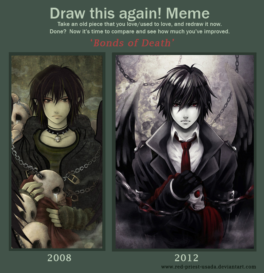
 Red-Priest-Usada — Draw it again - Bonds of Death
Published: 2013-01-03 20:09:48 +0000 UTC; Views: 92228; Favourites: 5714; Downloads: 622
Redirect to original
Description
I planned to finish this meme some months ago but I couldn't make the new version look right. To be honest, I spent so many hours drawing and correcting the same parts that my eyes hurt now, seriously X______________X ;;;;.But back to the picture...
Improvement memes are very motivating and inspiring. I love looking at other people's entries. I decided to make a new version f my 'Bonds of Death' pic because I couldn't stand looking at this lame shading and clothes;;;; (not to mention lame skulls). Well, there's still a lot of things for me to learn and improve but I already started enjoying playing with light and colour. I need more practice of course. I just wish my bishies drawing skills improved faster :___:.
Meme base: [link]
Credits for
Related content


Comments: 382

I love your comment so much! 8D. But that also bothers me, is it better to make the skull cry? Was it actually a good idea? That's a serious question 
👍: 0 ⏩: 1

You know, I think it depends on what you were trying to portray with the original artwork. Is that idea still represented in the new look?
I mean a grungy looking boy surrounded by sobbing skulls can mean the same as a man in a suit with a skull and chains.
If the meaning is there, the feeling is there.
I think I like both pictures.
👍: 0 ⏩: 1
Thank you for your answer. I looked more carefully on both pictures and in the first one, Thanatos's face is stoic, almost emotionless while the skulls around him are crying so the atmosphere is rather sad. Back then his personality was not fully developed and that has changed during 4 past years. Now he's more confident, a grown up man, not a teenager. The second picture portrays him as a fearless god, ready to take any soul without hesitation.
So yeah, the pictures are similar in many ways, yet they convey different emotions  (Smile)")
👍: 0 ⏩: 1
mmhmm. the character grew with time, just like your artistic talents! what more can you ask for?
")
👍: 0 ⏩: 0

this is a huge difference both are amazing tho
👍: 0 ⏩: 0


I definitely like the second one better...also, the second one reminds me faintly of Light from Death Note
👍: 0 ⏩: 1
That's new XD''- usually he reminds people:
- Sasuke from Naruto
- Sebastian from Kuroshitsuji
- Rin from Ao no Exorcist
- Hibari from KHR!
👍: 0 ⏩: 0


you should post the second one seperate, so I can favorite it
👍: 0 ⏩: 1
I will, I will. Now I'm analysing the feedback to learn how to improve some parts.
👍: 0 ⏩: 1

they both look absolutely amazing, but for some reason the newer one reminds me of Light Yagami...
👍: 0 ⏩: 0

People could love both, people could prefer the style of the before one more, but no one can deny that you've improved amazingly over the years!
👍: 0 ⏩: 1


wow, mind blown. You just made me realize that I've been +watching you since 2008???? this shit is crazy. The improvement is amazing though, it feels most apperant on the sculls and the chains, as their amount of detail and realistic shading has incread? Same with the clothes.
👍: 0 ⏩: 0

Wow your improvement is great! The proportions look good and so does the shading. I wish I was that good haha
👍: 0 ⏩: 1
Good luck with your improvement. I'm sure you can do it. It's just the matter of practice and self study
👍: 0 ⏩: 1
Haha thank you. I used to be able to have more time, but now I'm majoring in pharmacy. lol
👍: 0 ⏩: 1
Yeah.. studies take a lot of free time. I have a job for 7 years and when I'm back from my work I'm so tired that I can't draw (except weekends). The same was with my studies.
👍: 0 ⏩: 1
Haha I can't even do that. Oh I saw the other comments and I have no idea what they're talking about, but like I said: everything was great (men in suits are pretty hot), yet I did like the crying skull though. That's about it. haha ^_^
👍: 0 ⏩: 0


")

ugh auto faces. ._.
👍: 0 ⏩: 0

Wow! I love the old picture, but the new one is even better. You've improved a TON, especially with shading and making things more interesting; a slightly tipped down chin, chains and skulls in the background, a red tie. Beautiful!

👍: 0 ⏩: 0

That is amazing!!!! Nice work!
👍: 0 ⏩: 0

Woah major improvement 
👍: 0 ⏩: 0

This is absolutely amazing! I love both of them but you can honestly see a lot of improvement. Good job.
👍: 0 ⏩: 0


Wow! They are both very nice!
👍: 0 ⏩: 0

Even the "before" drawing is still really good, and the "after" drawing is truly amazing!
👍: 0 ⏩: 0

Looks like a mixture of Sasuke and Yagami light
👍: 0 ⏩: 0

This is a really beautiful piece, and the improvement is shown^^
(to me, personally the newer version looks more like DeathNote Light Yagami xD )
However, I adore the shadowing and clarity of the newer piece.
👍: 0 ⏩: 0

This is so pretty ;_____;
I especially love the change in light vs shadow in the face. It gives your character so much more dimension and expression.
👍: 0 ⏩: 0

I actually prefer the old, though the new looks more professional...I just like the old one more.
👍: 0 ⏩: 0


Love both of them but not to be rude when I say this but the older version looks better to me.
👍: 0 ⏩: 0

I think it interesting how not only does this piece show how you've grown and changed, but it almost looks like the character in the piece has grown up as well. He looks like he's gone from punk teenager to businessman of death. O.o
👍: 0 ⏩: 0

i have to ask, what program do you use for your art? i just got a bamboo tablet which i think should help me but i'm in need of a good program.
love the pics btw
👍: 0 ⏩: 0

AMG- both are amazing! ;A;
I am at loss for words because of this epicness before me!
👍: 0 ⏩: 0


you can definitly till how much youve improved
👍: 0 ⏩: 0

I love both, but I can definitely see the improvement!
It looks amazing OAO
👍: 0 ⏩: 0


i'm sorry but i have to be honest...i liked 2008 better XD
👍: 0 ⏩: 0

this is a great idea...man, u really made urself upgraded. 2 thumbs up dude.God bless!
👍: 0 ⏩: 0

this is so awesome and in truth i really luc both of them
👍: 0 ⏩: 0

such progress 0_0 your art looked great in the 2008 drawing but it looks awesome now!

👍: 0 ⏩: 0
<= Prev | | Next =>