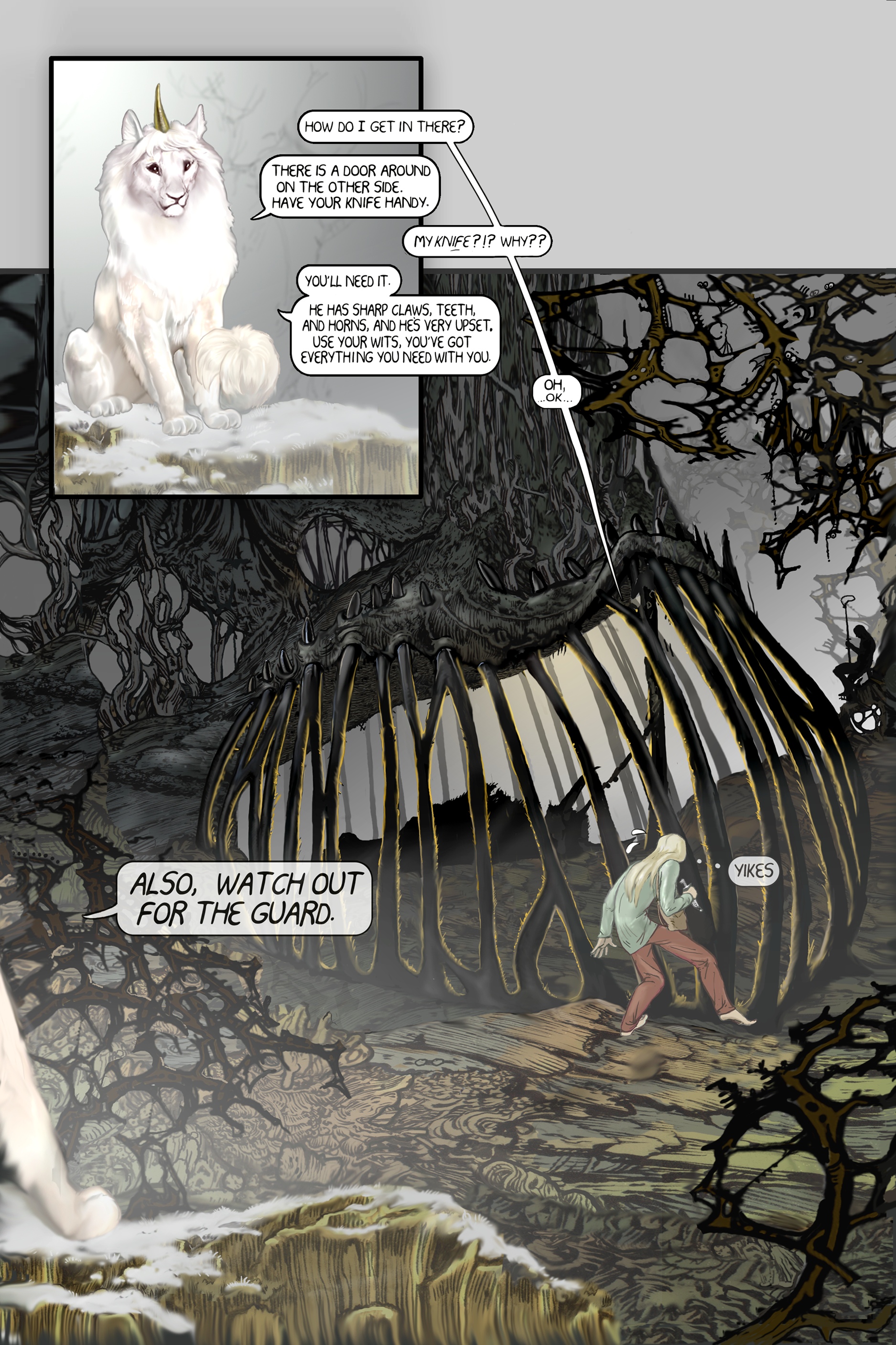
HOME | DD
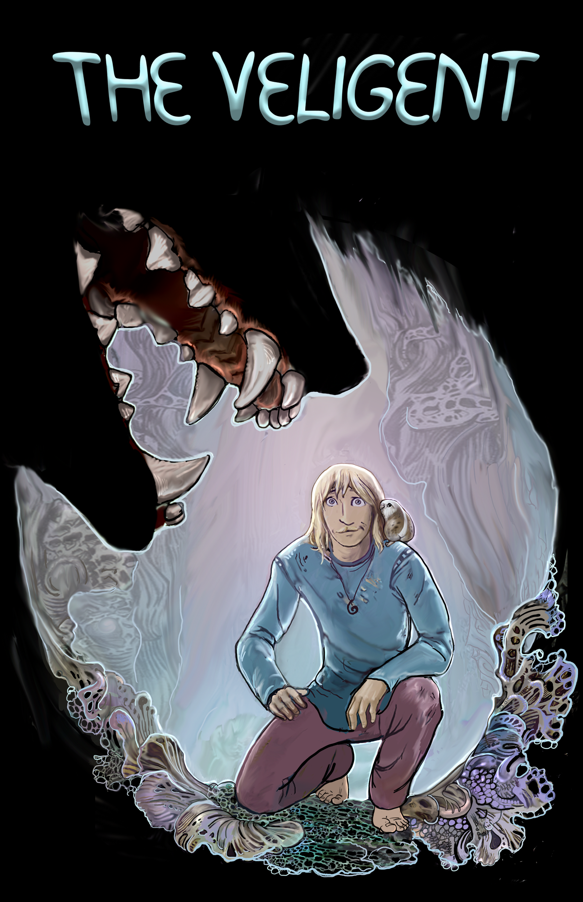
 Reptangle — latest Cover for The Veligent
#coverart #jaws #wolfmouth #demonmouth #comiccoverart #theveligent #wolfjaws #blackwollllfdemon #dramaticcoverart #snarlingwolfjaws
Published: 2017-07-21 21:05:34 +0000 UTC; Views: 1233; Favourites: 83; Downloads: 2
Redirect to original
Description
I have been re-doing the cover to make it more, you know...dramatic or something. Here's what I got so far. I am trying get some of the story tension into it, while balancing the danger with the sweet.I am clueless about what font I should use, I want a friendly looking font, to keep the cover from looking like it is for a horror story.
Related content


Comments: 29

I like the idea of a hand-drawn title. I know this font is your writing, but something a bit more in the style of the art? Maybe just a little bit of nettuce in the right places, so it's uniquely yours but not hard to read? I am not great at graphic design but this font does come across to me as a bit balloony and generic. Like "I drew something and slapped a font on it quick!"
Maybe a nettuce border for frame for the title? Hmm!
👍: 0 ⏩: 0

i like the font! its fun, but pearlescent to fit the cover color! There's the veligent's sweetness and, im betting, the other general's scary teefuses!
FRIENDSHIP! ITS COMIN FOR YA! lol
👍: 0 ⏩: 0

 (Smile)")

It's a nice cover, although I also loved the first one. Have you you made space for the author's name? Do you have enough space on the final on all sides for the cropping process?
👍: 0 ⏩: 1

This image doesn't include other text, or bleed yet. Even the title is just a mock up. It is a digital image, so all that stuff will get worked out.
I need to find out what text MUST be included on a book cover. I've seen books that have all kinds of stuff written on the covers.Makes em look like liquor store windows. I prefer less text.
Some book printer places give you the option of having variant covers in your book run, so i could do both covers.
👍: 0 ⏩: 1
I always make the cover art to fit the required image size for that particular edition that includes the excess where they will crop. Then make the text the required distance, at least, from those edges. I only put in the title and sub-titles and the author's name. On the back cover I put an extract from the book and a small graphic or icon that is the book's totem. That goes as a small insert with the back cover extract wrapping round.
I agree that too much chatter on the cover tends to misdirect attention from title and author. One can, if doing a sequel, say so somewhere. But if you're doing a whole series that isn't appropriate so it's better done inside on the "Other Books by this Author " page.
Streamlining is a good aim. People are very easily bored by too much stuff. They just have a quick look, couldn't be bothered to read all the unnecessary cover blurb and move on. Once they move on, you're more or less toast because they don't come back.
👍: 0 ⏩: 0

Maybe a more Lacy look to the letters? With a Vel or a few like a flower (i mean branching off the words, not an actual flower) coming off it here or there? By the way, I really love your work. The Veligent is the second webcomic I've been able to get my mom to read with me. (the first is Two Lumps: www.twolumps.net/ )
👍: 0 ⏩: 1
Really?That's great!
I did some lettering like this, but I decided it was too difficult to read.
👍: 0 ⏩: 2
It looks almost done. With your style of coloring it would be very easy to read. Different colors emphasizing each letter, et voila! Though I can understand the Veligent title being slightly redesigned to be a bit less "busy". I'm sure it'll turn out perfect if you do it the way that'll make YOU happy. I think you'll understand what I mean once you post it and receive all our praise for your awesome work. We just want to see what you choose to create! Is all beautiful!
*edit: though i admit: i'll miss the flying fish! maybe the old title could be augmented into a 1st"er" page?
👍: 0 ⏩: 0

^ thats what i was talking about too!! i love that look! ...i could see were some might have trouble reading it though...maybe it could be simplified just a little bit?
👍: 0 ⏩: 0

Hey, that cave opening looks like a dinosaur claw, but wait it has teeth and- ooooo, how did I not see that? Great work though!
👍: 0 ⏩: 0


If you have neat handwriting you could always write out your own font, maybe make some artsy lettering that would go with the plant life of the world ( that undersea coral look it has is really cool) ")
👍: 0 ⏩: 1
This is my own font! It is what I lettered the comic with. I am still fooling around withit to make it look right. , maybe lose the 3d look and outline it , or something... Or Maybe it needs to be fatter...
👍: 0 ⏩: 1
oh haha! i didn't realise! it looked like a bubblie font of some sort XD my bad at least you know it looks nice enough to fool me into thinking you used a pre-made font
 (Wink)")
👍: 0 ⏩: 0


the look on his face is prefect.
A mix of concern, curiosity, friendliness and fear. PERFECT.
👍: 0 ⏩: 0

I would suggest a font without any 3d effects/ gradient
👍: 0 ⏩: 1
Yeah. I'll fool around with it .
👍: 0 ⏩: 0

I think the font is great, it helps put a little bit of whimsical in a dramatic scene. His expression really pulls it off though; it makes me laugh XD
👍: 0 ⏩: 1
Looks like it was written by balloon animals
👍: 0 ⏩: 1
Exactly! That's exactly something The Veligent would do

👍: 0 ⏩: 0

Have you tried any AR font? I use AR CENA and it looks quite "friendly".
👍: 0 ⏩: 2

font-alphabet-styles.blogspot.…
for reference. I like the Christy too.
👍: 0 ⏩: 1
Where can I find examples of AR CENA? Is that the font on your comic?
👍: 0 ⏩: 1
Yes, that's the one i use for the character's baloons.
👍: 0 ⏩: 0