HOME | DD
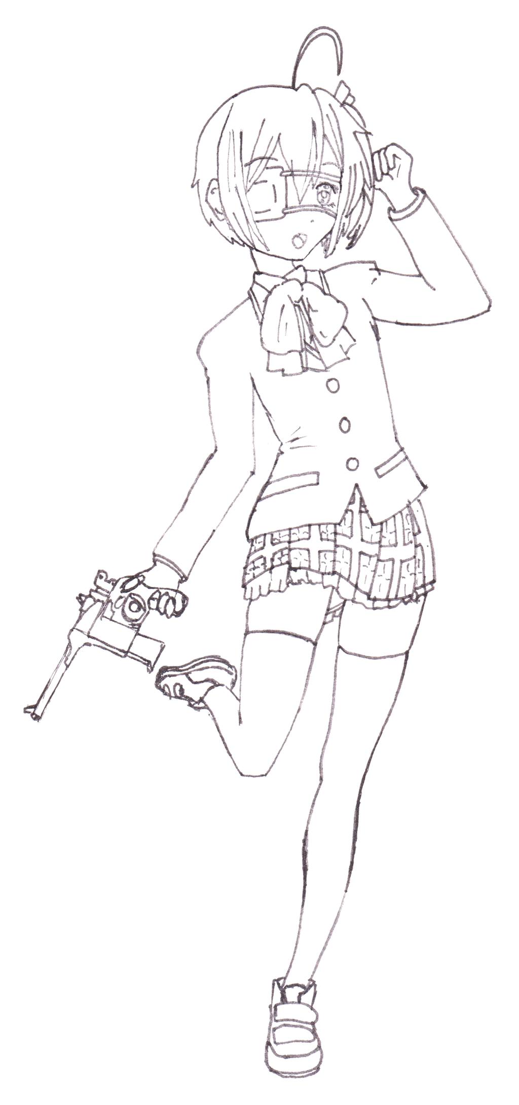
 return-null — Sketch - Succubus

#demon #elf #girl #pose #succubus
Published: 2016-12-10 05:55:37 +0000 UTC; Views: 411; Favourites: 8; Downloads: 0
Redirect to original
Description
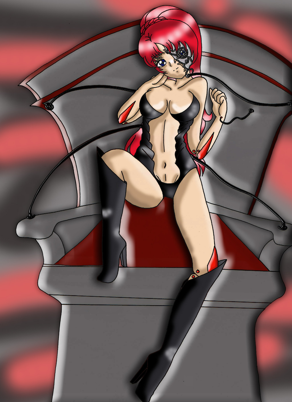
Took more measurements on the pose I attempted last night, traced over it, and then attempted the pose again. Pose came out kinda sultry, so I ended up adding flowing hair and the rest of the outfit followed.I need to strive to get faster. Most of my drawings say "sketch" but they've all taken at least a couple hours.
I think the anatomy turned out much better than the first attempt.
Pose reference was 001 from:
www.proko.com/poses-for-artist… (Store Link / Contains artistic nudity)
Related content


Comments: 27

Overall

Vision
Originality
Technique
Impact
It feels weird critiquing a drawing of a half-naked succubus. >_< But that's ok!
Here is a list of things you need improve on:
- The thighs are uneven somehow. Like the one thigh is fatter than the other.
- It is probably just being me nitpicky. Well, one of the eyes is slightly smaller than the other eye so it's uneven. :/
- It looks a bit plain around the stomach. Add some details like a belly button. Just a food for thought. e.deviantart.net/emoticons/s/s… " width="15" height="15" alt="
 (Smile)")
- I feel that the head and the transparent clothing is going with the flow of the drawing. I mean the hair flow in one direction and the rest of the body seem to tilt in the seem direction. Why not have the face tilt too and clothing flow that way like the hair. The flow of the drawing would look good. e.deviantart.net/emoticons/s/s… " width="15" height="15" alt="
I feel like this isn't gonna help you but I'm gonna post this anyways. e.deviantart.net/emoticons/s/s… " width="15" height="15" alt="
👍: 0 ⏩: 1

- On the thighs, I'm actually really happy with how they turned out regarding fidelity to the original drawing. It was tricky to not make them the same width actually.
(I'd post the original reference, but it's a paid image)
Thighs aren't perfect cylinders, especially with a leaner body build, a cross section would be more ovalular.
Here's a good 3d modal that shows what I mean. Look at the thickness front on and then turn the modal to the side.
sketchfab.com/models/3e7565af3…
By no means am I saying that my drawing is perfect. In fact, what I'm really defending is that I got the contours/lines right, but by blindly copying contours, I might be missing out on conveying motion/gesture. Maybe it would have been a good idea to taper the leg a bit to make the pose more striking.
- Regarding the eyes, I still have a long way to go with faces. I probably need to do more large drawings of heads, as in most of the drawings I do, the faces are so small I can't get much detail in without the ink bleeding away any detail (which is probably a problem in and of itself). I will hopefully be doing more digital art by the end of the month, so I want to focus on faces then.
- I had a belly button in the original pencil sketch, but I forgot to ink it and in the process of scanning and upping the contrast, it disappeared entirely! D: I really do need to find a way to add more detail to the stomach. Adding definition is hard because it's easy to make the stomach look too buff or like she's starving. It's actually easier if I color the image, so maybe that's some motivation to color more.
- Your last comment really strikes at the heart of the issue, and you are spot on. Like I mentioned above, I'm so concerned right now with getting the anatomy right and making sure all the measurements line up, that I am neglecting to exaggerate and really bring more life to the pictures. That's definitely the next step and something I feel like I've never really accomplished.
Your feedback is definitely helpful, and I am always happy to get opinions on it. A lot of the things that you mentioned I had some uneasiness/displeasure with myself, but was trying to subconsciously sweep them under the rug, hoping that the rest of the image would "smooth out the wrinkles". However, critiques like yours serve to reiterate that some of the areas in which I am slacking are important and noticable, and I should continue trying to improve and learn from my mistakes.
Again, thanks for taking the time to critique!
👍: 0 ⏩: 1
O-O Woah! That's a lot of text there. Well, you're welcome! OUO I wasn't sure that my feedback was helpful or not. :/
👍: 0 ⏩: 1
So long as it gives me ideas on how I can work to improve, it's helpful!
👍: 0 ⏩: 0

Overall

Originality
Technique
So first thing. What side of DevientArt Am I again? Not to be mean but I myself do not think... Hey mabye I want to draw a half naked girl. The pencil shading is off and you can see throught the hair. so what I likea about this though is that it is an elf. and it is cute. the feet are good and alligned and the fact it has horns make it 100 times better. even though it is a half naked girl and I am on the wrong side of the devientart website again it is non the less an AMAZING picture.
From, A Pal, Noah
👍: 0 ⏩: 2

I think people can be able to draw half-naked fantasy creatures, at least it's not pornography. and if it does contain nudity from a drawing it should have a mature content filter on. and if somebody posts uncensored IRL pornography on the website, they get reported and banned.
👍: 0 ⏩: 1
okay thanks for clearing that up!
👍: 0 ⏩: 0
If your initial thought is not "Hey maybe I want to draw a half-naked girl"...you're probably not practicing drawing anatomy at that time. It kinda gets old just drawing mannequin pose after mannequin pose, so I just added enough detail to take it from mannequin to half-naked girl. I could have added clothes, but that would have hidden some of the anatomy that I am wanting to get feedback on.
As far as the see through hair, it's partly due to laziness/inability to erase the ink. Also it's partly to allow for flexibility if I want to color over it.
anime.stackexchange.com/questi…
If I were to color this image, the hair would likely occlude the tip and base of the ear on the left, but I would probably keep the eyebrow showing through.
I'm glad you enjoyed the extra flair I added by adding the horns, elf ears etc. Made it worth finishing it out instead of putting up yet another mannequin. At the end of the day, if your biggest complaint is that it looks like a half-naked girl, I'll take that as a compliment!
👍: 0 ⏩: 1

That's rly a nice sketch, i also watched your first attempt ^^
I think this time you hit the anatomy not only better but just right.
Really i think its flawless.
What i really like is how u didn't gave her typical enormous anime boobs.
All in all the sketch looks really natural is what i wanna say i guess.
The only thing that bothers me is that her underwear is so sleek, i guess you should have added a few details to accent her sexual parts, but maybe im just a hentai hue hue hue
👍: 0 ⏩: 1
I'm glad you liked it! Did you see the finished version?
I've found that a lot of people enjoyed the subdued, realistic anatomy. At the same time I want to get better at pushing the anatomy and the pose to make it more sexy!
Thanks for the kind words! It inspires me to work harder and get better!
👍: 0 ⏩: 1
yes i saw the finished version but i only like the left without colors.
The Eye in the left has also colors though.
You did the exposure absolutley right, but the hair and the face remained sketchy also the colors dont really fade.
I like the sketch more therefore
")
👍: 0 ⏩: 0

Your anatomy is on point, but I am not sure how much is traced, so I hope you gained some valuable lessons from it. From some of your other works, you do not seem to have any issue visualising limb formation and shape. However, I advise you to be more adventurous in adding pencil shades of varying contrasts to your work, especially with the limbs and folds of clothing. It gives an illusion of shape, volume and mass, but takes time and practice traditionally. You've tried it digitally, but it's much harder to replicate with pencil. If you prefer working with pens, try minute crosshatching instead and reinforce your lines (make them thicker) once you do so; it makes certain parts visibly separate from others, so the viewer can isolate which parts are, say, the limbs, the veil, and any additional shading you might have. I find this to be a very informative article with even more internal links to other guides on various techniques with inking and shading with pen, as opposed to pencil.
Also, a sketch may take a few hours, but that's par for the course. All artists' versions of a sketch become more complex as their skill level increases. Take more risks,and if you have the hard copy of a sketch you have done, see what can be added or corrected, especially in terms of shading. For example, in some of your other works, I find minor asymmetry in the neck and head region from a side-view. It can interpreted as an art style, but that's up to one's subjective viewpoint.
Slight tic: the socks and horns can be fully inked, but risk tearing the paper lest it becomes too wet, so I can understand. I do suggest darkening the whole piece in general, though.
Good luck. I am sorry I cannot help you further; I am not very experienced with ink.
👍: 0 ⏩: 1
I did learn a lot of anatomy from practicing this pose. This attempt was not a direct trace, but of course it was made heavily referencing a photo. Definitely going to read up on the different shading/lining techniques that you referenced, though I probably am going to continue digitally at this point. (I would like to be able to use fountain/brush pens as I think it's a really awesome skill, but my hands are SUUUUPER shaky). Regardless, shading is important in any medium, and the lessons will apply across all of them.
There has been a lot of interest in this picture, so I'm thinking it's a good candidate for me finishing digitally and trying to improve with some new techniques. Hopefully those lessons will carry over into my traditional work as well.
Thank you for the well thought out feedback, and I hope you will continue to watch me grow as an artist in the future!
👍: 0 ⏩: 0

Hi there! I'm here to critique your drawing as a part of ProjectComment
The first thing that struck me about your drawing is how charming it is. You've mentioned that it's part of anatomy practice, but adding the details and creating a character lifts it from being just that. It stands on its own as a character illustration.  (Wink)")
Her calm expression makes her feel serene and lost in thought, which I really like. It makes me feel at ease when I look at her. However, since she's a succubus, perhaps an expression that conveys determination and / or confidence might have been better? For example, having her look directly at us and smirking goes a long way in portraying her true nature. But if you're going to work with this character in the future, it WOULD be fun to see how a cute and calm succubus would play out.
As for your lineart, I think you've got some things to improve. You don't seem confident in your lines yet, as they're very sketchy. Your lines are also mostly the same line weight; the places that do have different line weights look a bit like accidents (such as her right shoulder). It looks like you're using either pen or pen liner to ink; personally I found them very hard to use when I was starting out. I think you should experiment with different inking tools, like brushpens and dip pens.
I hope this was of some help to you. Your art is very cute and I like it a bunch <3 Keep it up!
👍: 0 ⏩: 1
Thank you for the compliments and words of encouragement! I'm really glad you like the character and enjoyed the drawing.
I just finished watching the video you shared, what a great, simple explanation. I'm definitely going to try some of the tips that she shared!
I hope you will consider watching me as I improve my art!
👍: 0 ⏩: 1
Anytime! I linked to the part of the video that I found the most relevant, but there is more information earlier in the video as well if you're interested in that.
👍: 0 ⏩: 1
I think the most useful part was her just saying to line everything in one thickness and go back and add variation. Working on my first drawing in Clip Studio Paint right now and this video gave me a good idea of the workflow I should try to adopt. Next picture should be very "ink" intensive and interesting!
👍: 0 ⏩: 1
Awesome! I'm looking forward to it.
👍: 0 ⏩: 0

Greetings from
This is really lovely. The proportion and shape of the body is so perfect! I love how it looks like a real body, not exaggerated for illustration. Given how perfect the body is, I'd love to see a bit more detail on that face. She's pretty, but right now it feels bare bones, and more personality to her would be cool to see.
Looking closely, your lines are very timid. It would be good to practice drawing more bold, strong lines with confidence. I'm not good with lines either, so it's easy to say hard to do. But since you got a such a good handle on the body shape, and you draw lovely women, it would improve a lot with more confident and diverse lines. For example, her thigh should be drawn with one strong stroke as it's a large body part with strong muscle. The shawl she's wearing should be drawn with smooth, but thin and soft lines and it's a see through, soft fabric. I think once you get more comfortable with drawing different styles of lines, you'd make a huge leap.
Love to see this coloured by the way.
Lovely job!
👍: 0 ⏩: 1
I'm glad you think the proportions are good and that the anatomy is believable, especially since I was so unhappy with this pose the first time I drew it. That said, I think I need to continue working on exaggeration, but within believable bounds.
As far as the face, it is very lacking and a lot of it has to do with the size I'm drawing. I bought some larger circle stencils this week so hopefully that will help me draw in a bigger scale to allow for more detail and personality.
Thank you for the specific ideas and suggestions about the lining. It's definitely tough, and I've been saying "I'll do better when I start doing digital" but that's a bit of a cop-out. Again, I think drawing larger images will help too.
Hopefully we'll see a colored digital version of this within the month.
Thank you for your helpful feedback and kind words. I hope you will continue watching me grow as an artist in the future!
👍: 0 ⏩: 1
You are very welcome and looking forward to your future work
👍: 0 ⏩: 0

This particular succubus seems a little more down to earth than others you might see around.
There is less exaggeration in the waist, the hips and above.
To think that this showcases beauty without the need for exaggeration of the figure.
I respect that.
I respect this succubus.
She seems to have a little more self control.
Like the things she does are just a means, a job.
She is a succubus, she does succubus stuff.
That doesn't mean that has to be her entire life.
👍: 0 ⏩: 1
Not gonna lie, this comment made me snort-laugh earlier.
Though it also made me feel like I SHOULD have drawn it more curvy and exaggerated and seductive to really sell the gesture and motion.
And for that I probably made you lose all respect for me.
So sorry.
👍: 0 ⏩: 1
whatever floats your boat
if the lines are solid and proportions are right (unless altered proportions are your goal e.g. chibi)
you've got yourself a good image.
Respect is all you need from me.
And you've got it.
👍: 0 ⏩: 0