HOME | DD
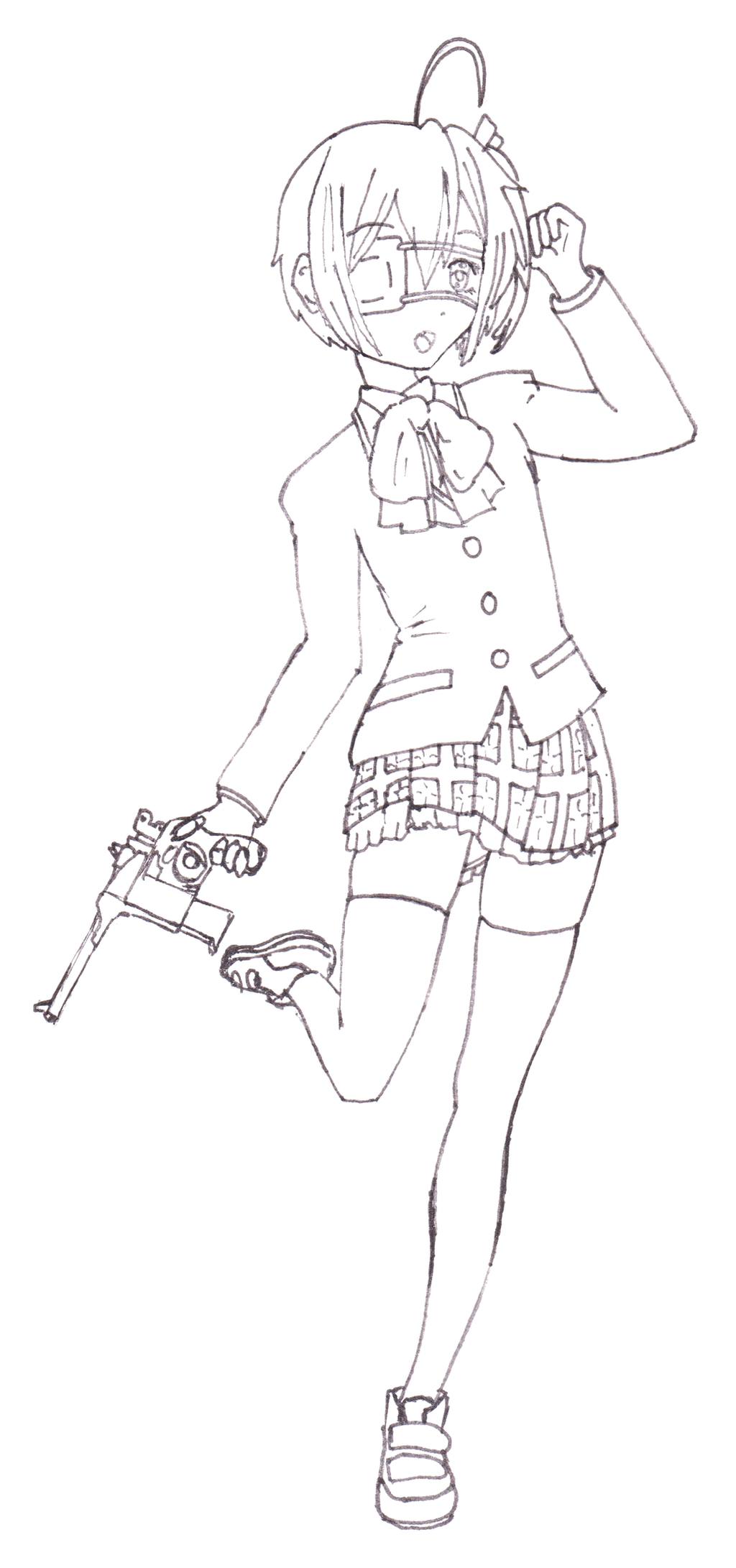
 return-null — Rikka Christmas

#anime #girl #pose #rikka #chuunibyou #chuunibyoudemokoigashitai #rikkatakanashi
Published: 2016-12-19 00:16:19 +0000 UTC; Views: 882; Favourites: 27; Downloads: 1
Redirect to original
Description
"This cursed eye of mine sees you when you're sleeping and knows when you're awake!"Wanted to try and draw her again but in a fullbody pose. The semblance is decent, but the end result is still pretty messy. Went ahead and made it Christmas themed, first time I've done Christmas art in years and years I'm sure.
Merry Christmas!
Screentone from:
This is my submission to GetWatcher's Winter Art Challenge.
Related content


Comments: 18

Overall


Originality
Technique
Impact
This piece surprised me a little with that incredibly small Santa hat! Like how you shade the girl and the patterns of her skirt. >w<
Here is a list of things you need to improve on:
- The way you have drawn the foot is placed firmly on the ground almost looks like her foot has been squashed into pancakes which is weird. :/
- One half of the hair looks like it hadn't been shaded or lighted.
- I feel like the background does not fit the Christmas theme. It just looks like she's the star of a concert which is nice but still doesn't fit the theme of it all.
Hope this helps! ^_^
👍: 0 ⏩: 1

Haha, glad you thought the hat was cute! The skirt was tricky, so happy to hear that you think it turned out.
It's interesting that you think the BG looks like a concert. I kinda just wanted to to use that tone haha. Personally just thought it looked snowish. Worth considering other perceptions if I think to use it in the future.
👍: 0 ⏩: 1
 (Smile)")

Love the clean lines. This drawing jumped out when I was looking through the project session and I must say you do a really good job with proportions and anatomy. I have two smaller issues, one is the background. I noticed the screentone you used had smaller orbs than the ones you finalized with so it didn't quite have the same impact. Maybe making the orbs smaller and have them in various sizes would help. The second issue is on the pose itself to Rikka the character. Although I really like what you did with the pose and how well you drew it, I feel it lacks impact when you imagine her yell "Banishment....this world!" But overall I love what you did with Rikka and look forward to seeing more from you.
👍: 0 ⏩: 1
Thank you for complimenting my lines! I tried hard on this one, now that I have good digital tools it's very tempting to just sketch everything roughly and fix it in the computer, but comments like yours make me want to try better in traditional media as well.
As far as the tone, I guess I went with bigger orbs thinking it might look like snow maybe haha? I feel like having the tone was better than no background at all, but that I could do a more impressive BG in the future.
I totally agree with you about the impact of the pose/exaggeration/really selling the character. When I was drawing this, I prioritized anatomy and adapting the reference poses I was looking at to the stylized proportions of the character. You will definitely see more Rikka from me, I hope you don't grow tired of it! She's such a fun and interesting character, and I like drawing her and trying to improve each time. It's honestly been probably a year now or more since I watched the show, but I just recently read through the official art/guidebook. I think you're right on the money, and the next time I draw her in a pose, I will keep in mind her catchphrases and judge if I can see her saying them in the pose!
Also, thank you for the watch!
👍: 0 ⏩: 0

The pose looks really good~ c: I like the purplish color on the shading of the jacket, it makes it really stick out. And the detail of the skirt is nicely done as well I think adding deeper shading on the white fluff of the lining would make it look more fluffy and have more of a shape. Remember to think of the actual shape and not just shading along the edges; right now on the one side at least it looks like there's just one straight line of lighting going on. I also can't help but notice, because of how striking the rest of the shading is, that you forgot to shade the bow thing. >.>
👍: 0 ⏩: 1
Glad you found the shading interesting, even if I still have a long way to go. I'm trying to get a feel of varying line weights (digitally atm) and I'm hoping that will enrich my shading in future drawings and help me think about how to shade more believably.
As far as the bow, I was hoping no one would notice, I didn't until after I submitted...
As always, thanks for the advice and words of encouragement! Have a happy new year!
👍: 0 ⏩: 1
Getting line weights to work with you can be tough, but it always looks fantastic when it comes out well. This one it looks like you free-handed, which I think is the easier way of getting the lines how you want, but I've noticed some of your stuff looks like it was done using the pen tool, which I'm definitely no expert on, but tried learning it when I was first getting into digital stuff. To get line weights with the pen, you just have to put the brush to whatever size you want the thickest part of the line and hit "simulate pressure" when filling the pen paths. It's then usually a good idea to stroke them again with the brush on 1px and the pressure turned off. But to me, free-handing is so much easier and less of a hassle even if sometimes ya gotta cheat a bit to get a straight line. xD
No problem~ Happy new year~!
👍: 0 ⏩: 0


Hi I will be commenting on behalf of ProjectComment
First off, your drawing skills are good not perfect. But hey, nobody is perfect. I would recommend you draw as much as possible. Your line work needs some attention when it comes to"clean lines". The best way to practice clean lines are to use a thin marker to ink you pictures. Moving from thick to thin is a lot harder than the opposite. The way you colored this picture is really nice and ok. Your shading and highlights could use some practice. I would recommend watching vidz on youtube on this matter.
You seem to have no problem with poses even though your probably still nervous when drawing them right? A nice Tip that I discovered as I was working on my graphics novel is. The more you fear and hate to draw a character from a odd angle, the more you hold yourself back. You have to find your mental block "for me it was fear" and remove it from your art. If you can do that then your talent will increase at a alarming rate! A lot of beginner artists have the Patience block, where they can't wait to finish the artwork and end up destroying any chance of improving.
I hope this helps you better your art....Enjoy your day
Nice artwork by the way!
 (Wink)")
👍: 0 ⏩: 1
Ah yeah, as far as lines, the pen/marker I'm using is pretty thin, but I wanted to have a little variety, though I may have made the lines thicker haphazardly.
As far as the pose, I actually stressed out about it a lot on this, and I definitely want to get more comfortable doing more interesting/varied poses. My issue with this was that I had practiced the face style from a direct front view...which is pretty unnatural. Even though I am wanting to go back and work on slight angles, three quarter, side views and beyond, I wanted to go ahead and do a fullbody pose. That said, the time it took me to find a pose that would allow a head on view would have been better spent learning to draw the head from the other angles and pick a more interesting pose.
I'll take up your challenge and do a more interesting pose next time! Thanks for your help and advice! I hope you will continue to watch me grow as an artist!
👍: 0 ⏩: 1
I'll be sure to keep an eye out and offer more advice in the future.
👍: 0 ⏩: 0

You did Amazing on Rikka! her pose, and everything looks amazing! can't wait to see more form you
👍: 0 ⏩: 1
Haha, thanks! I'm always so critical of my own work, so I'm really happy that you think this looks close to the source material!
And you will see more from me, and probably a good bit more of Rikka as I try to emulate the nuances of the style!
👍: 0 ⏩: 1
you're welcome! yay i can't wait to see more rikka and you! ^^
👍: 0 ⏩: 0

Great job with the colour! It looks really good!
👍: 0 ⏩: 1
Thank you! I tried some new things and I think it turned out alright!
👍: 0 ⏩: 1