HOME | DD
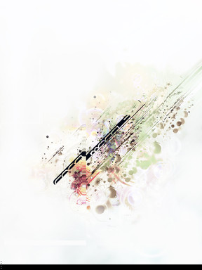
 rndl — root

Published: 2004-12-03 08:28:31 +0000 UTC; Views: 4854; Favourites: 88; Downloads: 981
Redirect to original
Description
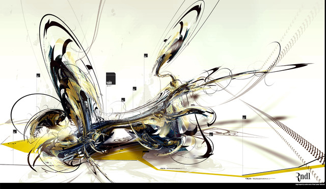
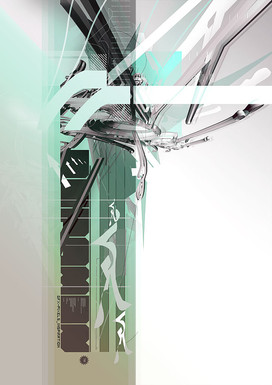
serving oxygenetic Pack5: Protege_______please visit [link] for more great pieces from this pack


Related content
Comments: 38

love the colors, thou I would have made them more saturated or with less opacity, but it is good! congtrats!
👍: 0 ⏩: 0

that is amazing!!!! how did u do it? is it all done in ps as well?
👍: 0 ⏩: 0

my favourite tones. if it was wearable, I'd wear it!
👍: 0 ⏩: 0

excellent composition and fantastic use of texture. i really dig the color scheme as well. very nicely done...
👍: 0 ⏩: 0

I love the colors of this.
Very earthlike. (if that makes sense)
👍: 0 ⏩: 0

Looks very beautiful! I'm impressed. So 
And now I'll check your gallery, hehe
👍: 0 ⏩: 0

now thats beautiful. amazing looking watercolour. +fav.
👍: 0 ⏩: 0

thats kinda neat, but very non-crispy. crispy would be nice.
👍: 0 ⏩: 1

so you must check out KFC right away...
👍: 0 ⏩: 0

favs > comments - no, no nic wiecej nie 3eba dodawac..
👍: 0 ⏩: 0

that is so cool! love the colors and the hole grunge effect! the textures rock! great work! +fav
👍: 0 ⏩: 0

Oh wow, I really love this, the layout, text, colour is just amazing. Wonderfull use of negative space.
👍: 0 ⏩: 0

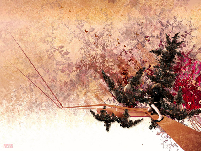
wow, fantastic work, bro. youve ushered in a new age of digital abstract by shining use of texture. you know just what should be organic and what should be plastic, and i envy you sweetly for that innate ability. your a true designer, whereas so many of us get away with being "illustrative" and "modeling". you have no idea the amount of respect i have for you at this point in time.
i really like the roots or plants. what exactly did you do to make them? photography perhaps? i cant tell when i look really close. i love the brown sections, too, but i wish the white border was layered behind them so they could break past the border to off the image itself, just like the red lines do.
perfect use of negative space, as well. the way you throw the word "root" around in transparent places is really boss, too. it all comes together to make an image thats complex in detail, but not in concept, just like looking at a patch of ground.
the technical aspect of the brown shapes is also very pleasing, and i have no critique of it whatsoever, especially since its not the same shaping ive seen recently. great work, mac daddy!
+joe
👍: 0 ⏩: 1

good god! thats one of the best and constructive comments i`ve recived here at deviantART...really glad you like my work so much.
👍: 0 ⏩: 1

I figure this: You demand excellence out of your art, so you deserve excellent critique, and I humbly do my best, sir. Thanks for staying around here on dA and inspiring some of us who are always in need of good inspiration.
+joe
👍: 0 ⏩: 0

Holy effing bejesus, that owns. So good, I want to pet it. But I can't 
👍: 0 ⏩: 0

