HOME | DD
 rococo — Band Practise

Published: 2005-04-21 22:54:00 +0000 UTC; Views: 1146; Favourites: 27; Downloads: 150
Redirect to original
Description
First off: if this looks washed out to you, put the screen brightness down? I was getting really confused with my last couple of CGs as people had commented upon the dark atmosphere ... "What dark atmosphere? Urrrm, 'Thank-you!


 '". My screen brightness was at 80-something on a 100 scale ... this one was done at 50.


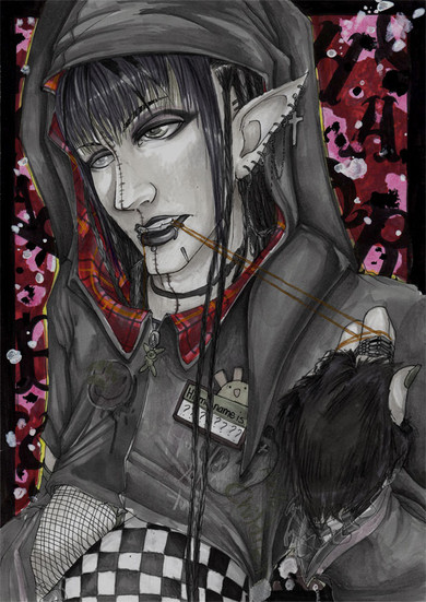
I had no idea what to call this ... .__.; Urrrm, but, it's Leon, and he has his guitarrr ... so let's pretend he's stopped practising for a bit. To tie his hair back. Because that's what people do when they've got time off. All makes sense! He's got my brother's guitar (different colours) because I couldn't manage to improvise anything and that was lying out in the hallway ... he's got silver bits in his hair because the blonde on its own looked too plain, and I reckon that he probably would randomly put colour through his hair a lot seeing as it's naturally that light. x_x *thinks too much into this* Urrrm, I don't think he's actually have a guitar strap that colour, or glittery and see-through, but I wanted some contrast ...


 I've been getting really frustrated recently over the fact that I'm finding it really hard to like something enough to actually get it more than half-way finished, so I set myself a target of making something printable within a day ... thus my bastardised cell-style comes in handy. .__.; Normally I spend ages trying to get things to look as smooth as possible, which is why I actually managed this. PhotoShop over scanned Multiliner lineart (light-boxed because I sketched in green - sketch: [link] ), about 7 hours. Lazy half-assed background used a load of PS brushes, mainly off of the first page in the DA brush section ...
x________x. *writes too much*
Related content
Comments: 22

Nice job mixing the cel shading and regular shading. I think that you pulled it off very well. Nice little details in there too, like holding the tie with his mouth. Interesting style you've got going on.
Nice background too... Very busy. I like the mosaic/pixellated look.
👍: 0 ⏩: 0

Wow, this isn't my computer so I never thought to tinker with the brightness things, and I found out that I'm viewing with my brightness on zero...
So, just to see what it looked like, I went to 100! ...Needless to say, it wasn't a very exciting journey, but anyway...
I love this picture, I'd give you something more to go on, but I'm more or less someone who just looks around and can't really contribute to the art world. I'm just here to appreciate, but appreciate in a non-constructive way, I hope you don't mind.
👍: 0 ⏩: 1

Hee, before doing this I'd always been unsure of what setting to keep my screen at, and I realised that everything was just too dark ... this was probably a bit of a mistake in that process! 
Thanks a lot for your kind comment, as well as the 
👍: 0 ⏩: 1

I can't say that I'd blame you, people liking things you do is always nice, I just can't believe that you would get that many critiques anyway, I adore your work.
((Though it looks way different using my monitor at home, wow. Playing monitor tag with art is fun <3))
👍: 0 ⏩: 0

I noticed recently I've been having issues with finishing things so I'm trying to work on it nonstop to actually get something accomplished.
The shirt is awesome- I love mesh- but is he supposed to be that lanky? I can understand it's because of the character's personality he looks like that but his torso is incredibly elongated and it especially looks that way because his arms are raise. But that's not a big issue. It's just personality.
The hair is gorgeous- you get many kudos on that.
The guitar strap contrast gamble was just that a gamble. It may have been wizer not to but the fact that you thought about it and willingly did that (not because of accident) it's not half-bad. It was a smart, logical move.
It's just...it's magenta...XD
👍: 0 ⏩: 1

I hadn't actually really intended him to be quite as lanky as he turned out ... he's meant to be slim, but not hugely so. My figures are just getting narrower and narrower ... I really need to sort that out. x_x I made his torso too long as well I think, I do have a habit of doing that when it's just the upper body on the page ...
I was thiiiiis close *measures* to giving him a rainbow-striped strap. HOT pink was a compromise between that and the plain leather I'd been considering originally. 

Thanks for the crits~ I appreciate it.
👍: 0 ⏩: 0

D'aaaaw he's prettying himself up for the ... band... members. And instruments!
I think you did a great job on that pose, and the guitar strap (it REALLY looks 3d, and it has that guitar strappy texture to it too O_O *amazed* ) Love the colouring too, it's like a sort of soft cel style. So goooooood
Aw I suck at being constructive today. I hope that's okay. Please don't eat my young.
👍: 0 ⏩: 0

It's really dark as 50. I like the 80 though :] this arm things are cool.
👍: 0 ⏩: 0

Oooh nice! I love his hair color, the guitar looks awesome, and the colors are really great.
👍: 0 ⏩: 0

Thats some intense piercing even by my standards XDDD its smexy ^.^/ I was acutally planning on doing a pic very similar to this XD but you beat me too it, and did it much better mind you. Nice one X33
👍: 0 ⏩: 1

Hurrrrm, I actually left some out on him ... X3;; *piercing freak, though still lacking many*
And you know I couldn't do it better than you, so hush! XD;;;
👍: 0 ⏩: 0

Eeek it's perfect, i love the wee things like his earings and his dog-collar, he rocks just like you ma petite Gail.
👍: 0 ⏩: 0

That is HELLA sexy.
I love his hairstyle. MMMM shaved back head YES. <3
Lovely job on the colouring dearrrrr <3
AUGH I love your crazy punk designs. They rock my socks.
👍: 0 ⏩: 1

Eee, I completely cheated with designs on this ... I saw that shirt and a load of necklaces like that ages ago, and I was like, "I would love you too much if I had any moneeeey!!" (Plus the see-through-panel-over-chest-ness.) So he gets them instead. ;-;
And, urm ... 
👍: 0 ⏩: 0

I wouldn't know anything about washout, I never mess with brightness. Lol.
Really great though! I love how well the hair shows the way it's being put up, and the pink guitar strap. 
Hot all together. ^^
👍: 0 ⏩: 0

Oooh so neat! It doesn't look washed-out to me at all and I've got brightness at 100 and an LCD monitor which makes things lighter usually XD Anyway, I love his hair highlights and the guitar strap is one of the most awesome ones I've seen. I also really love how you arranged his bracelets! XD
👍: 0 ⏩: 1

Okay ... that can't be a bad thing, then. XD
Fankies XB
👍: 0 ⏩: 0

OK the brightness on my monitor was at 6% and I just turned it up to 50% and it's like. Really washed out. XDD The black border hardly looks black and yeah. O_o;;; Screen brightness is something that will never be consistent, I guess the artist just can't win u_u *turns brightness back down*
Anyways. The silver in his hair is so pretty!! *___* The green background works really well with the colors of his skin and hair and clothes. That shirt is hot, by the way. xD Mmm and the necklace :9 And man. Guys putting up their hair are sooo pretty XD;;; *__*
👍: 0 ⏩: 1

X3 I'm pretty sure that it changes a lot between different screen makes, so that's understandable enough! lol When I've got the brightness of my screen up full you can still see black as just being darkish grey, and white's still white when it's right down ... just that I had it darker than usual, and when I printed a copy out, it looked really light.
Aaaaaaand, thank-you! X3;;
👍: 0 ⏩: 0

Its very good. I like the way the arms look, more, realish if that makes sense. SOme poeple might say his hips are a bit skinny...but I likes the skinny!!
👍: 0 ⏩: 0


