HOME | DD
 Roguehill — Captain Spectre color
Published: 2008-06-23 14:04:08 +0000 UTC; Views: 976; Favourites: 24; Downloads: 24
Redirect to original
Description
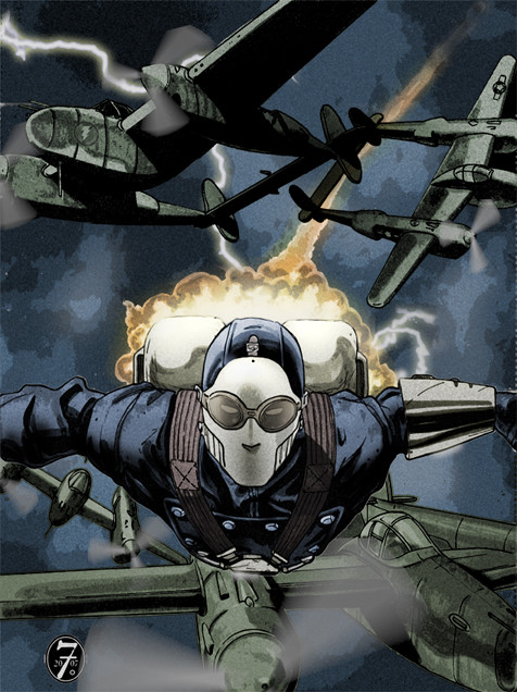
A colored version of a previous piece I did for friend Tom Floyd featuring his incredible Captain Spectre character.Check it out at [link]
I think I still have a couple of tweaks to do to this...I'd like to experiment with adding some atmosphere..but it's mostly all there.
-Dave
Related content


Comments: 8

Impressive piece, you captured Captain Spectre perfectly.
I too, am a fan and friend of Tom Floyd, and a Loyal Legionnaire!
👍: 0 ⏩: 1

Thanks, Sneed! It's always great to meet another Legionnaire. Tom is a great guy, and Captain Spectre is awesome!
👍: 0 ⏩: 0

definitely evokes that classic rocketeer feel, pulp for the win : D
👍: 0 ⏩: 0

Love the grainy feel to this! If you don't mind, what did you do in photoshop to get these colors?!
👍: 0 ⏩: 1
Gaston- I use Adjustment Layers in Photoshop to get the values/hues just where I want them, along with adjusting the opacity of the layers. Its...hard to explain. I can tell you that I recieved my "epiphany" by watching Areil Olivetti's photoshop tutorial: [link]
It's in spanish...which I can't read....and it's on a mac...which I don't use...but I was able to glean enough of the process to make some significant advances.
Enjoy the tutorial!
-Dave
👍: 0 ⏩: 1
Thanks man, going to check that out right now!
👍: 0 ⏩: 0

Well done! You've chosen a really excellent palette for this piece. It's dark and moody, like your inks, but not so dark that you lose all that lovely definition you put in there. Also, the gritty textures you chose really enhance the feel of the piece.
My one critique, if I may offer it, is that you've got rocket fire and lightning in the picture, which are two insanely bright and hard ligth sources. I think some nice edge high-lights might really make the piece pop and feel even more cohesive.
👍: 0 ⏩: 1
Thanks for the comments, Zach!
I thought about the highlights that the lightning and jetpack offer, but I shied away a bit because the composition is already so busy I didn't want to introduce new elements of contrast that could pull the eye away from the central figure. I plan to do more work on this piece, so I may play around with some drama just to see how far I can punch this up.
Stay tuned!)
-Dave
👍: 0 ⏩: 0