HOME | DD
 rustymarc — MAKE - Quick preview

Published: 2004-04-21 08:04:30 +0000 UTC; Views: 587; Favourites: 1; Downloads: 150
Redirect to original
Description
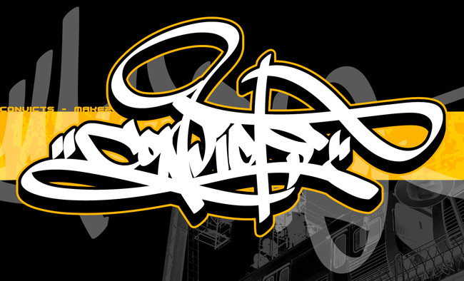
That's right. A little sketch-preview of what is to be my latest digital burner. Before any of that happens, though, i'm going to require the services of someone to help me out with it a bit.I need some nice person to trace this out in flash for me. No colours or anything are required, just a quick outline trace so that i can get to work on this properly, as opposed to trying to colour it straight off. Get me on msn @ three_days_deep@hotmail.com if you wanna chat.
As far as this sketch goes, i was just trying to add that extra level of super-cool stylishness to my style, which it has been kind of lacking lately. Just small letter tweaks and whatnot. Fun stuff.
Ah well. I'm done. Enjoy.
Comments/Crits appreciated.
Thanks.
Related content


Comments: 13

not bad but phase 2 pretty much flipped that style already, good piece though.
👍: 0 ⏩: 0

blanket [2004-04-22 06:44:18 +0000 UTC]
meh i dunno about styles or anything. i = teh ignorant. but i think it looks cool. and i like the flares on the 3d bits
👍: 0 ⏩: 0

hey!
that is kool dude!
Anyways... Why flash u want to make it an animation?
👍: 0 ⏩: 1

No animation, i just needed a vector version so i could colour it digitally. Flash seems to be the norm these days, so that's what i mentioned.
Thanks for the comment.
 (Smile)")
👍: 0 ⏩: 1
your welcome for the comment!
If I had flsh I cold so it for u becuse I use it a lot at school though I need one for home to do my own things.
")
👍: 0 ⏩: 0

i commented on this before while i was at work but i guess it didnt show
its got a lot more style than your usual
i mean its a lot more spread out
less confined
room to breathe
and i like the K
but i reckon you coulda made the bottom leg a bit thicker
👍: 0 ⏩: 0

I got it, mush, but i can't open .fla files with anything. Any other format that is ps-able?
Hehe.
👍: 0 ⏩: 1


Im with faro on this, great lettering but the middle arm on the E would probably look better if it was thinner. Really feeling the other letters though, great job.
👍: 0 ⏩: 0

yea, im definatly feelin this. all the letters are spot on besides the E. i think its the middle arm thats to thick...if you know what i mean. but other than that this is hot and i cant wait to see the end result.
👍: 0 ⏩: 0