HOME | DD
 sampleguy — Spidery Practice

#34 #63 #bend #bender #bent #big #boobs #breast #breastexpansion #expansion #gb #gender #genderbender #genderbending #girl #man #marvel #parker #pete #rule #sexy #spiderman #spidey #submissive #tf #tg #tits #transgender #woman #m2f #rule63
Published: 2017-08-03 19:12:24 +0000 UTC; Views: 186069; Favourites: 1047; Downloads: 468
Redirect to original
Description
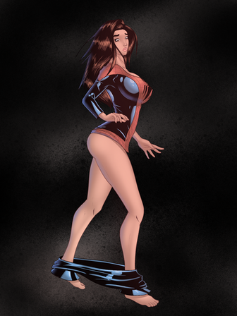
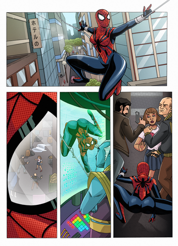
Another TG'd Peter Parker.i drew this as part of what I call my "5th Revolution" (I'm going through my 5th phase of trying to improve my art)
This time I am focusing on colors and a small emphasis on linework.
But I need your help! Give me an honest critique. I want to be as good as an actual comic artist one day, and sometimes I am blind or ignorant to bad technique
Related content
Comments: 13

👍: 0 ⏩: 0


I love this pic. It's clean and sharp. It's action-oriented so you are capturing a moment. It's well drawn and dynamic. The shadows are well done considering the medium, the proportions look good. The most important aspect of comic book style art is that each panel has to tell a little story and this absolutely does. I particularly love how parts of the costume are baggy while others are overly tight due to the transformation. I particularly appreciate this type of art that can be sexy but feel realistic by which I mean the character is not possed in a pin-up, playboy centerfold fashion. It makes sense why she is on her hands and knees without any pornographic need. She clearly fell and is picking herself up. Sexy without looking like that is what she is trying to do.
👍: 0 ⏩: 0


So right off the bat I love the pose. I could easily see this as a splash page with some dialogue at the top or even a cover piece. you have enough negative space at the top to fit Amazing spider-man perfectly.
The proportions are well done the hands and head in the fore ground mesh well with the rest of her as it flows back away from the viewer.
Color wise much like your last one its well done your shading from blue to black is good. there are sharp lines where the fabric folds and there should be sharp lines and theres some round fading where the fabric is tight and the light fades.
My only problem is the shadow. towards the top because the Hair is a similar color it loose some of the detail. the face is great but the hair and then the shadow draws the eye away and up. I think I would have put the shadow going more to the right and back vice directly behind. Not to keep complaing about shadows but should there be a shadow from the left arm? I also noticed some of the spotting you have on the cement spill over to the left knee. I like the effect has on the cement it gives it some grit.
Overall it looks great. my favorite part would be the face. its really hard to nail facial expressions and I think you knocked this one out of the park its not over the top but still tells a story on its own.
👍: 0 ⏩: 0

...Her facial expression is really well done, & goes well with her pose! There does need to be more shadow though (her arms, & perhaps a touch with her knees). The 'under the spotlight' feel is really good!
👍: 0 ⏩: 0

I read some comments, a lot of help youre already getting
👍: 0 ⏩: 0

Jessica Drew 5.0 (Modified Clone of Peter Parker) Canon character partnered with Miles Morales.
👍: 0 ⏩: 0

It's a great image. If I had to critique, I would say that there's an oddness to the shape of the nose and the placement of the lips, face doesn't feel like it comes together.
The hair is gorgeous and the image feels very dynamic and alive, great work.
👍: 0 ⏩: 0

WOW! definitetly see the improvement. Love the change in color in the lines from part to part, been experimenting with it a bit myself, the lighting looks awesome too. I agree the perspective seems off, feels like more of a straight on angle close to the ground than a birds eye view, but the pose looks great and natural, could just adjust the ground and itd look perfect. Also love the new haziness to it!
👍: 0 ⏩: 0

I like the thinner lines (and I have a sweet spot for thick lines), it's less brutal than your other pieces. The mix of black shading on the clothes and softer shading on the skin also gives it a unique style. The ground's perspective seems wrong, but I see what you did with the shadow.
👍: 0 ⏩: 0

Looks good.
Was the image blow-up? I see a lot of jagged lines like the image needs more anti-alising.
👍: 0 ⏩: 1

Yeah it's part of a larger page, but the rest is still in pencil phase
👍: 0 ⏩: 0
