HOME | DD
 SaraChristensen — Tree of Life Painting
Published: 2011-06-12 06:21:37 +0000 UTC; Views: 2710; Favourites: 43; Downloads: 1579
Redirect to original
Description
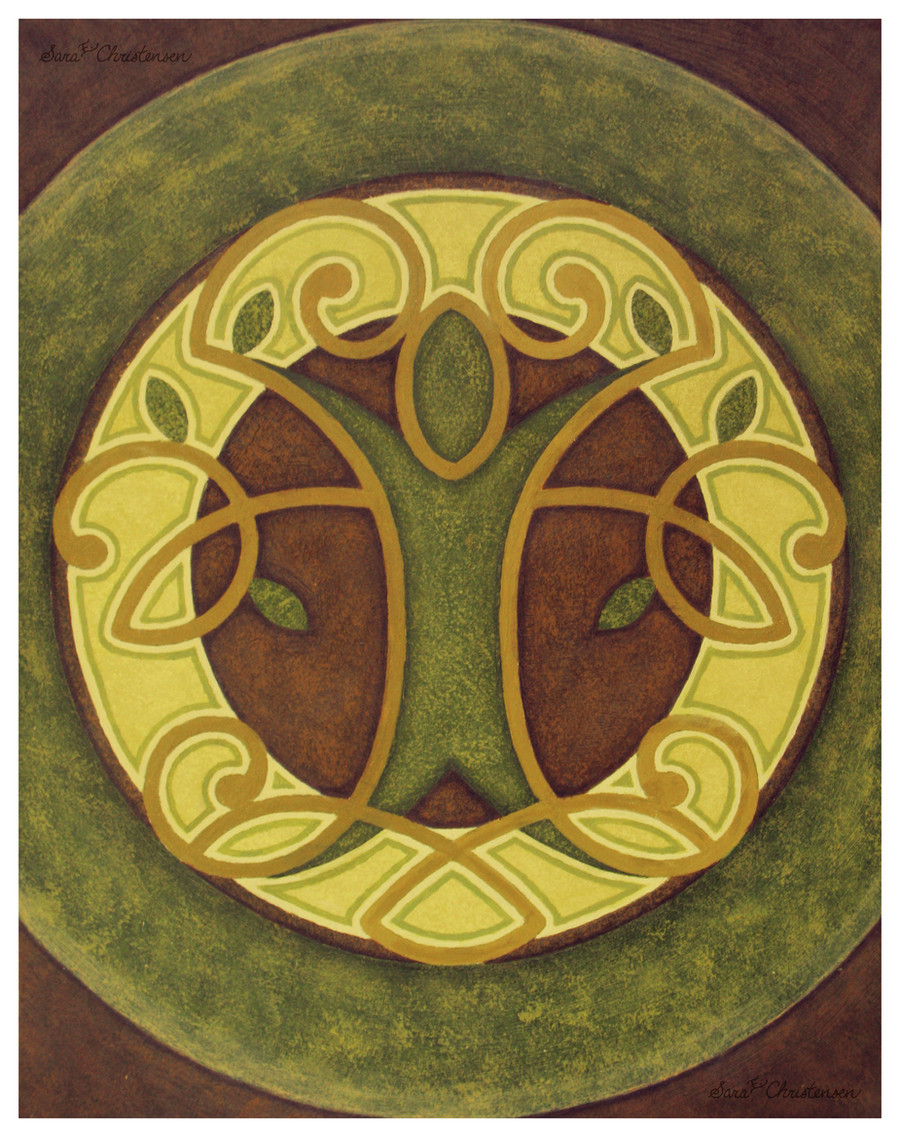
Download Size: 2910 x 3675This is from last quarter, but I have a backlog of deviations to upload for you guys.
So, I am definitely more of an oils girl. This was done in acrylics and I was hating
every minute of it, but I loooved getting back into painting and working with real,
traditional media. I'm missing that this quarter since all of my classes are digital.
This painting is a stylized representation of the tree of life, modeled after knot work
since I love the intricate symmetry of that art style. In the Fall, I drew a small concept
sketch for this and couldn't get it out of my head, so when I got to Color Theory II and
we were given the opportunity to paint whatever we wanted, I absolutely had to do it.
I first took the sketch into Illustrator and made a digital lineart, just to ensure that both
sides were mirrored accurately. Then I put it in Photoshop to mock up some different
color schemes. When I had one that I liked, I turned to my acrylic paints and slowly but
surely recreated what I had done on the computer… even the texture effects I added.
I spent so much time perfecting this painting; it went through three or more revisions
before I could call it finished. I put a lot of effort into the leather-like texture, using a dry
brush technique to give the impression of stippling. It didn't turn out exactly as planned,
but I'm not unhappy with the results either. One thing that I am proud of is how precise
I was able to be with my brushes, how clean the lines/transitions are, how symmetrical
everything still is. A steady hand was absolutely required for this! The major thing about
this project is that every color used was mixed with a warm green---those were the only
project requirements. We could mix as little or as much of it in as we wanted. By using
that one constant hue, every resulting hue kept within the same harmonious spectrum.
My favorite aspect of this piece is the shadowing around the brown areas. If you look
closely, you will see that the darker edges are actually very purple. It gives the piece
some added interest, I think. These colors and even the symbol itself are very me and
as soon as I can find a nice frame and mat, this baby is going up on a wall somewhere.
I hope you enjoy this month-long painting exercise, lol. I am a hideously slow painter.
Painting completed March 4, 2011.
Acrylics on 11" x 14" bristol paper.
Related content


Comments: 19

Awesome job! Especially being out of your comfort zone with using acrylic instead of oil. I'm kind of the opposite in that sence. When I paint I much prefer acrilic to oil and always dread working with oil paints. Love the use of colors and the textured look of the green and brown! Also a big fan of knot work and symetry as well.
👍: 0 ⏩: 1

")
more smoothly and the paint doesn't dry before I'm able to work with it.
Oh man, I think knotwork is so beautiful. It melts my design heart, lol.
👍: 0 ⏩: 1
No problem. As far as knotwork you chould check out my Celtic Cross if you haven't already. [link]
👍: 0 ⏩: 1
Wow, that is some intricate knotwork. I love the symbolism.

👍: 0 ⏩: 1
One of my favorite things to do in art is to kind of go off the deep end with the intricacies... I've definitely been accused of being detail oriented a few times.  (Wink)")
👍: 0 ⏩: 1
Nothing wrong with being detail oriented.
👍: 0 ⏩: 0

 (Smile)")

I love the colours.
One of the thing I find amazing about traditional art is how FOCUSED you have to be - it's really hard work! So well done to you for pulling this off so spectacularly; the colours really are lovely. ^^
👍: 0 ⏩: 1

after having spent so much time accomplishing things digitally. I mean,
an outer glow in Photoshop is a 5-second job whereas with acrylics, it's
an all-day project, lol. It was tough but definitely worth it in the end!
👍: 0 ⏩: 0
👍: 0 ⏩: 1

u mean my stuff from school? those are just assignments, though. and u should upload more of your school stuff 2 ^__^
👍: 0 ⏩: 1
Your stuff from school is awesome! When I was in your dorm last,
you had AMAZING things hung up on your wall that aren't posted yet.
I will certainly upload more school stuff soon. This week, even!

👍: 0 ⏩: 1


👍: 0 ⏩: 1
I'm so glad you like it! The colors were hard to achieve since the warm green kept de-saturating
everything, but it was a great learning experience. I'm also pleased to hear that it looks like a
tree of life! Someone in my class said it looked like the Starbucks logo. ")
👍: 0 ⏩: 1
aw. you flatter me so.
i the colors are great! that yellow really helps the green pop out.
the textures are nicley made, i mean this is quite an enjoyable
piece. i also like this, because you can totaly tell that it's your
style. your such an amazing artist. i don't think it looks like
the starbucks logo. ( if it did, this is better
you are so very welcome. you definatley deserve it.


👍: 0 ⏩: 1
I speak the truth!
Oh good! The first version of this painting didn't have
the light-light yellow around the gold, so nothing really
popped. My professor suggested that I look for a way to
add contrast, so I changed it! You're so sweet, I'm really
happy to hear that. I think I'm finally finding my style
in art and design, which is exciting for me. Haha, thanks.
I didn't think it looked like Starbucks either, but oh well.


👍: 0 ⏩: 0