HOME | DD
 scart — Punk Note - Scart-Tatt2
Published: 2004-03-02 23:41:32 +0000 UTC; Views: 2072; Favourites: 22; Downloads: 236
Redirect to original
Description
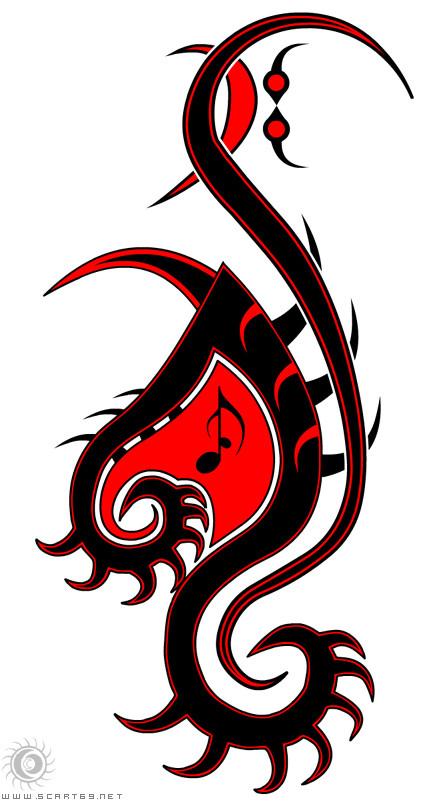
The original shape for this started as a symbol for my music and/or punk/alt music, have evolved it from there. For those who can’t see it, it started as a music note with spikes/thorns etc, a similar feel to my first one, (my icon and tatt) " Scart Symbol Tattoo - ArmJob "Will prob get this on my left shoulder when I get the cash to spare. Not sure if it’s finished yet, will update if I do.
Cheers
Related content


Comments: 28


That's really neat. If you don't look at it straight on, but peripherally, it looks like a dragon drawn in a tribal style.
I've always loved tribal designs. I'm absolutly horrible at making them, but I love looking at them.
This design is just so spiffy. I can just see so many different things within it.
Very nifty.
👍: 0 ⏩: 1

Glad you like, had it in a dream so couldn't resist bringing it to life
regards
👍: 0 ⏩: 1
That happens to me all the time. Except I'm too chicken shit to post most of them. I usually get frustrated because I can't recreate what I dreamt into perfection in reality.
I have two tattoo designs, floating in my head. Both are in my scraps section, but eh.
^^
I so want the full spinal...
mmm.
👍: 0 ⏩: 1
Perfection is over valued, flaws and vision are they way most great things are realized and improved over time.
regards
👍: 0 ⏩: 1
*smiles* I enjoy my flaws sometimes.
but most of it just isn't ... refined, I guess is a better word choice, enough to really be found appreciative.
👍: 0 ⏩: 1
I think you've got some great drawings in your scrap area, I like Falcon and the spinal piece you did. The Dragons are starting to get there, I think a weak point might be that the heads/faces are more snake like than Dragon-ish (that a word?  (Wink)")
regards
👍: 0 ⏩: 2
thanks! I love falcon too. I just don't feel finished with it yet. The arms and legs, especially, still need work. And I want to turn this into an extremly detailed peice.
Now for the motivations.... ^^
👍: 0 ⏩: 0
thanks! I love falcon too. I just don't feel finished with it yet. The arms and legs, especially, still need work. And I want to turn this into an extremly detailed peice.
Now for the motivations.... ^^
👍: 0 ⏩: 0


 (Smile)")
Glad you like it, I'll post the tatt when it's done
Cheers
👍: 0 ⏩: 0

beautiful! very nice job, how long did this take you to do? i would get this no problem, not even mentioning it stands for everything i love...
the other one turned out great aswell!
👍: 0 ⏩: 1
The original idea started as a sketch, then scanned and traced in vector, started adding elements etc, prob about 3-4 hours all up, with experimenting.
thanks for the comments, much appreciated
Cheers
👍: 0 ⏩: 0

")


great graphic ... i like red white and black ... punk native motif
👍: 0 ⏩: 0


Nice design! Dunno about up at the top, though-- where there are two red circles and a curve? makes me think of a frowning face.
seriously, though, great design. mmm, contrast.

👍: 0 ⏩: 1
those are a stylization of Bass Clef, any edit wouldn't be to remove that part, only to add to it
Cheers
👍: 0 ⏩: 0

k, I'll be round at 3:00 with the ink, grab a bottle of scotch for anesthetic cause all my needles are blunt at the moment
Cheers
👍: 0 ⏩: 0
