HOME | DD
 Seahorsepip — Sharp WIP2

Published: 2014-05-22 18:09:07 +0000 UTC; Views: 4191; Favourites: 15; Downloads: 82
Redirect to original
Description
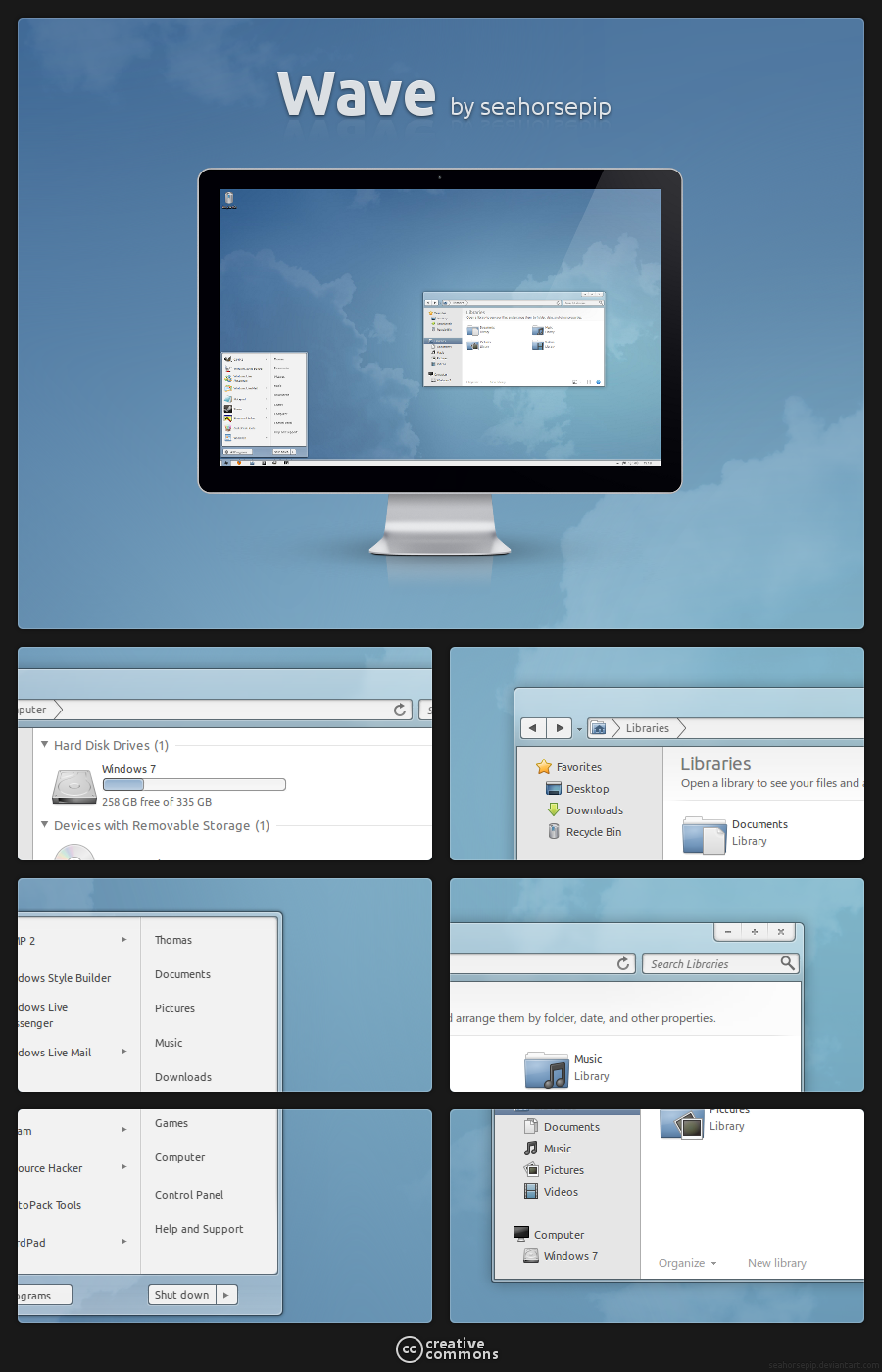
Second screenshot from my work in progress theme "Sharp".I tried to make it look simple and modern as possible, while keeping the windows look.
This theme also works without aero, the transparent parts will be solid in that case.
Related content


Comments: 8


Very nice mate!
Glad you are back with more stuff!
Can i ask you something?
The explorerframe will be like this in the VS too?
How do you accomplish that space between back/forward and refresh button?
I really like the colour scheme and the navigation bar especially!
👍: 0 ⏩: 1

It will be like this, this is a actual screenshot
And on win8 you can use any nav button image size you like and the theme will just make the navbar bigger for it
The reload is a fake button, actually it's the dropdown button of the navigation
 (Wink)")
")
👍: 0 ⏩: 0


oh my god, yes
please tell me this is for windows 8
i need this for windows 8 aaa
👍: 0 ⏩: 1

I really like the subtle borders in the mockup. It makes it easy to see the borders of a window, while still keeping the Windows look. They might be here, but the color of the borders makes it a little difficult to see well.
👍: 0 ⏩: 0