HOME | DD

Seahorsepip — Wave VS Preview Update

Published: 2011-01-05 16:17:52 +0000 UTC; Views: 6740; Favourites: 41; Downloads: 89
Redirect to original
Description 
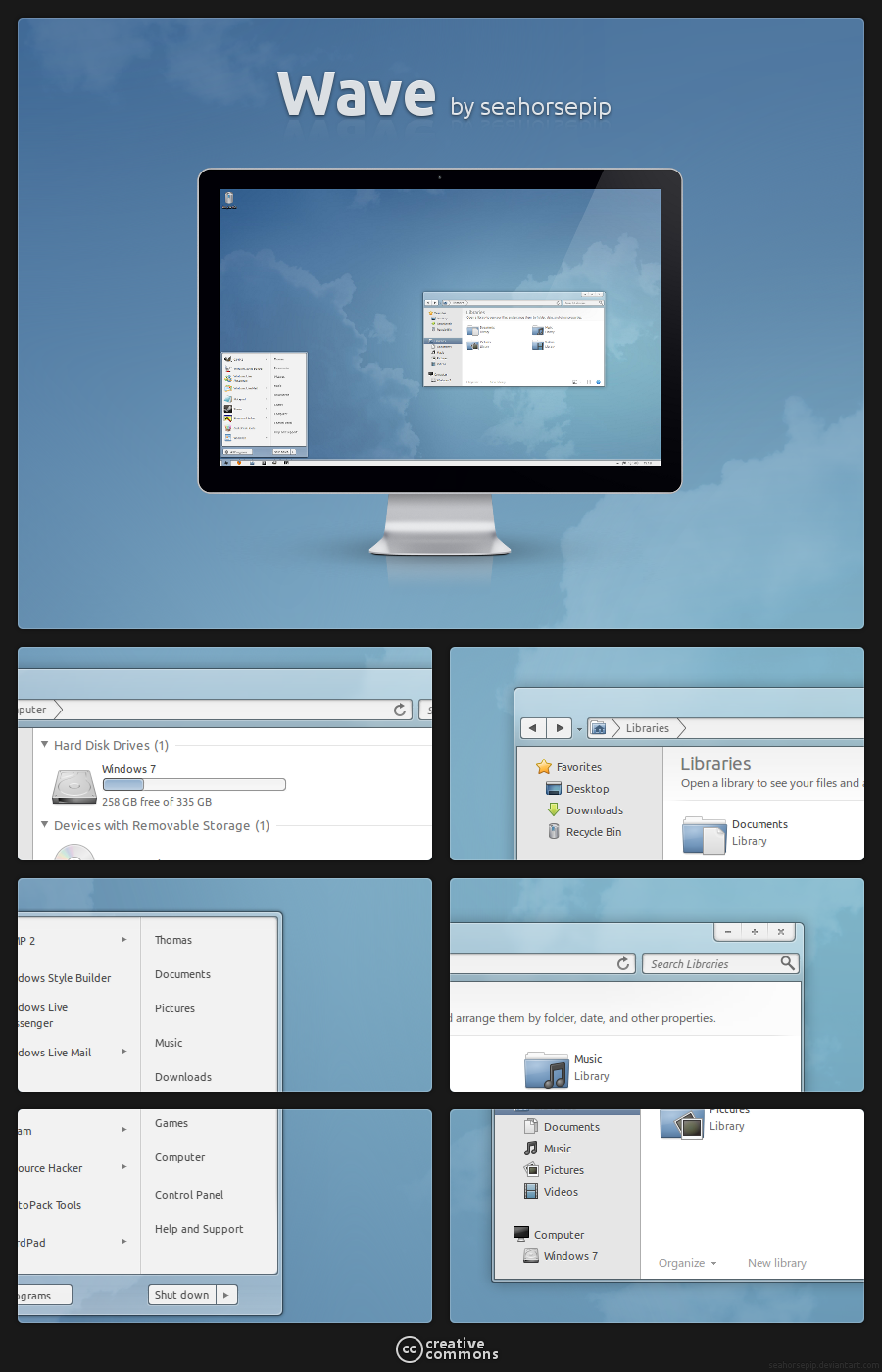
After long time doing nonthing for windows I thought it was time to make a new Visualstyle again and so I started to make this mockup yesterday based on elementary GTK, Wave GTK and Windows Aero.

I hope you like it or got any ideas

Update1:
-Changed Window Frame
-Added highlight to locatio and search bar(forgot that )
-More depth at window frame
-Added details pane
Related content
Comments: 108

elaphent [2011-01-11 10:12:04 +0000 UTC]

I'd love it

👍: 0 ⏩: 1

Seahorsepip In reply to elaphent [2011-01-11 16:45:43 +0000 UTC]

see update 3-> [link]

👍: 0 ⏩: 0

congapc [2011-01-10 17:37:01 +0000 UTC]

Oh ze! awesome! wait wait wait! max/min is very nice, i like it!

👍: 0 ⏩: 1

Seahorsepip In reply to congapc [2011-01-10 18:53:36 +0000 UTC]

Thanks

👍: 0 ⏩: 0

vi20RickrMetal12us [2011-01-09 01:47:06 +0000 UTC]

maybe some taskbar/buttons, start menu in the mix? need ideas or what still impressive.

👍: 0 ⏩: 1

Seahorsepip In reply to vi20RickrMetal12us [2011-01-09 20:30:11 +0000 UTC]

I will be posting startmenu mockups/screenies later

👍: 0 ⏩: 0

ivire [2011-01-08 22:47:58 +0000 UTC]

finally something for windows 7, can't wait !

👍: 0 ⏩: 1

Seahorsepip In reply to ivire [2011-01-09 20:29:53 +0000 UTC]

see my new update

👍: 0 ⏩: 0

legnis [2011-01-08 15:53:25 +0000 UTC]

cute

👍: 0 ⏩: 1

Seahorsepip In reply to legnis [2011-01-08 18:26:10 +0000 UTC]

lol

👍: 0 ⏩: 0

GamerWorld14 [2011-01-08 04:22:41 +0000 UTC]

Looks like a very nice mock-up, a visual style for this would be awesome.

👍: 0 ⏩: 1

Seahorsepip In reply to GamerWorld14 [2011-01-08 15:56:44 +0000 UTC]

Ofcourse it's going to be a visualstyle but diefernt from this xD
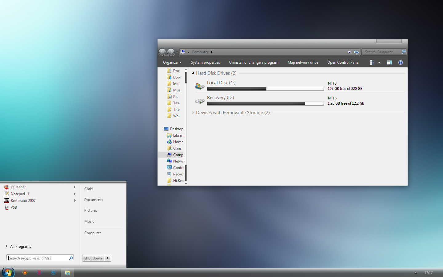
I will soon post a screenshot of the working thing and 2things I can tell: 1textboxes and buttons aren't transparent anymore and captions are also not transparant because of technical issues and 2 it has just normal borders instead of minimal ones

👍: 0 ⏩: 1

GamerWorld14 In reply to Seahorsepip [2011-01-18 04:19:36 +0000 UTC]

so with the hard drive lossage, did you lose your files on the visual style at all? if so, i'm sorry to hear that.

👍: 0 ⏩: 1

Seahorsepip In reply to GamerWorld14 [2011-01-18 05:38:48 +0000 UTC]

nope I didn't lost any of my visualstyle

👍: 0 ⏩: 1

GamerWorld14 In reply to Seahorsepip [2011-01-18 15:41:47 +0000 UTC]

well that's great!

👍: 0 ⏩: 0

3rd-apex [2011-01-07 19:00:08 +0000 UTC]

Very nice, but I have always preferred a more windows style forward back/min-max-close buttons.

👍: 0 ⏩: 1

Seahorsepip In reply to 3rd-apex [2011-01-08 15:51:01 +0000 UTC]

I understand but I prefer this style xD

👍: 0 ⏩: 0

rushikh [2011-01-07 18:18:05 +0000 UTC]

Yes the only thing I see is the forward, and backward buttons. Otherwise it is a very nice mock!

👍: 0 ⏩: 1

Seahorsepip In reply to rushikh [2011-01-08 15:50:33 +0000 UTC]

I changed already

👍: 0 ⏩: 0

rushikh [2011-01-07 18:18:05 +0000 UTC]

Yes the only thing I see is the forward, and backward buttons. Otherwise it is a very nice mock!

👍: 0 ⏩: 0

rushikh [2011-01-07 18:18:05 +0000 UTC]

Yes the only thing I see is the forward, and backward buttons. Otherwise it is a very nice mock!

👍: 0 ⏩: 0

rushikh [2011-01-07 18:18:05 +0000 UTC]

Yes the only thing I see is the forward, and backward buttons. Otherwise it is a very nice mock!

👍: 0 ⏩: 0

isgie [2011-01-07 02:30:34 +0000 UTC]

The forward and back buttons seem to need work. They aren't bad but they feel off to me. I really don't know why though
The rest is nice but you should extend the border on the sides and on the bottoms.

👍: 0 ⏩: 1

Seahorsepip In reply to isgie [2011-01-08 15:57:00 +0000 UTC]

I changed already

👍: 0 ⏩: 0

Yellooh-Snooh [2011-01-07 00:52:23 +0000 UTC]

I dig it it man!

👍: 0 ⏩: 1

Seahorsepip In reply to Yellooh-Snooh [2011-01-08 15:51:28 +0000 UTC]

good idea

👍: 0 ⏩: 1

Yellooh-Snooh In reply to Seahorsepip [2011-01-08 20:59:59 +0000 UTC]

lol

👍: 0 ⏩: 0

dpcdpc11 [2011-01-06 19:19:29 +0000 UTC]

looking better and better... why don't you try reverting the gradient of the details pane? just a suggestion...

👍: 0 ⏩: 1

Seahorsepip In reply to dpcdpc11 [2011-01-08 18:26:28 +0000 UTC]

neh I tried and looked bad

👍: 0 ⏩: 1

dpcdpc11 In reply to Seahorsepip [2011-01-08 23:53:43 +0000 UTC]

cool... was wondering how that looked... waiting for the next update!

👍: 0 ⏩: 1

Seahorsepip In reply to dpcdpc11 [2011-01-09 20:28:02 +0000 UTC]

Updated

👍: 0 ⏩: 1

dpcdpc11 In reply to Seahorsepip [2011-01-10 01:34:04 +0000 UTC]

cool... looking better and better! kinda missing the status bar which I would enable if I would use Windows Explorer.
But looking more and more linuxy... which is good!

👍: 0 ⏩: 1

Seahorsepip In reply to dpcdpc11 [2011-01-10 08:01:07 +0000 UTC]

I can skin that one too
I will do that and you can enable statusbar just by pressing at then choose view and check statusbar...

👍: 0 ⏩: 1

dpcdpc11 In reply to Seahorsepip [2011-01-11 00:42:13 +0000 UTC]

cool... can't wait to see that done!

👍: 0 ⏩: 0

iRememberx [2011-01-06 11:33:44 +0000 UTC]

This looks awesome ,, can't wait to use it !

👍: 0 ⏩: 0

mACrO-lOvE [2011-01-06 11:00:38 +0000 UTC]

fantastic

👍: 0 ⏩: 0

Viski94 [2011-01-06 10:24:04 +0000 UTC]

Ohh yess! Finally windows stuff

👍: 0 ⏩: 0

RaymonVisual [2011-01-06 07:20:44 +0000 UTC]

Looks good my friend!

👍: 0 ⏩: 0

YoungEaE [2011-01-06 06:08:48 +0000 UTC]

Waiting anixously for the release

👍: 0 ⏩: 0

SloAu [2011-01-06 05:17:29 +0000 UTC]

nice one, maybe different font - [link] [link] ?

👍: 0 ⏩: 1

Seahorsepip In reply to SloAu [2011-01-06 06:38:02 +0000 UTC]

I used Ubuntu
Because mockup was made on ubuntu with gimp
But I didn't looked already for ubuntu ttf font so thanks a lot for that link

👍: 0 ⏩: 1

SloAu In reply to Seahorsepip [2011-01-06 07:31:23 +0000 UTC]

no problem

👍: 0 ⏩: 0

JasonAbsolom [2011-01-06 03:54:47 +0000 UTC]

Looks great, nice work!

👍: 0 ⏩: 0

Hayeti [2011-01-06 03:22:32 +0000 UTC]

I really want you to finish this, I really like this, and would definitely use it.

👍: 0 ⏩: 0

73LL0 [2011-01-06 00:47:26 +0000 UTC]

So damn awesome!!!

👍: 0 ⏩: 0

IzzuThug [2011-01-06 00:28:08 +0000 UTC]

whoa that's sick, that would be one awesome vs

👍: 0 ⏩: 0

FallingDark [2011-01-06 00:09:24 +0000 UTC]

Looks awesome, but I don't know how you're going to deal with the blur problem...

👍: 0 ⏩: 0

phs2 [2011-01-05 23:01:22 +0000 UTC]

really nice buttons, any idea for the bar?

👍: 0 ⏩: 1

Seahorsepip In reply to phs2 [2011-01-06 16:34:28 +0000 UTC]

details/preview pane?
Yes I just updated with a preview pane

👍: 0 ⏩: 0

opt1ckz [2011-01-05 19:59:56 +0000 UTC]

I...want...nao!!!

👍: 0 ⏩: 0


| Next =>