HOME | DD
 SheWolff — WIP - Help please
Published: 2008-09-15 01:11:57 +0000 UTC; Views: 1066; Favourites: 38; Downloads: 21
Redirect to original
Description
Thanks a lot for your comments, I appreciate them greatly.
 This is going into scraps now, as I think I have enough feedback to make a decision. ^^
---------------------------------------------------------
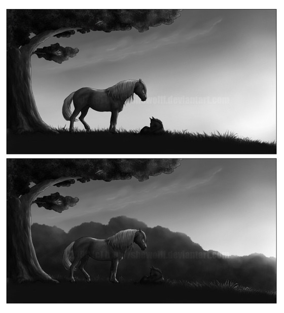
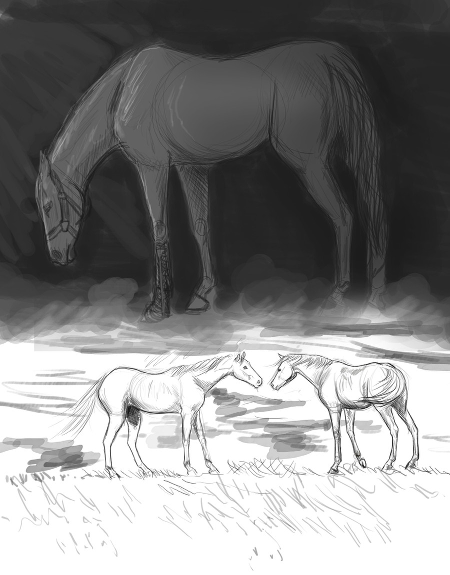
Hiya guys, I need your help for a sec. *begs*
Here's two versions of a panel in the first page of my comic. But, I can't decide which version to use! The one with trees in the background is the original one, but I was curious to see how the panel would look without the trees, and I quite like the dark silouhettes against the sky...
One word: HELP?
") Which version do you like?
Which version do you like?Btw, there's much more to be done to this; coloring, adding further detail etc. The original is in a much larger resolution as well, but you'll have to wait 'til the entire page is done if you wanna see more details.
")
Related content


Comments: 72

Definitely the original! I love the contrast of the sillhouettes and the light sky.

👍: 0 ⏩: 0


first panel definately...gives it a nice look with the sillhouettes!!

👍: 0 ⏩: 0

Åh, jag älskar båda, men jag gillar nog övre mer också
👍: 0 ⏩: 0

I think that when it is colored, the original will be a better choice, but, if you leave them Grayscale, the top one will be better.
👍: 0 ⏩: 0

i like the one without the trees
often your first guess is correct

👍: 0 ⏩: 1

I like the first. The silhouettes add more drama to the panel and grab your attention
👍: 0 ⏩: 0


I prefer the first one. The one with the trees feels a little crowded.
👍: 0 ⏩: 0

The one with the trees is moodier, but the one without is more dramatic. I like the first one, without the trees because you can see the foal better.
👍: 0 ⏩: 0

It might be easier to tell once you add color, but for now I really like the first one better. Much better contrast and you can actually see the foal ^^
👍: 0 ⏩: 0


Both are great. But I think I prefer the first one
👍: 0 ⏩: 0

the first one makes me think "empty".
not necessarily in a bad way,
but it really draws the eye to the characters.
the second one makes me thing "encroaching",
more in a dark sense than anything else.
as if they were under pressure to get out into the open, almost.
👍: 0 ⏩: 0

Jag gillar båda versionerna... Men den första är nog bäst, då man ser fölet
👍: 0 ⏩: 0

I like the first one best because *puts on posh accent* the foal is more apparent to the eye and therefore one notices the meaning of the picture sooner ...
Does that make sense?
Jessi
👍: 0 ⏩: 0

The first one. You can see the foal better and I think the trees take away from the serene, peaceful look it has
👍: 0 ⏩: 0

I have to say I like the top one better, in the bottom one the horses are sort of lost in the trees, they don't stand out very much. In the top one it's much easier to appreciate their detail, even as the silhouettes.
👍: 0 ⏩: 0


 (Wink)")
👍: 0 ⏩: 0


I like the one without trees, It looks like the sun is setting on a quiet morning, and it just works really well  (Smile)")
👍: 0 ⏩: 0

I really love the trees AND the silhouette, though I think if put to it the trees may be a little dark so the horses don't show up as well? I'm not sure about colors, they'd make a difference too. 
👍: 0 ⏩: 0

I think the first one, the second one is nice but the trees make it too dark. In the first, the sky is nice and light which makes the horses stand out a lot more, it creates a much better effect overall.
-But That's just my opinion
👍: 0 ⏩: 0

The first one really is foccusing on the horses. And I think that is the best for a comic
👍: 0 ⏩: 0

If it were just an art piece, I'd say the second.
However, for a comic, it's rather important for things to be clear at first glance, so the first does a better presentation of the characters, IMO.
Oh, and by the way, fantastic job with the shading. ^^
👍: 0 ⏩: 0

Mmmh I prefer the first one, in the second we don't see the cute foal very well
👍: 0 ⏩: 0

Argh.. I can't decide. Is it supposed to be an evening or a morning? Is it supposed to be in a real-world setting, or a fantasy-setting? Is it an ominous or joyful beginning?
👍: 0 ⏩: 0


I like the first version!
It looks much more eyecatching without the trees as the horse and the foal comes directly in focus.
👍: 0 ⏩: 0

For me the first is much better - easier to see whats goin on and more clear i would say
👍: 0 ⏩: 0

First i think as you can see the shadows *MUCH* Better but overall its a wonderfull piece of work ^_^
👍: 0 ⏩: 0

the contrast without the trees is really good, but there is something missing for "balance" on the right side of the picture. stones maybe or some piece of wood
👍: 0 ⏩: 0


I think you need to decide on the setting more than what 'looks' good. Is it an important place in the comic? What shoudl that place feel like? What do you wnat to envoke emotion do you wnat to envoke with the panel? The forest suggest a more protected aream, whilst the clean hill suggest a more exposed situation.
As far as things not beeing really visable (as I read in some comment) at this point - I'm sure the coloring will bring everything into attention.
👍: 0 ⏩: 0

I very much like the one with the trees, and just doing a quick scroll through the comments I seem to be the only one.
Anyway, there's my two cents! It looks absolutely beautiful, and I can't wait until we actually see some of these comic pages! I'm on pins and needles.
👍: 0 ⏩: 0

I love the one without the trees. It's so much more dramatic but has a strange sense of desolation while the other one has a sense of protection with the trees. Still, there is so much more space and freedom in the first one. You can see much more of what I believe is the dawn
👍: 0 ⏩: 0

The first one, with the silhouette - it's more powerful.
👍: 0 ⏩: 0


I like the silhouettes better, personally. I think it's a little more . . . intense? Or eye-catching, maybe. Plus, the foal is easier to see. Without the silhouette on top, I might not have seen the little guy against the trees!
👍: 0 ⏩: 0

The one on the top is beautiful! My eyes were just drawn to the horses immediately, but with the trees in the background they are harder to see. The composition of the piece on top is much better I think
👍: 0 ⏩: 0

First one!
Can't wait to see it done, SheWolff.
👍: 0 ⏩: 0

I like the second. It gives more of a scene of where the two characters might be.
👍: 0 ⏩: 0

I like them both but the second one has a better composition I think. When I look at the first it feels as if they are almost floating. Something just doesn't seem right to me. I don't know. Maybe its just me. The second looks more homey and secluded. I think that a mare with a new foal would probably more likely chose the second location. But like I said, maybe its just me. They are both beautiful though. I cant wait to see the finished product
👍: 0 ⏩: 0

I love the first one. Love the sillouhette (sp?)- ness of it.
👍: 0 ⏩: 0


| Next =>