HOME | DD

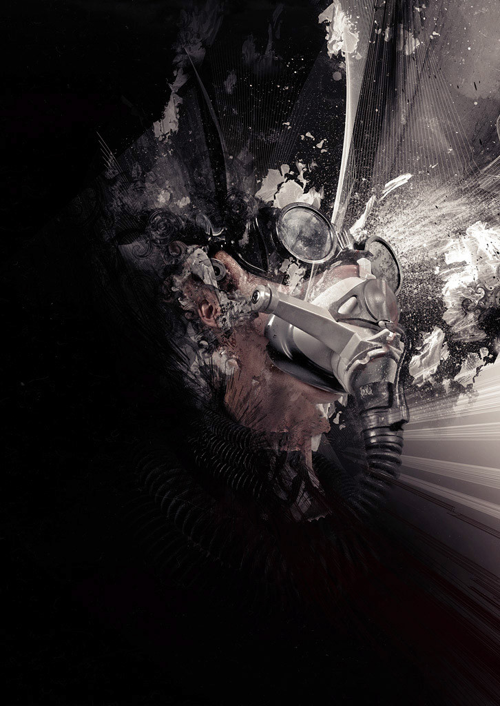
Shinybinary — Alienation

Published: 2006-09-17 23:25:40 +0000 UTC; Views: 24197; Favourites: 556; Downloads: 190
Redirect to original
Description A poster produced for a friends band, Harry Angel, for an upcoming series of CDs. The idea is that the poster will promote the band while the covers of the CDs will be crops of various parts of the poster, the first and main one using the face area.

I was asked to do something predominantly black and white with a small splash of colour using the themes of 'dark, edgy, alienation, paranoid' etc. I hope the picture captures those feelings otherwise I've gone wrong somewhere...
Related content
Comments: 103

Mayu-kun [2006-09-18 18:12:08 +0000 UTC]

poor guy

👍: 0 ⏩: 0

WishRM [2006-09-18 17:27:46 +0000 UTC]

Awesome work, very impressive.

👍: 0 ⏩: 0

Assassinatorsalbum [2006-09-18 17:07:42 +0000 UTC]

Holy shit. I wish I could pull off b&w.

👍: 0 ⏩: 0

Sykoslocos [2006-09-18 16:14:27 +0000 UTC]

its sick thats all i can say. and if anything else it would make an excelent "its war and i just got my head blown of in an artistic way" kinda thing

👍: 0 ⏩: 0

Fractured-Visual [2006-09-18 16:00:04 +0000 UTC]

amazing

👍: 0 ⏩: 0

zepone [2006-09-18 14:43:32 +0000 UTC]

wicked mate

👍: 0 ⏩: 0

xaosone [2006-09-18 14:19:51 +0000 UTC]

ufff. Great pic.

:a' xaos one::

👍: 0 ⏩: 0

darkex [2006-09-18 12:15:39 +0000 UTC]

Original work, I love this style, unique, original, perfect combination of the brushes with the stock.

👍: 0 ⏩: 0

mu2abu2 [2006-09-18 12:08:28 +0000 UTC]

cool... nice details and colors....

👍: 0 ⏩: 0

zhoumlh [2006-09-18 11:46:54 +0000 UTC]

👍: 0 ⏩: 0

hicky2 [2006-09-18 10:21:30 +0000 UTC]

Man! I love your style! You got those feelings..... its cool

👍: 0 ⏩: 0

F3rg [2006-09-18 10:03:47 +0000 UTC]

awsome work there

👍: 0 ⏩: 0

R-psyco-R [2006-09-18 09:13:25 +0000 UTC]

hell yea
lovely


greetz

👍: 0 ⏩: 0

norbi [2006-09-18 08:59:29 +0000 UTC]

what's your myspace url bro?

👍: 0 ⏩: 1

Shinybinary In reply to norbi [2006-09-18 09:33:38 +0000 UTC]

Haha I don't have a myspace page... maybe I should get one

👍: 0 ⏩: 1

norbi In reply to Shinybinary [2006-09-18 10:05:24 +0000 UTC]

Yeah, you should set your page, definitely. ;]

👍: 0 ⏩: 0

Brandonc1 [2006-09-18 08:53:47 +0000 UTC]

very hott`

👍: 0 ⏩: 0

dremDDl [2006-09-18 08:35:29 +0000 UTC]

Awesome stuff bro, love the monotone look of it.

👍: 0 ⏩: 0

lSpeeDl [2006-09-18 07:57:22 +0000 UTC]

this is amazing

The Love MonkeyTM

👍: 0 ⏩: 0

dot-Silver [2006-09-18 07:44:51 +0000 UTC]

"'dark, edgy, alienation, paranoid' etc. I hope the picture captures those feelings otherwise I've gone wrong somewhere..."

You certainly haven't gone wrong anywhere!

👍: 0 ⏩: 0

tragedies [2006-09-18 07:21:20 +0000 UTC]

thats one awesome poster!! *fav

👍: 0 ⏩: 0

p4c3k [2006-09-18 06:51:52 +0000 UTC]

u mix old urs technics but its still stunnin imo

👍: 0 ⏩: 0

rejectsocietyfx [2006-09-18 05:57:00 +0000 UTC]

holy shit sweet one love the darkness combines with that weird skin color what stock did you use ?

👍: 0 ⏩: 1

Shinybinary In reply to rejectsocietyfx [2006-09-18 08:51:13 +0000 UTC]

A good stock pic of a woman in a mask and quite a few random textures.

👍: 0 ⏩: 0

fIRebUgs [2006-09-18 05:24:55 +0000 UTC]

WOW WOW WOW WOW WOW WOW WOW WOW WOW

👍: 0 ⏩: 0

JaxeNL [2006-09-18 05:01:58 +0000 UTC]

very nice mate, nice grunge look and the lines give the poster a really nice effect!! great job,!

👍: 0 ⏩: 0

Ysobelle [2006-09-18 03:54:48 +0000 UTC]

oh my god...wicked

👍: 0 ⏩: 0

wreckedsavage [2006-09-18 03:12:05 +0000 UTC]

As always a piece of perfection.
with composition of great texture an detail.

👍: 0 ⏩: 0

kitster29 [2006-09-18 03:11:36 +0000 UTC]

superb

👍: 0 ⏩: 0

Genesis-Orbit [2006-09-18 03:08:27 +0000 UTC]

Excelent composition bro

👍: 0 ⏩: 0

tbob [2006-09-18 02:29:43 +0000 UTC]

Wicked as hell.

👍: 0 ⏩: 0

Azzua [2006-09-18 02:17:39 +0000 UTC]

I love how you have NO idea what this is just by looking at the thumbnail. And then you click it because you're curious, and it's like. "Wow."

👍: 0 ⏩: 0

saeedesign [2006-09-18 02:08:55 +0000 UTC]

wonderful work...

👍: 0 ⏩: 0

kadafi [2006-09-18 02:08:17 +0000 UTC]

wow.. just brillant

👍: 0 ⏩: 0

Catastrofic [2006-09-18 01:21:29 +0000 UTC]

i love it.

👍: 0 ⏩: 0

PsychoKlown408 [2006-09-18 01:07:42 +0000 UTC]

Wow, that's awesome. Great idea with the CD covers!

👍: 0 ⏩: 0

theanimejump In reply to ??? [2006-09-18 01:01:28 +0000 UTC]

This is fantastic! -I didn't realize how it was sitting for awhile- but i get it now

👍: 0 ⏩: 0

Jkea [2006-09-18 00:42:44 +0000 UTC]

Can't seem to get much better then this! an amazing design.

👍: 0 ⏩: 0

sheld0n [2006-09-18 00:32:14 +0000 UTC]

skills

👍: 0 ⏩: 0

SanityUnvailed [2006-09-18 00:29:22 +0000 UTC]

i love the texture and colors (lack thereof) hah

👍: 0 ⏩: 0

Monkeyboogie [2006-09-18 00:18:32 +0000 UTC]


Youre right on spot with those feelings.
This is I M P R E S S I V E

👍: 0 ⏩: 0

ekud [2006-09-18 00:13:08 +0000 UTC]

Something went boom!

👍: 0 ⏩: 0

thirdvector [2006-09-18 00:11:29 +0000 UTC]

awesome bro

👍: 0 ⏩: 0

suprsonic [2006-09-17 23:52:02 +0000 UTC]

love the colors,teh render and all the effects...

👍: 0 ⏩: 0

thefifthorder [2006-09-17 23:45:26 +0000 UTC]

Reminds me much of blackdog. Very good as always bro. However, I think it's missing something to kick it up a notch, perhaps some extreme whites or something.

👍: 0 ⏩: 0

beaucoupzero [2006-09-17 23:45:08 +0000 UTC]

wow

👍: 0 ⏩: 0

mistercreevy [2006-09-17 23:43:14 +0000 UTC]

best yet!

👍: 0 ⏩: 0

smashmethod [2006-09-17 23:34:57 +0000 UTC]

Though you explained the reasoning behind it, I still think the lack of color hurts the piece as a whole.

👍: 0 ⏩: 1

dottori In reply to smashmethod [2006-09-18 02:49:50 +0000 UTC]

yeah i kinda think the same!

👍: 0 ⏩: 0

urq [2006-09-17 23:34:15 +0000 UTC]

om...great pic dud...i love your art...

👍: 0 ⏩: 0


| Next =>