HOME | DD
 SilverMercury — Disconsolate.

Published: 2009-08-13 03:50:50 +0000 UTC; Views: 2132; Favourites: 32; Downloads: 0
Redirect to original
Description
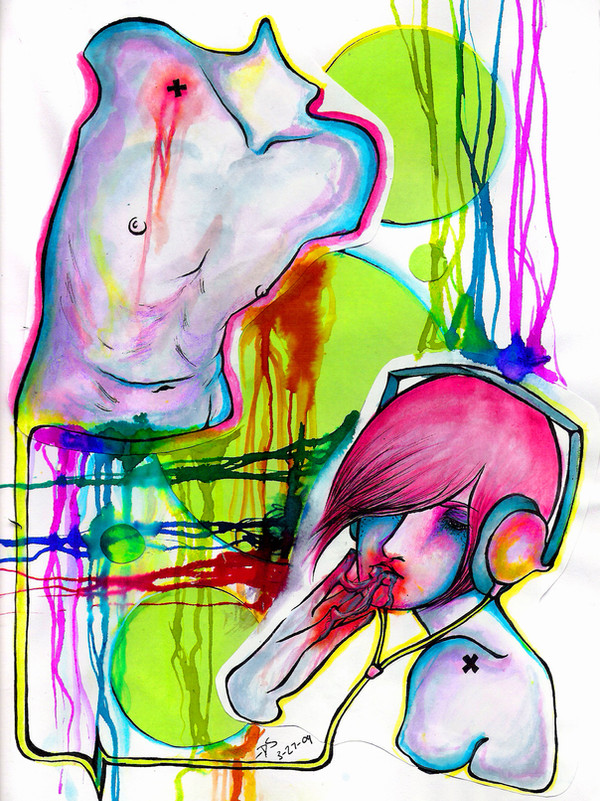
A part of my summer AP Studio Art project.The criteria was something along the lines of a portrait that used certain colors in combination with the content to set a certain mood.
I fucking suck at portraits [obvs], but thought it'd be a nice challenge.
Cause that's the point, right?
I would really appreciate critique on things I could change/add to, but please nothing that's set in stone.
I'm very aware of the stupid flaws that I've already made permanent.
Thanks~
Prismacolor Marker; a broken, black CD; silver marker, shitty, old watercolor.
Reference obviously used.
Related content


Comments: 44


Looks alot different than your other stuff (in a good way ")
Very nice
👍: 0 ⏩: 1

Thank you!
I thought I'd do something a bit more class room appropriate haha.
👍: 0 ⏩: 1
Lol, well yeah, I suppose it won't offend anyone too bad  (Wink)")
👍: 0 ⏩: 0

I love this, therefore it is featured here: [link]

👍: 0 ⏩: 1


beautiful as always. I especially like the way you coloured the eyes and face. I think that you have to work on making your marker strokes smoother though
👍: 0 ⏩: 1
Thank you very much!
I agree with you, completely. I did very little planning as of x color would take up x amount of space and it resulted kind of streaky hahaha
👍: 0 ⏩: 1
hahaha yes, well sometimes its good not to plan though  (Smile)")
👍: 0 ⏩: 1
Thank you very much <3
👍: 0 ⏩: 1

no problem.
I wish I could draw that well.
👍: 0 ⏩: 0

well struggled >___<
half profiles are the biggest challenge (beside hands and hairs and feet and ...XD )
to proof the porportions i very often use a mirror, i try to dupe my brain hehehe
i think the left cheek could be a little less broad
understood my genglish?

👍: 0 ⏩: 1
Thank you haha!
I definitely agree with you -__-
Mirrors are a good idea (:
I noticed that, but I actually broadened it because the face was too long and slender, and I had already pretty much inked the right eye so I couldn't readjust D: Blehhhhh haha
👍: 0 ⏩: 0

I love the colors.
This picture looks beautiful. :]
👍: 0 ⏩: 1

Yeah I agree judging from this you're really great at doing portraits and so creative with the use of a cd and all the beautiful, vibrant colors. And the emotion it quite powerful too, 
👍: 0 ⏩: 1
Awwww 
That really means a lot to me.
👍: 0 ⏩: 1
Hey no problem, you definitely deserve it.
👍: 0 ⏩: 0

Hm´´´´´´ I ADORE IT
It reminds me colours of fashion of 80´s...
Realy great painting, quite realistic i can say
👍: 0 ⏩: 1

I really like this picture especially the hair and the expression on her face.
The only advice I can give that differs from what Bluemoonbirdy already said, is that I think the left eye is slanted upwards just a tiny bit too much. But you still did a really fantastic job on this.
👍: 0 ⏩: 1
Thank you very much!
Haha I didn't notice that before. n__n
👍: 0 ⏩: 1

this is beautiful!
i dont think you suck. you did a good job for just a trial.
👍: 0 ⏩: 1

The portrait really isn't bad. I Love the way you did the lips! The nose is a tad off and the palm of her hand seems awkward to me, but only slightly. Otherwise I like the use of color and I find the shattered cd pieces to add a nice touch. Nice! :]
👍: 0 ⏩: 1
Thank you very much!
The nose drives me craaazzzzyy. I could never fix it so I gave up lol D:
And don't even me started on hands lol! xD
👍: 0 ⏩: 1
It is okayy. We all make mistakes, just means we need to practice. I can NEVER get hands right. It drives me crazy. Haha.
👍: 0 ⏩: 1
True dat.
Dude I know, me either D:
👍: 0 ⏩: 1