HOME | DD
 Simanion — The Sound Lab

Published: 2011-07-28 03:39:32 +0000 UTC; Views: 11086; Favourites: 190; Downloads: 0
Redirect to original
Description
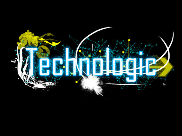
Another work that was part of my Masters, this is an illustrative type identity I created for "The Sound Lab" - an awesome radio program on Triple J that plays the best new experimental music.Hard to categorise the show further than that, but you get everything from post rock, ambient, noise, to minimal techno, house, chiptunes, twisted folk, electro-acoustica, remixes, dubstep and experimental hiphop. Great to sink into late on a Sunday night

As an identity, it fits as part of a "dynamic branding" approach, where there are many variations of the "logo" with different amounts of detail or formats, but where the essence of the identity is always maintained.
I've just copied and pasted this next bit from my thesis for anyone who cares about what certain things represent. Otherwise, hope you like it! I may upload other bits and pieces related to this project
Due to the highly experimental nature of musical content on the radio show, it was appropriate and indeed essential to reflect this in the identity. The approach of interpreting the scientific and experimental connotations of ‘lab’ was taken and visually infused into the type, which was made to look like a system of pipes, test tubes and other laboratory apparatus. Surrounding illustration referenced the predominately electronic nature of the music through circuits and motherboard-like imagery that in places fuses into musical notation or guitar necks. Idiosyncratic and more natural forms are shown emerging from areas of the design to represent the sometimes organic style of the sounds, despite their technical origin. Finally, the whole identity was inverted to white and placed over black, which captures the late night feel of the show (which airs from 11pm to 2am).
Follow me on Facebook for a more compelling and rich Simanion experience: www.facebook.com/simanion
Share "The Sound Lab" on Facebook: www.facebook.com/photo.php?fbi…
Reblog "The Sound Lab" on Tumblr: simanion.tumblr.com/post/81312…
Related content


Comments: 62

 (Smile)")

Thanks! Glad you think so ")
👍: 0 ⏩: 1

Typography is not my particular interest, so you know better.  (Wink)")
👍: 0 ⏩: 0


this makes me want to reconsider what masters program i want to do. i wanna make stuff like this! melikes!
👍: 0 ⏩: 1
Thanks! What Masters program do you want to do?? Maybe you could work illustrative type in somehow
👍: 0 ⏩: 1
Wow you actually reply to all your messages! That's pretty awesome. I'm trying to do a degree in architecture, since that was my undergrad. I feel that I want to do all kinds of design though, if that's possible, haha, even as a hobby. They're probably all related. So thanks for your suggestion!
👍: 0 ⏩: 0

Love this, interesting to read your notes too. Triple J? Happy memories of listening to that station whilst travelling around Oz.
👍: 0 ⏩: 1
Thanks! Oh cool, when were you here? Your work is fantastic by the way

👍: 0 ⏩: 1
Thanks. A while back - 2002, loved listening to Triple J, played great music.
👍: 0 ⏩: 0

Really love the piece all the way down to the composition do we get to see a colour version any time soon.
👍: 0 ⏩: 1
Thanks Brian 
👍: 0 ⏩: 1
Can't wait to see that..No i just thought it would be great. Now that you say it was cramped I can see what you mean. Love the energy
👍: 0 ⏩: 0

I I I I love your woooork so much. -cough- Yeah, I think it's great how it always represents the subject so cleverly and openly, and yet there's always little items to find and new ways of looking at the pieces. Sounds like a pretty wicked program, anyway!
👍: 0 ⏩: 1
Ah, I missed this! Thankyoouu 
👍: 0 ⏩: 0


oh and as far as showing them the work. print it out and pail it to fenella, you can get the details on their site.
👍: 0 ⏩: 1
Yes I considered this too, it might be the way to go..
👍: 0 ⏩: 1
pail... hahah i meant mail, which i think you figured out.
👍: 0 ⏩: 0
the sound lab is the only show on radio brave enough to play my partners music. it is absolutely awesome. Hopefully we can get anothe ron air interview when we finally release the 2nd album...
now to the art.... THIS IS FRICKEN AWESOME!
👍: 0 ⏩: 1
Thanks Riannon
👍: 0 ⏩: 0


👍: 0 ⏩: 1


You're always welcome!
👍: 0 ⏩: 0

Yay!
I like how some letters look like meat-choppers (:
Very unique again, very outstanding ^^
👍: 0 ⏩: 1
Haha I hadn't thought of the meat choppers thing but I suppose that's one interpretation! They certainly make a sound. Glad you like it, thankyou
👍: 0 ⏩: 0

great work. i love the lines and use of empty space.
from the music you mentioned, i would recommend looking up 'beardyman' on youtube, it's pretty amazing stuff ( [link] )
👍: 0 ⏩: 1
Thanks
👍: 0 ⏩: 0

Astounding piece of work. Thanks for sharing...
Featured in Amour de Typographie at www.hangaroundtheweb.com
👍: 0 ⏩: 1


Love it. you should show it to them i'm sure they would love it
👍: 0 ⏩: 1
I think I plan to...but it seems there's no private way to do so, ie. I'll have to post it on their facebook wall and just be all like "hey, so I did this.." haha.
👍: 0 ⏩: 1
hrmm yeh hopefully they notice it!
👍: 0 ⏩: 0
| Next =>