HOME | DD

SimplySilent β€” Rising-Artists Skin (Updated)

Published: 2013-07-28 02:30:10 +0000 UTC; Views: 8153; Favourites: 254; Downloads: 830
Redirect to original
Description Commission Me | Free Journal Skins | Gallery Skins

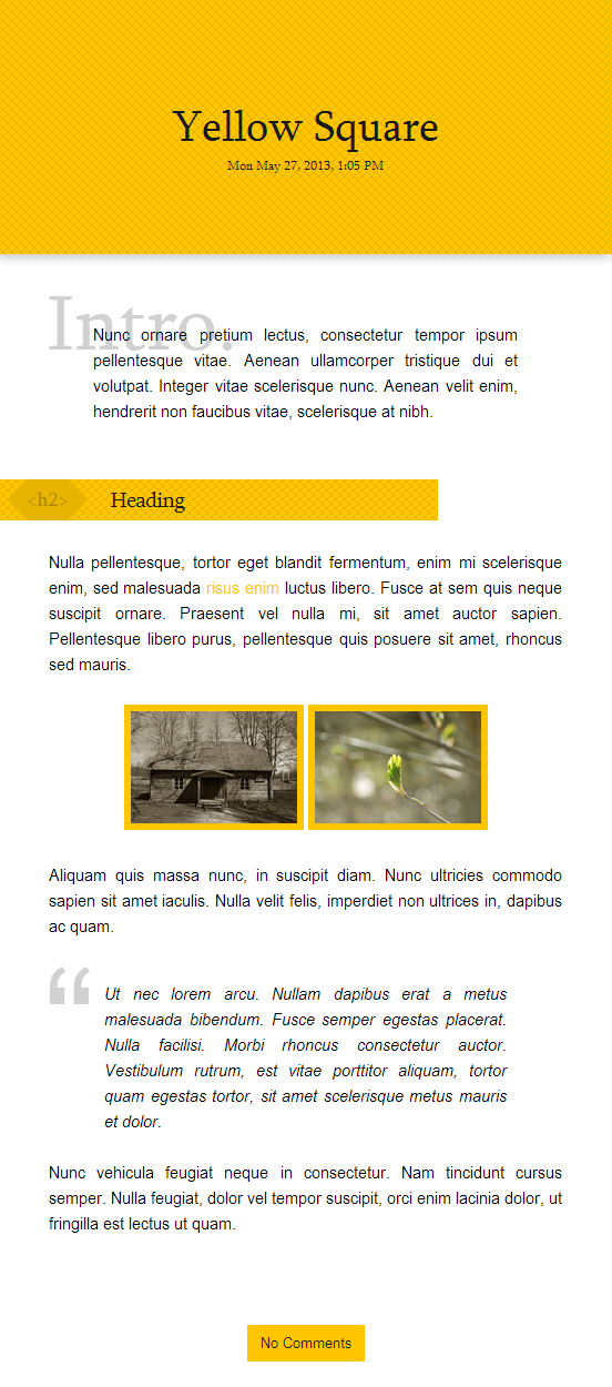
See the Live Version .

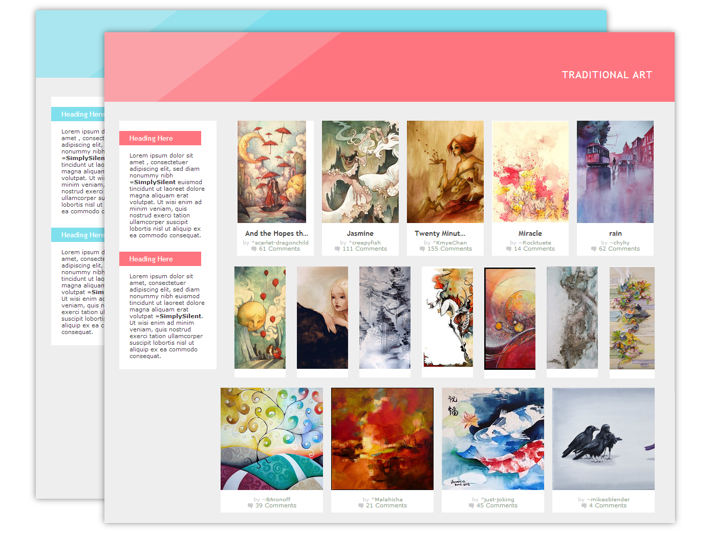
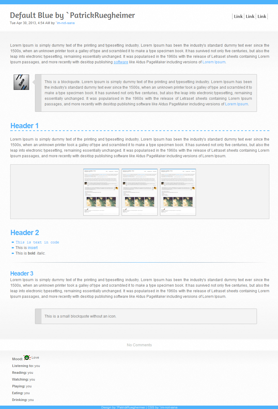
Here's the official #Rising-Artists skin available for admins in case they want to submit a journal to their own portal as well as the group. This is also free to use for anyone who wants to support the group, or for those who just like the skin design.

*Disclaimer: This journal was designed for the super squished display of the group's profile page, so at wide widths, the journal may look a bit funky.


Updates:

Sept. 26: Fixed list formatting that dA recently changed


Credits

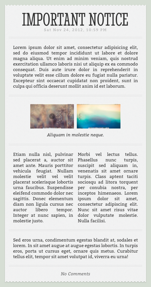
Squairy pattern by Tia Newbury
Lined Paper pattern by Gjermund Gustavsen
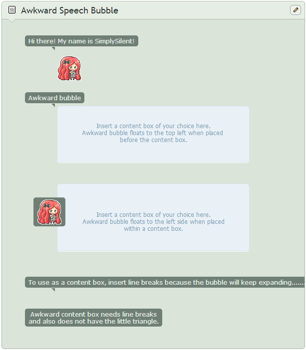
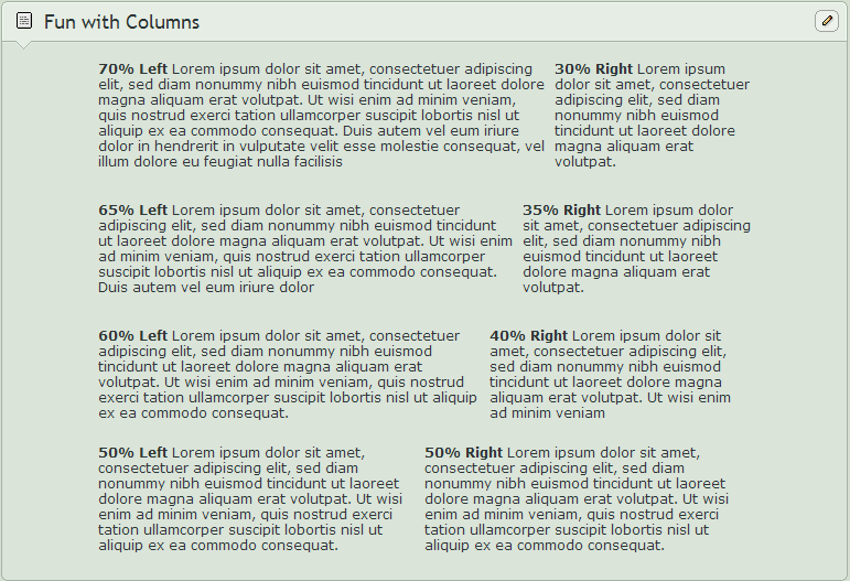

Headings:

>Heading 1>
>Heading 2>
>Heading 3>
>Heading 4>
>Heading 5>
>Heading 6>

Blockquotes:

>I'm a blockquote>

Unordered Lists:

>>Bulleti>
>Bulleti>
>Bulleti>ul>

Ordered Lists:

>>Bulleti>
>Bulleti>
>Bulleti>ol>

Menu Links:

The code in the header for each button follows the following format. Insert your own URLs and link names to change the buttons.

>ef="URL">LINK NAME>li>

Editing:

You can edit this journal all you want for your own use, but please do not remove the credits in the footer. Thanks!
Related content
Comments: 37

Sunnyre [2016-08-25 19:02:46 +0000 UTC]

Aaaaw this is amazing, thank you so much for all the skins -^^-

πŸ‘: 0 ⏩: 0

Ra-ChelB [2015-11-26 16:14:38 +0000 UTC]

Hi!
I love this skin and I'm using it, but I don't like the grey boxes (?) around the thumbnails... can I remove them? If yes, how can I do?
I looked up in the Edit Skin, but I can't find anything...

πŸ‘: 0 ⏩: 1

Xyuenna In reply to Ra-ChelB [2018-07-15 09:24:14 +0000 UTC]

Just Look Up Onto The "Skin CSS" A Scroll Down Until You Find This CSS


.text a img, .lit, .avatar{
vertical-align:middle;
padding:10px;
margin: 10px;
outline: 1px solid #ddd ;
}


Change The "outline: 1px solid #ddd ;"

To Be "outline: none;"

So The Border Won't Show... ^U^

πŸ‘: 0 ⏩: 0

Aoki-kimi [2014-01-19 14:00:46 +0000 UTC]

Nice. >w<)9 This was very Pretty! *w*)9

πŸ‘: 0 ⏩: 1

SimplySilent In reply to Aoki-kimi [2014-01-20 04:57:38 +0000 UTC]

Thanks!

πŸ‘: 0 ⏩: 0

Ikue [2013-12-05 12:36:43 +0000 UTC]

Very nice.

πŸ‘: 0 ⏩: 1

SimplySilent In reply to Ikue [2014-01-04 22:04:22 +0000 UTC]

Thank you!

πŸ‘: 0 ⏩: 0

feat-outsider [2013-09-28 11:40:21 +0000 UTC]

waah beautifulβ™₯ I think you are the best css artist out there β™₯uβ™₯

πŸ‘: 0 ⏩: 1

SimplySilent In reply to feat-outsider [2013-09-28 19:45:34 +0000 UTC]

Awww, you are just too sweet!

πŸ‘: 0 ⏩: 0

namenotrequired [2013-08-02 11:06:47 +0000 UTC]

Great design, I love it

πŸ‘: 0 ⏩: 1

SimplySilent In reply to namenotrequired [2013-08-02 17:21:43 +0000 UTC]

Thank you!

πŸ‘: 0 ⏩: 0

ShuyinTheEnigmatic [2013-07-29 03:03:09 +0000 UTC]

This is some cool stuff!

πŸ‘: 0 ⏩: 1

SimplySilent In reply to ShuyinTheEnigmatic [2013-07-29 03:23:32 +0000 UTC]

Thank you very much

πŸ‘: 0 ⏩: 1

ShuyinTheEnigmatic In reply to SimplySilent [2013-07-29 03:24:11 +0000 UTC]

Welcome!

πŸ‘: 0 ⏩: 1

SimplySilent In reply to ShuyinTheEnigmatic [2013-07-29 03:28:36 +0000 UTC]

πŸ‘: 0 ⏩: 0

SagittariusRose [2013-07-28 17:54:12 +0000 UTC]

very very nice

πŸ‘: 0 ⏩: 1

SimplySilent In reply to SagittariusRose [2013-07-28 18:59:00 +0000 UTC]

Thank you!

πŸ‘: 0 ⏩: 0

Sitraxis [2013-07-28 08:12:46 +0000 UTC]

What I actually like about this skin is that it looks like it has a world of its own or a website of its own rather with the way the menu items are placed above the even with the fact that the group it's meant for is a group in the deviantArt community. The minimalist theme in this skin is really beautifully designed. and I adore the use of textures because it makes it very pleasing to the eye. I also like the fact that the headings are of different colors despite being sizes by default. It makes it more convenient for the user. Keep up the wonderful work,dear.

πŸ‘: 0 ⏩: 1

SimplySilent In reply to Sitraxis [2013-07-28 19:04:54 +0000 UTC]

Aww, thank you for your sweet comment~


Huh, I never really thought about whether it looked like it's own page, but in a way it's sort of does. Most journals don't have the menu up top, but I did that because in the narrow space group journals are displayed in, there's no place to put a sidebar.


And, yay, I was shooting for a nice and neat design that would be easy for group members to read.

πŸ‘: 0 ⏩: 1

Sitraxis In reply to SimplySilent [2013-07-29 02:43:56 +0000 UTC]

No problem.


Exactly why I think it makes the journal unique. The rarity of that feature just gave me that feel.

πŸ‘: 0 ⏩: 1

SimplySilent In reply to Sitraxis [2013-07-29 03:25:37 +0000 UTC]

πŸ‘: 0 ⏩: 0

bunnydesuuu [2013-07-28 06:03:49 +0000 UTC]

OMG THIS IS SO COOL
can you teach me how you format the icon to be the writer of the journal?

πŸ‘: 0 ⏩: 1

SimplySilent In reply to bunnydesuuu [2013-07-28 06:29:56 +0000 UTC]

Thank you~!


Check out `im-not-sana 's article here:Β fav.me/d64pcqv

πŸ‘: 0 ⏩: 0

Boo-Tay [2013-07-28 03:16:13 +0000 UTC]

Oooo this is very nice!

πŸ‘: 0 ⏩: 1

SimplySilent In reply to Boo-Tay [2013-07-28 03:16:57 +0000 UTC]

Thanks!

πŸ‘: 0 ⏩: 1

Boo-Tay In reply to SimplySilent [2013-07-28 03:22:10 +0000 UTC]

No worries

πŸ‘: 0 ⏩: 0

Peter-The-Knotter [2013-07-28 03:05:59 +0000 UTC]

Not up to your usual standard......

Β 

Β 

gone past that!... now you're in trouble:

Β 

1 seriously good rep to live up to... al the time..... you poor foolish girl....

Β 

P.

πŸ‘: 0 ⏩: 1

SimplySilent In reply to Peter-The-Knotter [2013-07-28 03:17:09 +0000 UTC]

πŸ‘: 0 ⏩: 0

MafiaVamp [2013-07-28 02:48:05 +0000 UTC]

I like this journal design a lot!

The overall look is neat and tidy, the alternating colours of the headings add to that.


I was wondering -since you seem to be quite apt with coding- is there a way to bring a font to perfectly be in line with a lined paper background?

Because that's what always bugs me a bit when I see lined paper in journals.

πŸ‘: 0 ⏩: 1

SimplySilent In reply to MafiaVamp [2013-07-28 02:50:34 +0000 UTC]

Thank you very much!


There certainly is. You have to work with line-height and match the height with the lined paper. That typically bugs me too, but here I was using the lined paper as a background texture so it wouldn't be plain white. Otherwise, I would have made sure that it was perfectly lined up.

πŸ‘: 0 ⏩: 1

MafiaVamp In reply to SimplySilent [2013-07-28 02:52:41 +0000 UTC]

I see. That would be far more work too, I asume?

Thanks for telling me!

πŸ‘: 0 ⏩: 1

SimplySilent In reply to MafiaVamp [2013-07-28 03:17:47 +0000 UTC]

It wouldn't be too terribly difficult And no problem~

πŸ‘: 0 ⏩: 0

Celvas [2013-07-28 02:45:05 +0000 UTC]

This one is beautiful. Simple graphics, solid coding. The choice and range of colors a perfect fit. This needs further investigation, I think!

πŸ‘: 0 ⏩: 1

SimplySilent In reply to Celvas [2013-07-28 02:48:56 +0000 UTC]

Aww, thank you so much! Β  Β 

πŸ‘: 0 ⏩: 0

FTSArts [2013-07-28 02:36:17 +0000 UTC]

Yay! Thank you

πŸ‘: 0 ⏩: 1

SimplySilent In reply to FTSArts [2013-07-28 02:38:24 +0000 UTC]

Thought it would be helpful to have all the features laid out~

πŸ‘: 0 ⏩: 1

FTSArts In reply to SimplySilent [2013-07-28 02:41:12 +0000 UTC]

Ya it is nice when an admin makes something now that it will match the rest of the Page's theme

πŸ‘: 0 ⏩: 0