HOME | DD
 sinthux — Geoplum

Published: 2010-05-09 05:07:43 +0000 UTC; Views: 6540; Favourites: 95; Downloads: 196
Redirect to original
Description
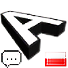
I actually did this a week or two ago, but I was too lazy to submit. This is for an app that display information you're looking for based on proximity to your location.Related content


Comments: 39


Never made a flat version of it, since it was only required for the app website and icon for the iPhone, and Droid. Although if I did, it would either just be the plum by itself, or a cut-out outline between the plum and the pin to separate the two.
👍: 0 ⏩: 1

Ah so it's less a logo, more of an app icon. I getcha.
👍: 0 ⏩: 1
I suppose. Is a logo much more than an icon that encompasses the significance of said brand? Not that I'm a logotype guru by any means.
Could definitely be more metaphorical, than a literal translation of the app name. But it was something I did quick and for free.
👍: 0 ⏩: 1
A logo is indeed an icon in the most basic sense of the word and vice-versa: they're both symbols used to represent a larger idea.
But both have their respective requirements and purposes. A logo is something that is intended to be massively versatile, and should be reproducible in many many formats, sizes, colors, and applications. An icon is more appropriate for a piece of software that sits in a dock, though, because in this instance it has a more limited application range (mostly just on-screen, rarely smaller than 16x16, but typically a minimum of 32x32) and people expect icons of this sort to be more rendered and visually "pretty."
This is why I said it's an icon instead of a logo. It wasn't out of quality (which, it's quite nice) but more out of intent.
 (Smile)")
👍: 0 ⏩: 0


Hehe.. Funny... GeoPlum...
But it looks awesome! Nice typography there!
👍: 0 ⏩: 0


One of best logos I never seen. I love it when I seen it on Dribbble.
👍: 0 ⏩: 1
Yea, that's pretty much the only reason why I uploaded it here. It got so much love on Dribbble.
👍: 0 ⏩: 0


very nice!
looks like Illustrator (mesh tool).
I dont know but I think the drops are faking the perspective. uhm... they are dont right connected with the fruit.
ah I have problems to explain >_>
but thats my opinion
good job !

👍: 0 ⏩: 1
You mean the water droplets? Yea, they were done kind of quickly using blending styles lol.
👍: 0 ⏩: 1
yeah thats it.
man, I have to learn more English >_>
👍: 0 ⏩: 0


Nice work!
Must've been a pain in the ass.
I agree on the droplets btw.
👍: 0 ⏩: 1
Hmm nope, it was actually pretty quick. Only took maybe 2 hours to do.
👍: 0 ⏩: 1
Looks like you've really mastered your skill.
👍: 0 ⏩: 0
This. Is. AWESOME!
* notes contact if a logo was needed *
👍: 0 ⏩: 0


I like the logo/concept.
What kind of font did you use to logotext?
👍: 0 ⏩: 1


love this, saw this in dribble and this is awesome logo dude :thumsbup:
👍: 0 ⏩: 0