HOME | DD
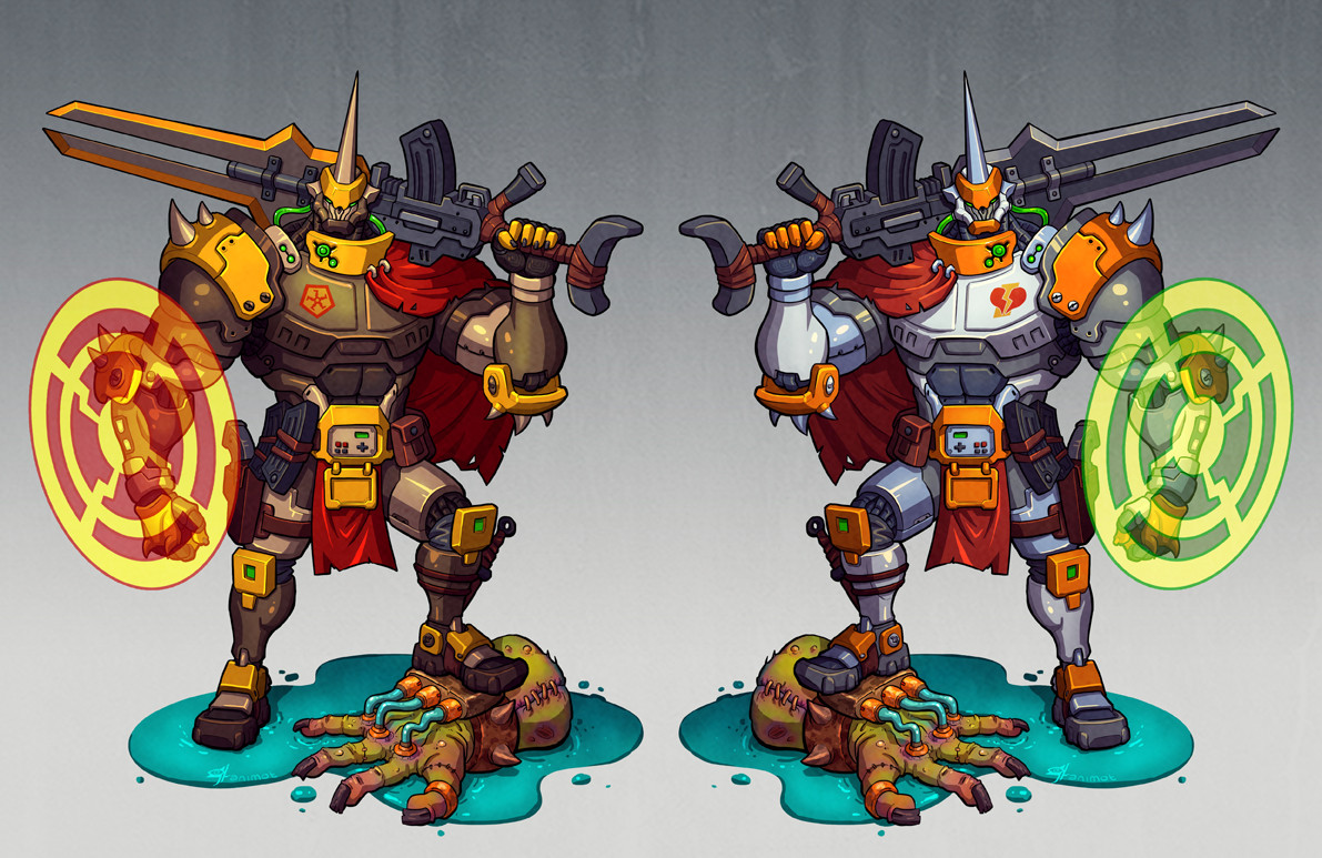
 Smearg — Mighty No. 1 Redesign

Published: 2013-09-23 23:16:57 +0000 UTC; Views: 3263; Favourites: 50; Downloads: 18
Redirect to original
Description
I loved the concept behind Mighty No. 1 here, but I wasn't a fan of this frail body structure. Here's my shot at a redesign that I feel suits him better. The wheel on his back is like the gear on a lighter, and I added more pipes like the ones that form his 'hair'. I'd love to hear any feedback on this-- what'd you think? Do you like the thinner design? Or would you rather it go a completely different direction?This character is from the game-in-development Mighty No. 9. You can read up on the project here: www.kickstarter.com/projects/m…
Related content


Comments: 8

Interesting idea, I'll give you that. Personally, I think the whole "frail body underneath massive flames thing" was kind of the point. You underestimate his destructive capabilities because of how frail his body looks, then BAM, he covers himself with flames and becomes huge.
👍: 0 ⏩: 0

You've legitimately completely improved the design.
👍: 1 ⏩: 1

Thanks dude, I didn't expect to still be getting responses to this. Awesome avatar by the way, I'm a huge fan of Protoman's crazy hair.
👍: 0 ⏩: 1

Amaziiiinnnggguh
You win all the gold stars. I actually need to go out and buy new gold stars because you won all of the ones I had.
👍: 0 ⏩: 0

It's nicely done and I really like your idea of the flint wheel using his "hair" to start the fire, similar to a Zippo lighter.
His bulkier design definitely looks tougher when the fire is off but here he actually kind of looks slow and "fat" when on fire (plus only parts are lit as opposed to fully engulfed like the original).
If you note the original design ideas for the creature, it was specifically meant to look weak when the fire was off but then huge and menacing when on fire. The contrast was what makes the design more interesting.
Still, a good "remix" and a very nice design and good quality fanart (like the cleanliness of it and keeping true to the designs as seen on his "thighs").
")
👍: 0 ⏩: 1
Thanks! I see what you mean on all those points. I actually came to realize exactly what they were going for- what with his unlit body being lanky and frail- about halfway through my original drawing for this. I actually started liking his real design after seeing some fanart, but I felt like I should finish this anyways- so I did.
👍: 0 ⏩: 1
Glad you did, it's still pretty good art and an interesting alternative.
 (Smile)")
👍: 0 ⏩: 0