HOME | DD
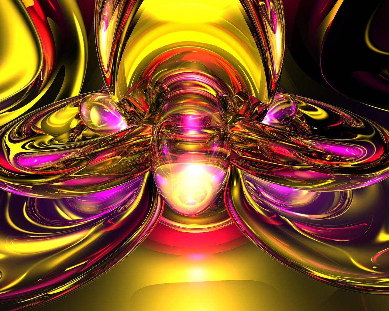
 smokin-nucleus — Abstract Redemption v1

Published: 2003-09-01 22:00:13 +0000 UTC; Views: 333; Favourites: 2; Downloads: 168
Redirect to original
Description
Ok, I toned down the psycho colors a bit....lol....I've been a busy little beaver this weekend (Smile)") This is like my fourth upload.... 3 sizes in zip.
This is like my fourth upload.... 3 sizes in zip.
Related content


Comments: 11


that looks good...the colors rock my world three times over.
👍: 0 ⏩: 1

Thanks once again bb, glad you like all these pieces, I aim to please...lol....
👍: 0 ⏩: 0

It looks much better this way, I can't understand either why sometimes parts of the picture look like they aren't
antialiased and then some wise guy says " hey, looks good but you should antialias it better..."
Oh well, you do the best you can do and that's all....
I know that sometimes the conversion from bitmap to jpeg degrades the antialiasing somewhat but there isn't
a whole lot you can do about that...
Anyway, I like the colors better this way.
👍: 0 ⏩: 3

Well guys, before I state my opinion on those areas that don´t seem antialiased (of a piece made with Bryce´s help), let me make clear that I do NOT consider myself a Bryce expert. As a matter of fact, I´m indeed a newbie at it.
Ok, so here´s my point: it´s extremely difficult to tame those areas that insist in not to look antialiased.
But, after looking at the galleries of many true Bryce experts, I became aware that is possible to produce great pieces of art with that program with a totally smooth appearance. It only takes a visit to Lady Akasha´s ( [link] ) DA page to confirm that.
I know that render times can be endlessly long, and that is very frustrating to realize that an area, large or small, looks like it was not antialiased after all the time it took to render.
I have experienced this situation, and in every occasion I´ve decided not to submit the piece. Instead, I tried to change the lighting, the positions of the objects and, of course, the anti-aliasing settings, until I was completely satisfied with the results.
Again, taking Lady-Akasha´s art as a benchmark (when it comes to pure techical aspects), my humble opinion is that those seemingly non-antialiased areas can spoil the whole piece, no matter how good the concept was.
This is not to say that a piece with those areas cannot be nice. Of course they can, as the ones in your gallery. But they would be so much nicer if that perfect smoothness were present...
Please don´t get me wrong ok? I really like your art. Maybe my standards are too high, but blame it on Lady Akasha...
👍: 0 ⏩: 1
You have a good point, but in my case I sometimes like those little areas that don't appear to be antialiased
properly. It doesn't necessarily detract from the total effect. If I thought it did, I would not submit the piece
and I would most certainly continue to re-render and move things around and change lighting etc. until I was
happy with it...
I appreciate your comments and that is your opinion to which you have every right, but I think the final
say so is obviously with the artist who made the piece and how he/she feels about it.
👍: 0 ⏩: 0
I always render everything on superfine mode, save it as a bitmap, convert the bitmap to a jpeg in either
Painter or Photoshop and I always render at 1280 by 960 and then reduce the bitmap to each lower resolution
that I use and save each as a jpeg. I never render at 1600 by 1200 since it would take bloody forever....
I then open up each jpeg in adobe imageready 7.0 to optimize them and reduce the file size.
👍: 0 ⏩: 0
Thanks Jim.....when the render's done I save it as a jpeg, a tiff, and a bmp, and I render it at 1600x1200, so I don't believe there's any conversion. The only thing I do is shrink the image (the jpg) in photoshop to the smaller rez's. I use super fine mode....do you use the premium? I've never tried, as I get some pretty scary render times as it is......lol.
👍: 0 ⏩: 0

Ya, the render isn't the best, but the colors look great. The yellows add a nice contrast to the dark blues and purples.
👍: 0 ⏩: 1
Thanks hoss, yeah I don't know what was up with the render, I always use high settings
")
👍: 0 ⏩: 0
Damn, that looks like a shitty render, I used all my normal high settings, i don't know why some parts look like they do.
👍: 0 ⏩: 0