HOME | DD
 snipes2 — mini'em all - beta versions

Published: 2011-12-16 12:02:37 +0000 UTC; Views: 11942; Favourites: 45; Downloads: 1834
Redirect to original
Description
22.12.11 // update two:// added alternative transparent version (>bottom image<)
22.12.11 // update:
// finished the VS for open beta
// added transparent version (>bottom image<)
// changed boxes, buttons, trackers, progress bars, fixed taskbar
19.12.11 // update:
// changed the caption buttons
// added the start menu
// added custom buttons
// added explorerframe images
16.12.11 // update: download enabled (horrible beta, haven't touched most parts. I suggest you to wait for the final version
 (Wink)") )
)new project
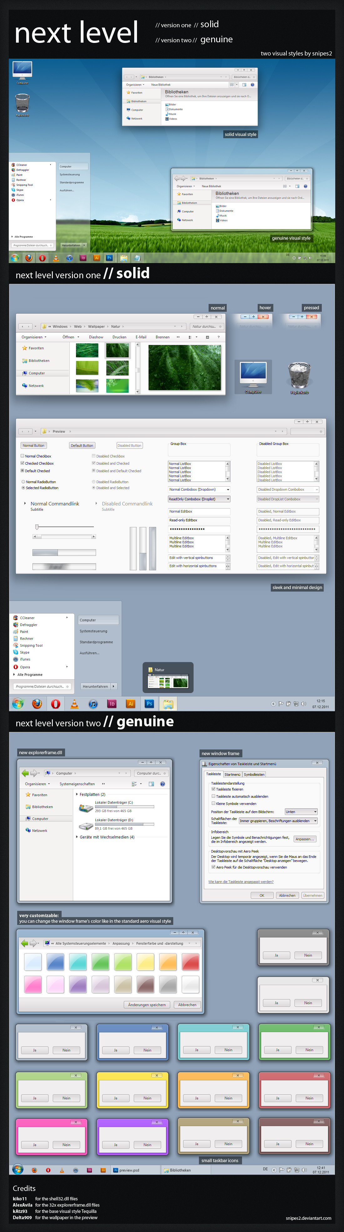
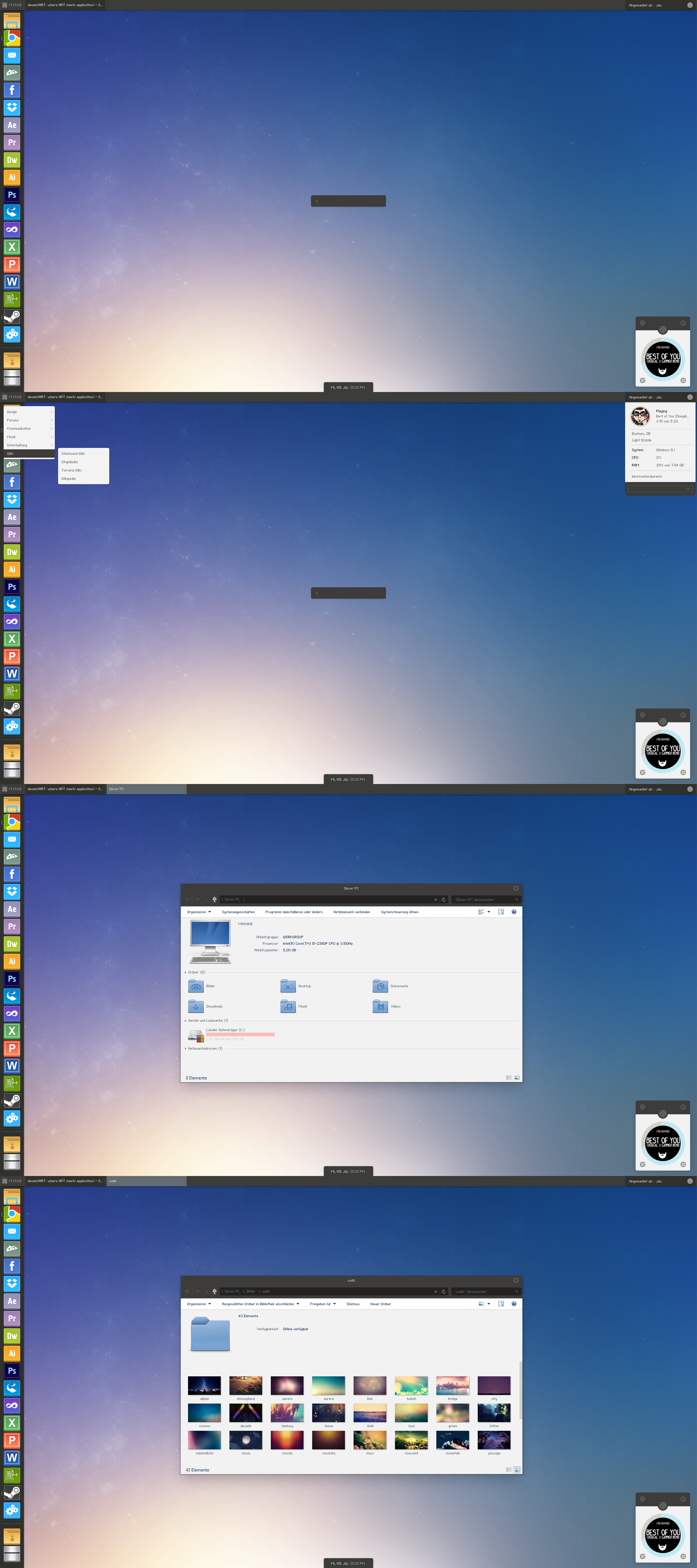
actual screenshot, no mockup.
I'll probably change the caption buttons so something more fitting later. I'm also thinking about a transparrent version, too.
Thoughts?
Wallpaper: modded version of my metro wallpaper here: [link]
VS: click download to get the worst beta you've ever got
")
Rainmeter: Omnimo 4.1 [link]
Icons: token [link]
Related content


Comments: 73


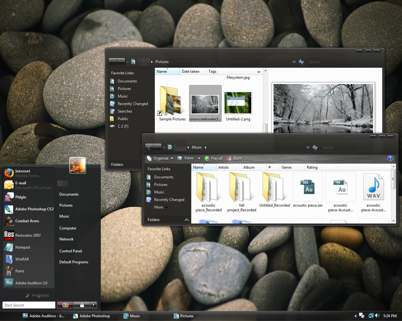
you are kidding me man .... love your theme but how can you on non transparent version make round edges ????
aaaaaaaaaaaaaaaaaaaaaaa  (Smile)")
👍: 0 ⏩: 1
and explorer great Organize, Include in library no edges clean but why why why have you made that UGLY one px border around Name, Date, Type menus ")
👍: 0 ⏩: 1
make it disapear and use the same style as on menu, and on folder tree ... sounds reasonable form me
👍: 0 ⏩: 0

Very nice!
You've still got some Aero elements in there though, like the blue toolbar backgrounds
👍: 0 ⏩: 1

Thanks,
i'm working on it, should be out in a few days...
currently bugfixing
👍: 0 ⏩: 0


Hey,
I´m looking foward to use this, when it´s finished!
I found an awesome Tool: [link]
You don´t have to change the explorerframe.dll, it´s the easiest way.
Can you support this in your VS, please?
👍: 0 ⏩: 1
Thank you,
but the image files are already included.
Just gotta have to hit the download button
👍: 0 ⏩: 0

The alternative version is VERY nice.
👍: 0 ⏩: 1
Haha, it's not hard work if you have fun, is it?
I really like creating something new, but hahte the bugfixing...
So, hard work is now
")
👍: 0 ⏩: 1
Yeah, you're right I've been spending hours upon hours working on this thing. Granted, I'd probably be spending less time if I was an experienced themer. But yeah, I've already come across a few bugs in my theme that I'm trying to phase out early on.
Good luck! I look forward to trying out your theme.
👍: 0 ⏩: 0
Thank you!
Vielen Dank auch fürs Austesten!
Das Bugfixing wird nochmal Arbeit...
Die Rechtsklickmanüs sind wahrscheinlich von den Programmen vorgegeben, ist zumindest bei Firefox, Chrome und Opera der Fall, ich werd mir das aber noch geauer anschauen.
Ach, die Menüleisten vergess ich meistens, da ich weder Gimp, noch andere Programme verwende, die diese Leisten brauchen... Danke für den Hinweis!
Ich wünsch dir ein Frohes Fest!
👍: 0 ⏩: 1

ja kann sein wegen den rechtsklick menüs.
ja ich weiss jetz niht genau welche programme, bemerkt habe ich es bei icofx, gimp, der firefox bookmarks-sidebar (oben bei der überschrift) und 7zip ... alle greifen auf so einen blau,weissen hintergrund zu.
(welcher glaube ich von der original win7 aero.msstyle stammt).
falls nötig kann ich gern screenshots machen.
danke, dir auch frohes fest und frohe feiertage
👍: 0 ⏩: 1
Ich schaus mir auf jeden Fall nochmal an
👍: 0 ⏩: 0

Thanks! I'll work it out some more, probably add another version, too.
But first bugfixing it is
👍: 0 ⏩: 0


Thanks a lot!
I'll update it again in a few minutes.
Testing some alternative transparent styles now
👍: 0 ⏩: 0
Good going so far! Liking all the changes you're adding... Looks like you're making great progress!
👍: 0 ⏩: 1
Thank you!
I hope my informations regarding the DWM Window Frames were helpful?
👍: 0 ⏩: 1
Oh yeah, DEFINITELY. It saved me a lot of grief and hours spent trying to figure everything out. I REALLY appreciate it. You're a godsend, haha. xD I'll keep you updated with my progress, but my DWM windows are looking pretty good now!
👍: 0 ⏩: 0
Thank you very much, it's not finished though
👍: 0 ⏩: 1

Your welcome and can not wait to see it when it is done then.
👍: 0 ⏩: 0

looking better and better! glad my 'plus' signs inspired you for the grouped taskbar buttons!
a theme that I might finally use!
just one suggestion: when you finish it, make an alternative version with light grey or semitransparent window frames. Why? Because dark window frames fatigues the eyes really bad. This coming from a guy spending more than 10 hours a day at the computer... not really a healthy life, I know... but it's a living!
👍: 0 ⏩: 1
Darn, i thought the plus sings on the taskbar were a great idea! I must have seen it on you VS then... I didn't want to rip it of, i really thought they are my idea.But you were first obviously
However, how did you fix the margins on the taskbar?
I tried different things, but i don't seem to get it right. Since i use one plus for "two windows open" and two pluses for "three or more windows open", one image always gets smudged...
I'll do a transparent version, too, but not until the very end. Have to do everything else first, so i don't have to work on two VS at the sane time
👍: 0 ⏩: 1
it's not a problem bro... not accusing you of ripping of my work, cause heck, I didn't invent the plus signs... I''m just glad that my ideas are spreading.
regarding your issue... can you please send me a screenshot so I can see exactly what you mean, so I can help you out?
regarding the transparent version... that's what I was saying as well... do the transparent/light version when the dark version is finished and after all the bugs have been fixed... else you'll have to work on 2 styles at the same time.
👍: 0 ⏩: 1
Here's a screenshot...
somehow the i can't find the margins that won't deform the pluses...
[link]
I can only use different margins for ether the small taskbar icons or standard taskbar icons.
But creating two versions becaus of that is ridiculous...
Thanks!
👍: 0 ⏩: 1
it's simple my friend.. has nothing to do with the margins.
you have to set the SIZINGTYPE:ENUM to TRUESIZE, instead of STRETCH.
👍: 0 ⏩: 1
Yes, i tried this, too, but not the pluses are misplaced (4px down)
I guess i'll have to go with that...
👍: 0 ⏩: 1
look at my latest theme Minimal Taste Flat and see how I did it.
there's not better option doing this.
you can thanks Micro$hit for this!
👍: 0 ⏩: 1
Yea, thanks!
Did you test the latest versions?
Would be great to get some your opinion, since i finished the VS as it is.
Now on to the "mods"
👍: 0 ⏩: 1
didn't have the time to test it out... will do that soon and comeback with a feedback.
👍: 0 ⏩: 1
Thanks a lot, i've got the feeling that i forgot sth...
👍: 0 ⏩: 1
hey bro... been testing ur theme and here's a screenshot with the feedback: [link]
Also not included in the screenshot:
- needs skinning: Start Menu> Control Panel pop out menu
- in the Start Menu I would remove the separator
- in the transparent version 2 I would either make the title bar text dark grey, or add a dark glow to the white text
- needs skinning: top menu bar which you can see in Win7 Style Builder for example.
- suggestion: make a completely transparent window frames version. Like I said before, using dark window frames on a light wallpaper, burns the eyes like hell.
Hope this helps my friend! Send a message when you add the next update so I can test it again
👍: 0 ⏩: 1
Thank you very much for testing!
I had some Internet issues these days and I'm happy to get it solved for now, so sorry for the late reply
The screenshot helps a lot!
Thanks for your effort!
👍: 0 ⏩: 1

Not sure if i'll do a dark or completly transparent alternative version...
What do you think?
👍: 0 ⏩: 1
transparent AND dark ... like static
but if only one thing - definitly transparent .
👍: 0 ⏩: 1
I'll sure do a transparent version!
I really like solid VSs, but tend to use transparent VSs more
👍: 0 ⏩: 0
Very nice so far! I do agree with you that the caption buttons look kind of out of place here, but I'm looking forward to seeing what you change them to!
👍: 0 ⏩: 1
| Next =>