HOME | DD
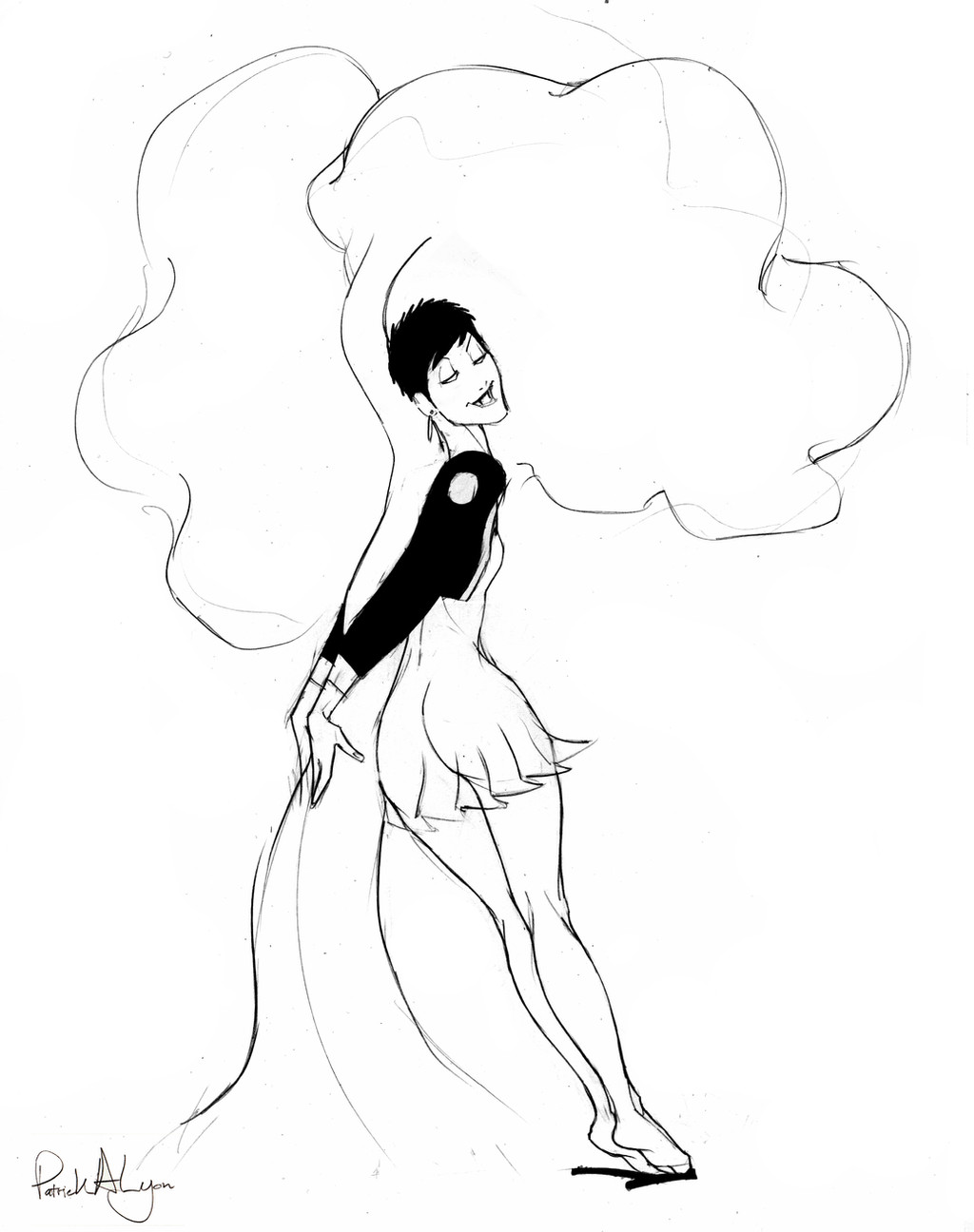
 Sol-Caninus — Blue-girl-lines

Published: 2017-09-06 02:07:54 +0000 UTC; Views: 344; Favourites: 9; Downloads: 3
Redirect to original
Description
Imported the image of an old drawing, The Blue Girl, and inked it. Did it as explained previously: 8.5 x 11 inches @ 350 dpi, then drop rez to 90. Working in Clip Studio Paint. Just starting to get into the line style. The simplicity makes it very difficult. Still, I got a feel for inflecting the longer lines and even for some patterns. Details are not beyond me, though I run out of gas doing them, so the level of detail throughout is, shall we say, uneven? XD. Spots come next. With that we have the makings of a rudimentary teen comic book style.I know I have to do a lot of these in practice before it will look good. Most of it I delete. No point junking up the hard drive with ugly stuff. It's not like I need a record of bad ink.
Compare the original sketch from 2008 (see scrapbook) with today's ink
:thumb104205455:
Related content


Comments: 4

ooo I like this, I am a huge fan of this style of inking/art.
 (Smile)")
👍: 0 ⏩: 1

")
👍: 0 ⏩: 1
it reminds me of some really cool classic artists like Don Flowers, are you a fan of pinups in general? I don't remember if that's why i followed you in the beginning, but I am a huge fan of classic cheesecake girls.
👍: 0 ⏩: 1
Sure am! Love Don Flowers - a name I haven't heard recently.
Yes. The pin-up styles tend to follow in the tradition of decorative outline. It's simple, reductive to the point of abstraction - cartoony - and notably lacking in tonal rendering. It's practically just line and spot. But there are different ways of doing it. Some ways look more "sketchy" than others, meaning they use multiple lines to weight an edge. The kind I'm going for is minimalistic, using only thin and thicker lines for everything. (Well, also spots and line breaks.) Flowers's style dips in and out of that. As I recall he worked with a pen, which doesn't lend itself to the "fat" sensuous lines of the brush.
Since the manner of expressing form is so simple an Spartan, these styles have to rely on "decorating" the subject matter with patterns, which are used variably for adding interest with detail as well as for toning. I'm don't incline toward it, naturally, so find myself going against the current to practice it. Takes time, I guess.
👍: 0 ⏩: 0