HOME | DD
 SonicSketch — Training Ground 6- Buddy System

Published: 2013-11-08 22:59:14 +0000 UTC; Views: 755; Favourites: 15; Downloads: 0
Redirect to original
Description
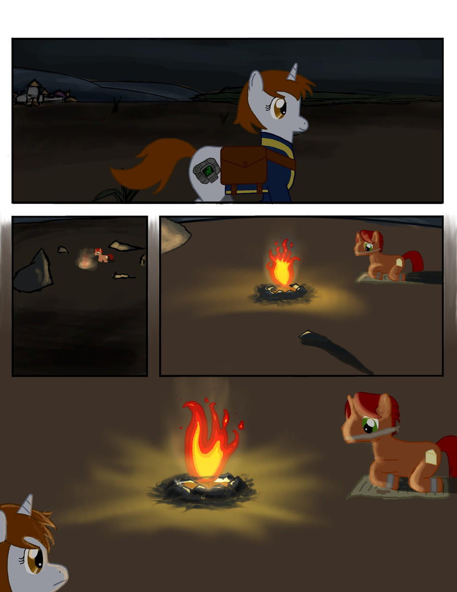
Training Grounds submission for "Safety"
Because the Buddy System is de best safety, ladies and gentlemen.


My miniture attempt at the actual MLP style. Didn't turn out as well as I wanted it to, but hey, it works. XD
Here we go again! My sixth Training Grounds, this time featuring my FC's Tucker and Riddle. X3 Before you ask, no, there is no real storyline here. I just wanted Riddle standing on the trail to the Everfree forest for some random reason, then have Tucker come out and show how much of a sweetheart he can be. ^w^
Thus far, I was disappointed to see very few submissions for this week's topic. So I tried my best to make this satisfying for the lack by trying something a little different. Because hey, why not? X3
I guess I don't have too much to say this time. Huh, tragic. XD I hope ya'all enjoy this lil' comic, and as usual, I can't wait for the next topic!
My Little Pony in general belongs to Hasbro and Lauren Faust
Riddle, Tucker and the art all belong to me, . If you'd like to use this in any way, please contact me first!
Related content


Comments: 13

Overall


Vision
Originality
Technique
Impact
Nice to see a comic between the submissions! Backgrounds are minimalistic in a good way, and less is more, as they say.
The text bubbles don't fit perfectly though. Maybe with some darker color, or outlining, it would have looked better and you could have tried to draw your own fonts - not like there would be any problem with this one.
The use of gradients is decent, except that the bushes in the first picture seem to be a bit off due to their bright color. I'd suggest using a bit darker one.
I like the "effects" on the eyes of the "monsters" in the dark, as well as the gray character's. Shading/lighting looks great, although the characters could have had a simple circle formed shadow on the ground, cause especially in the second picture, it's really missing.
Almost everything is pretty well drawn, but some lines should be smoother. The gray character's hat should be better detailed, or it rather shouldn't have those extra lines, cause it makes it look a bit worse, than if it would be blank.
Body positions, expressions and perspectives are really fine! I also like the "dark" mood of the picture. It's a good job all in all.
👍: 0 ⏩: 1
Hm. My Devious rating would be rather a 4, than a 3.5 ~
")
👍: 0 ⏩: 0

Well? Is the critique useful for anything?
👍: 0 ⏩: 1

Oh, of course it's useful! In fact, it helped me pinpoint things that were throwing me off about the pic that I couldn't identify at first, including the drop shadow that I forgot to add at panel 2. X3 I thank ya kindly for it!
The problems with this pic compared to all my other submissions to the Training Grounds thus far is this one I was trying a style that was not meant to be done in Photoshop and it was really rushed-- more rushed than my previous submissions. I saw some mistakes that ya mentioned and I already knew they were there, but since I was in a hurry to do this I wasn't able to notice 'em before I submitted. I found out that I didn't have to rush since it was due this weekend-- not the last. If I knew that, this would've turned out a lot better. XD
The only part of the critique that I'm wary about was the part regarding to Tucker's (the grey pony) hat design. His hat design I'm a little sketchy on myself, but the truth is, I took reference to a comic character that is wearing the same hat. It's the only reference I have, actually, and I can't seem to find a better fitting one, since the hat Tucker wears is a rare accessory. I could play around with his hat design sometime in the near future in another deviation in hopes I find a better way to fix his hat problem.
Apologies for the long comment. XD I like to write.
Thank ya kindly again for the critique!
👍: 0 ⏩: 1
Schedule your time better, so you don't need to hurry.
Explanations don't count, if you already submitted something. Better luck next time!
As for the hat ~ it's not exactly the design, but how it's drawn ~ probably the lines should be smoother - but that's something, that Adobe Flash or Illustrator can take care about. On a side note, you can get creative too: when I drew Jack's hat lately in an extremely misleading parody, I thought it's too blank, so I tried to add some shading and - not logical, but (for me) good looking lighting and it worked just fine. Anyway, you don't have to use each point of a critique of course.
Ur welcome again, and a long comment is not a problem at all.
(This comment is half as serious and mean/cruel, as it appears. ")
👍: 0 ⏩: 0
With my mean critique, you get a fav too.
 (Smile)")
👍: 0 ⏩: 0

This is a sweet piece of art, the style is really lovely, not to mention accurate. I find the expressions the best,you really convey the fear in the third box and the last has some excellent emotion. Great job on lighting too, keep up the great work
👍: 0 ⏩: 1
Aww, thank ya kindly for such a nice comment! ^w^
👍: 0 ⏩: 0

a little suggestion on the forest fading off into one tone, maybe add a bit of dark texture to look like overlapping leaf shadows or something... otherwise it looks a little off in the first panel.
👍: 0 ⏩: 1
I'll keep that in mind the next time I attempt to mimic the MLP show style. All I could really do is take reference, which is what I did. It was not very easy, to be honest, since I'm not used to using gradients in the way I did. Plus, to be honest, I had to rush this a bit because I have other stuff that I have to get done. XP This is what happens when I rush while trying a new style, I guess. XD
Thank ya kindly for the critique.
👍: 0 ⏩: 0

This is so sweet! I love the friendliness in this. A true friend!
👍: 0 ⏩: 1
Tucker: That's what I always try to be! A good friend to help those in need!
^w^ I'mma glad ya like this!
👍: 0 ⏩: 0