HOME | DD
 SpookyChan — God Machine Cover Draft 1

Published: 2007-11-24 08:29:40 +0000 UTC; Views: 7302; Favourites: 119; Downloads: 90
Redirect to original
Description
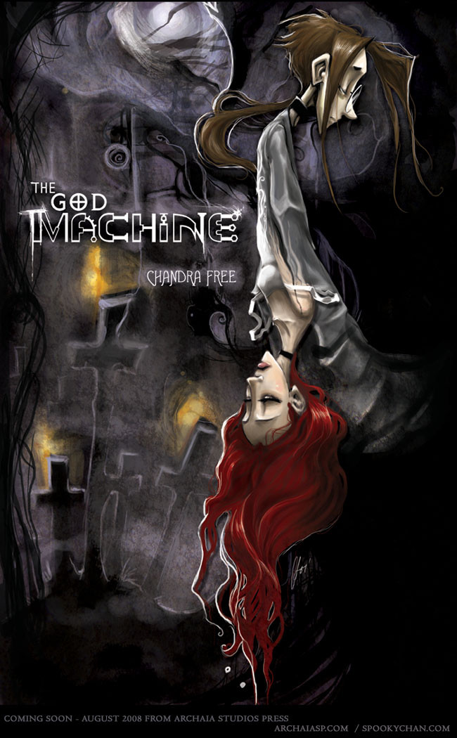
---full view please---character- Guy Salvatore
from- my comic, "The God Machine." [Summer 2008]
media- photoshop
So i've been struggling to do a redesign of the cover for book 1 of the God Machine. Either I just can't draw, the paper i've tried working on is a terrible grade [which it is], or i'm just out of ideas for doing something clever with Guy sitting at Sith's grave. :/
I decided that I'd try the Photoshop route since i can do fun painty things in it in glorious saturated color. [which the color is pissing me off..
 ; ]
; ]The result is something closer to what I want, but still off target. I don't know if i'll keep some of the work i've done with what you see here, or if i'll just start again. Who knows. I'll figure out something.
I just wish photoshop was working with me. It's been so glitchy recently that it's been extremely hard to work in it. This piece was extremely frustrating- photoshop has delay, and I don't have all my brushes up because i'm afraid of them slowing it down. :_: [i never had issues with PS7 until I got my new intuos and upgraded to windows XP]
I just started reworking book 1's comic pages. Reworking just means tightening the pencils. Which they are looking rather lovely. Which makes me happy.
I want to say so much more here. But i'm in this odd fear that if i make any announcements i will JINX myself. It's irrational but there you go.
-Chan
Related content


Comments: 42

I'm not an artist, rather a singer and a writer,so I cannot offer constructive criticism in that sense. Besides, all I can really say is if this is/was a rough draft, I cannot wait to see the final piece.

👍: 0 ⏩: 1

I went for something rather different after I did this piece. So I never went back to it as a concept as a cover. Though it made for a lovely image for my fliers.
 (Smile)")
👍: 0 ⏩: 1
Definitely.
I'm still so excited about The God Machine coming out soon! I am so buying them along with Mr. Murder is Dead and everything else Archaia. <3
👍: 0 ⏩: 0

Gorgeous! I LOVE the way you use colors and the way you make them sort of flow together in a sweepy, mystical way
👍: 0 ⏩: 0

hmmm I defnatly like the ohter one better. This works a an aimge and I do like it but something about it doesn't have the feel of te inside covers.... am not sure what but it doesn't... I defiantly like the other better. Plus I think the types much better on the other one... listen t me i sound like a graphic design student >.<
👍: 0 ⏩: 1
the logo in this was a stand in- and so was the one in the other cover. Me and Jim designed the real logo this weekend. [which the logo we made is similar to what i had in the final cover i did.]
👍: 0 ⏩: 1
aahhhh, well it was just something i thought i would point out, it wasn't my ersonal taste, can't wait to see the final one ")
")
👍: 0 ⏩: 0


theres a song by a local new england singer/songwriter named Emilia Dahlin called The God Machine, you should try to find it you'd like it
👍: 0 ⏩: 0

I like te simplicity of this - the division down teh centre and the colours of the background. I think what would give it more might be a whole lot more detail on the foreground, perhaps in the grey-tones, which would make the foreground stand out without ridding overall the otherworldly feeling given by the moon and bloody sky... I really do think the simplicity is best for a cover, and the colours are very indicative of those that you tend to use.
Of course you can't help feeling crap if your tools aren't working at their best! It's just as simple as not having a pencil sharpener on you when you're sketching!
👍: 0 ⏩: 0


I like the backlighting on this in particular. It sets the mood. As for the name on the gravestone issue, I think it's a good idea but I'd rather see it as a play of light and shadow as if the letters were chiseled into the stone, more an implication of letters than truly obvious letters. It leaves a mystery (albeit a small one "What is that name?") and a place for the eyes to hang and return.
The colors seem a little intense. I agree with you on that. Have you tried a hue/saturation adjustment layer over everything? It would afford you the freedom to adjust things as you see fit without retouching the whole image.
Compositionally, I'd say I like it pretty well, but I'd like to see Guy's eyes or glasses. There is detached and then there is avoiding looking at you. I get the feeling from Guy's pose and the fact that he's looking away that he's not interested in seeing me and that makes me a little less interested in seeing him.
Remember the old saying about how everyone's got opinions and take this with a grain of salt. I love your work, and as usual, it's gorgeous.
👍: 0 ⏩: 0

DA ate my first comment. So I will be a bit lazy even if it means I shall be whipped for it later.
This works well, and I think it looks great.
👍: 0 ⏩: 0

Ok, so I'm not the only one with the intuos problem. I think they always have that problem with regular PC type computers. EVERY time I used the thing, PS (PS7, CS2 and 3) would lag like hell or crash all together and there were times that my tablet would just stop working. Like it would act like I had no settings or anything on it, and I would have to restart the computer to get them back. But with the mac I have? I've yet to have a problem with it. I think it just doesn't like regular computers.
I still think that the cover looks really nice though. Not very cluttered, and the subject is clear and unobstructed. There's still a lot of your mark throughout the thing but without having too much fluff. You've always had a way with the digital that I've always admired.
One day...one day...I'll do it, I swear I will, lol!
Genki
👍: 0 ⏩: 1
dude, you is sounding like an art student!
theys be teachin' yous good up there! XD
yay!
--i'm convinced the latest driver for the widescreen edition of my tablet is all fucked. They might have different, more stable drivers for the mac because they might have a different team on it.
either that.. or it's evil-webil XP... can't figure out what.
👍: 0 ⏩: 1
well dude, going in debt has to at least leave me with something I could use! LOL
Genki
👍: 0 ⏩: 1

I like it.
Very minimalistic, yet effective and packing a great punch with an air of mystery.
And the colour looks great!
👍: 0 ⏩: 0
i appreciate the sentiment, but I have to push this design further for a final candidate for a cover for my book. I mean, i want this baby to catch people's eyes in the store, and woo them. So it needs more work and polish. Good enough for online, but not enough for the market.
👍: 0 ⏩: 1

I disagree. I mean, aside from making the title bigger (titles themselves catch eyes too, yo.), these colors already appeal to a certain audience. You've got the colors down. I wouldn't change that. But it is your choice, and naturally I'd love anything else that you came up with. As far as encompassing the entirety of your story goes, a cover is a very important thing, and I can repect that you feel incomplete with this ^_^ I wish you luck in future drafts.
👍: 0 ⏩: 1
thank you.
I have changed up the colors already [working on it currently] - went to a more blue tone, which adds more depth into it (i dunno how it happened, but it's a nice surprise).
I might post more versions of this later... pending on how i feel.
👍: 0 ⏩: 1
You'll do fine with it, I'm sure ^_^ Much love and luck!
👍: 0 ⏩: 1

👍: 0 ⏩: 1


the white lines on black looks AMAZING. If I saw this on a book shelf I'd immediatly buy it.
Your use of colours is awsome.

👍: 0 ⏩: 0


Wow that's nice. You have an original style that's very appealing.
👍: 0 ⏩: 0


I really like what you've done with the cover, it has loneliness, and longing, and that oh, Guy's so doomed kinda feeling, which suits the mood of what you've posted so far from The God Machine's draft perfectly.
there are some small things that I would modify, that are details wise (but again, this is me, so yo can totally ignore me as I am being subjective) and I would not touch the whole composition, because I repeat, I think the best part of this cover is the mood which was achieved, even with photoshop working against you ^^. The thingies are :
1. blending the darkest areas of the drawing with the full black area, mostly because I doubt you'll keep the watermark on the original, which is joining, with the halo of the moon (loved that loads, btw), both the drawing and the black area. When it´s gone, the contrast between both things might be a tad too much and get too apart.
2. defining a little more the reds, as that red line is a hugely great part of the composition (it's like my favourite thing.
that's all.
imho, the font size is absolutely perfect, and the tombstone featuring Sith's name is very fitting considering the argument and how important she is for the plot -any tombstone would associate Guy with death, but I think the thing that chains him is *her* death in particular, not a relationship with death in general, but maybe I am reading into the characters' too much? ^_^U- . I also love minimalistic, subtle things, and I do believe that making the drawing any bigger or anything about it more defined, would damage the great mood of this cover.
long comment o.O hope not to have bored you ^^U
👍: 0 ⏩: 1
took me to read over your 1st point [i'm half asleep, and just woke up.. yay i'm a bum! I slept in today. ^_~] --but i see what you're saying- and i think you might be on to something. Though i might want to play with border decoration in other versions of this to see what that gets me. -But certainly you do raise a pretty good point, and might see about really making that black encompassing.
About your 2nd point- i was thinking of that. Course right now the purple and the red are ticking me off.
--and you're dead on [no pun intended] to the whole Sith on the gravestone ordeadly. However I need to make that gravestone name a lil less jarring and more of a natural effect...
--i will probably tinker with this some more in the detail department.
--and if you hear of a photoshop intuous massacre... it wasn't me! ^_~
thank you sweetie for your detailed critique!
👍: 0 ⏩: 1
don't kill your intuous! (and if you have killed it already... let´s pretend I said nothing and walk by its grave in silence XD)
I'm really liking all the new things you've been uploading on The God Machine, it's like the project is growing and developing at an amazing speed. The enthusiasm and care you have for your project has always been evident, but it´s like it got a high lately, which is awesome ^_^
(I better start saving, wicked handling and shipping makes it a pain in the neck when it comes to ordering things from abroad, specially with the coin of my country currently being worthless -.-U)
👍: 0 ⏩: 0

I agree with Dave's comments and only have a tiny-ish one of my own:
To me, I think it should be something more detailed (maybe something closer to "Virgin Widow" or "Happy Birthday Guy") to grab people's attention. Covers are a sort of advertisement...and our attention is drawn to details more.
So really, just add some more background objects and fill in the headstone and Guy more. Maybe have the image be closer to 75% of the cover instead of only 50%.
👍: 0 ⏩: 1
i did say i was going to re-do the image. [hence "draft status"]
might use a pencil drawing i did. I dunno. I hate what I posted anyways.
👍: 0 ⏩: 0

i think it's a very eye-catching piece even for a draft. but you know what you're looking for and you'll hit it my dear cuz you've got the talent and the power. 
👍: 0 ⏩: 0


I think the overall composition works fine. My input, though:
1: Blend your shit into that black rectangle.
2: The name on the gravestone isn't suitable for a cover, and is too distracting, especially since it's more prominent than the actual book title.
3: Make the title itself more readable and/or prominent.
👍: 0 ⏩: 1
1. no. - that's my thing. i'll probably put that into the final.
2.temporary, just playing with the idea.
3. it's temporary- and to give an idea of where the title will possible go. I wouldn't have it on the shelves with that.
👍: 0 ⏩: 0

