HOME | DD
 spx — float (updated)

Published: 2004-01-05 11:05:26 +0000 UTC; Views: 4282; Favourites: 61; Downloads: 1138
Redirect to original
Description
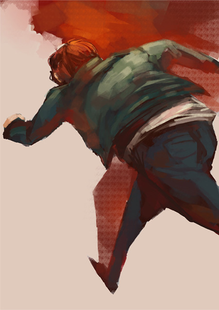
a sketch in painter 8edit: removed crappy text (it won't happen again, haha), and took some of peoples suggestions.
Related content


Comments: 37


Ah I love the stock picture you used, I've got a whole folder dedicated to floating/falling/flying stock photos, I love the rough look to it!
👍: 0 ⏩: 0


very expressive, i think when you draw, it 's one move directly, i like that
well done
HIKS
👍: 0 ⏩: 0


I like your black lines, they wouldn't be needed, but a nice touch, like a Mas of X bonous!
👍: 0 ⏩: 0

oh no! i've gone and faved another! the lurid quality of this more than compliments the pose.
👍: 0 ⏩: 0

Damn good job man. Congrats on adding another great peice.
👍: 0 ⏩: 0

I really like your style, the hands are especially pleasing to view. Good composition, also.
👍: 0 ⏩: 0


love the style as always. this totally reminds me of a scene from one of the animatrix shorts. nice work...
👍: 0 ⏩: 0

nice man. I like the newer version a bunch better. gives the char a better feeling of lift.
")
👍: 0 ⏩: 0


reminds me of the movie "waking dream" its all done in cartoon.. anyhow. i like
👍: 0 ⏩: 0

its..so beautiful. i love sketches. especially when its painted.
👍: 0 ⏩: 0
very pimp, man, as always.
not so sure on the typography, but I see the element it adds, which is cool.
the only thing I'd like to see is a vertical layout instead of the horizontal, with the figure either in the middle or near the upper third. as is it's too static. the middle alignment would still be static but with more of an up-or-down feeling, as if he were floating in space. moving the figure up would give the fig a sense of rising. either would be more effective in conveying the feeling I'm picking up on it.
👍: 0 ⏩: 0


absolutely beautiful work here.
i adore the entire thing..including the typography.
the colors are remarkable..and the pose...as if he's flying...splendid.
beautiful work!!
👍: 0 ⏩: 0


i love your work!!!!
keep it up. i don't want to miss one thing you do.
best wishes.


👍: 0 ⏩: 0

This picture is TOTALLY awesome. I love expressionism, it's so much fun to draw/paint as well.
👍: 0 ⏩: 0

I would agree with the ditching the text. Otherwise, quite nice. Great pose, nice texture and colour.
👍: 0 ⏩: 0

THis picture reminds me so much of the haunted house scene in The Animatrix... great stuff!
👍: 0 ⏩: 0

take out the awful text. It is taking away from the image.
👍: 0 ⏩: 1
 (Cool)")
excellent. Now that the text is gone, this is a keeper. (in fact, before you even did the edit, i had put the piece on my comp and removed the typo as well.. i really like the painting.  (Smile)")
👍: 0 ⏩: 0

Awesome. I just came from Ashley Woods' gallery; are you familiar with him? I'm sure you are, and are probably tired of being compared to him... but.. ya... I don't know where this is going.
Dude, you rock.
For seriously.
👍: 0 ⏩: 1

yeah, the dude is my hero
hes inpired many of my drawings recently.
danke!
👍: 0 ⏩: 0

Whoa ...
hehe ... very cool sketch ... I love the style
👍: 0 ⏩: 0

wonderful
the pose is so acurate even if oits a bit sketchy
i really like it
👍: 0 ⏩: 0

I love it! So messy but so clear. I might suggest that the colour of the text could be changed, but otherwise, it's great.
👍: 0 ⏩: 0

really cool sketch! most sketches are so boring, but damn you made it interesting... love the lines a lot
👍: 0 ⏩: 0

I really like the pose, very expert and accurate, but at the same time graphic and almost impressionist.
👍: 0 ⏩: 0


u bunghole!!!!!!!! I KNEW IT! u r ph34R t3h bukkakke ! BAD!!!! BAAAAAAAAADDDDDDDDDD
i like this

👍: 0 ⏩: 0