HOME | DD
 stalk — Project D.I.V.A: Trinity

Published: 2004-12-15 19:48:18 +0000 UTC; Views: 2089; Favourites: 29; Downloads: 351
Redirect to original
Description
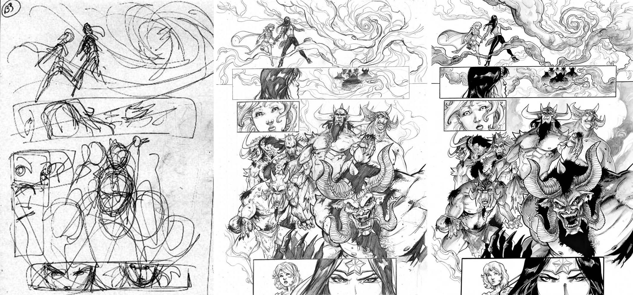
Cover pencils: Yours truly.Cover inks: The Amazing Stacie Ponder.
Related content


Comments: 15

Great stuff, I think the guy's face should be brought out more instead of thrown to the side like that. Pro work.
👍: 0 ⏩: 0

Excellent pencils and good inks! I noticed that the inker did, in this case, simply trace. I also know some inkers only ink what you give them (have had a few of those) and therefore the penciler has to supply the line weights and such.
...I take that back. Stacie pulls lines differently than you draw them, feathering them rather than using a slicker style to finish.
While I'd like to see Stacie bring some of her(? I assume a her, could be wrong, apologies if I am) own flavor to the inks, at least she isn't butchering the pencils, which I have also had happen to my pencils (and they saw print that way!! I think I'm still bitter...). I DO see a variation from your lines here and there, but it's almost negligable and I totally understand not knowing how to handle textures or distances in ink. So I'm not dissing her abilities at all, she's good and has vast potential, but I think it would behoove her to learn these things rather than simply tracing your lines (I simplified her process in this, I know she put in more work than just 'tracing'), but an inker should not be a tracer... they should bring something new and dynamic to the pencils. Anyway, despite anything I might have said, this is a great pin up and very well done, both drawn and inked! Good luck to you both and keep up the great work! Huzzah!
(Your pencil style here is kinda Alan Davis meets Scott Campbell. *LOL* odd blend, but very cool.)
👍: 0 ⏩: 1

I totally understand your opinions on this piece and agree on some points.
I tend to render the Hell out of my stuff, line weights, shading, texture...for the most part I feel that inkers would be bored to ink my junk as the "room" for them to add their flair is almost non-exsistent without changing the look of the art. That's just my old fashioned approach to how I draw and I too have had my pencils butchered by inkers (established inkers at that!) and it still makes me wary of handing off the pages.
What I like about Stacie is her consistency and ability. There's alot of people out there that can ink like a pro, but when your only doing a page or two of inks a week, something's not right. Also I find that she brings something out in the inks that my pencils just lack. Maybe it's just me, but I find her work very professional and well done. Then again, I'm no inker so take it all with a grain of salt.
Thanks for commenting and happy holidays.
👍: 0 ⏩: 1
Yeah, I started doing that to deter the butchering of art, but I know what you mean. There's some pieces in my gallery inked by my friend, Charon, also an artist. She does great work and brings a spark to the art, but in her case, she didn't know about line weights and breaks and such, so I added them in for her to get some dynamics going. Once that happened, the pieces really popped with the mix of her style and the added help. (To be fair, she is more an illustrative artist who dabbled in comics than a comics artist who dabbled in illustration like myself). So I know exactly what you mean and agree. Stacie IS good, never said otherwise, and it takes a GOOD hand and eye to NOT butcher pencils, too, so just in that sense I know she has talent.
Plus, there may be no real need to add too much to your pencils. I know some inkers who will redraw panels and pages if needed because light source is off or anatomy or even perspective. (Chance Wolf was one of these), and they make the pencils looks better. But sometimes pencils don't need the help and rather than being an inker's nightmare, I think you would be the inker's best friend because all they have to do is INK and not redraw, which isn't really their job. I hadn't thought of all that before when I commented first. So rather than saying her own style isn't on the table, I guess I should have thought that maybe she's just fine and happy with the fact she can do her job and not yours, as well. Which is a good thing.
Still, excellent job to you both!!
Merry Christmas!
👍: 0 ⏩: 0

nice...u both made an excellent pic here!...u got someone to color it?...i would be glad to if u hook me up with a hi res of the inks!
👍: 0 ⏩: 1
Thanks for the kind words and the coloring offer but the inker has the inks. I've just got a really shoddy copy of the pencils.
👍: 0 ⏩: 1
cool man well hook me up with her email or DA page so i can get the big version!!
👍: 0 ⏩: 0


Amazingly clean, both on the pencils and to your friend on the inks! I especially love how you layed out all the shadows. Im extremely envious....
GJ
👍: 0 ⏩: 0


This is fantastic. I love the way the guy looks at the top right.
👍: 0 ⏩: 0


👍: 0 ⏩: 0

Very cool work man, the inks are amazing too.
-Nick
sndq

👍: 0 ⏩: 0

Awesome pencils and inks! I like the angle too, the only thing I noticed that I feel the need to nitpick about is that I think it would have been awesome if they were all looking in the same direction. It would have been the coup de grace to this otherwise perfect composition, giving it balance. But like I said, that's a nitpick.
👍: 0 ⏩: 0