HOME | DD
 StefanHuerlemann — Daemon
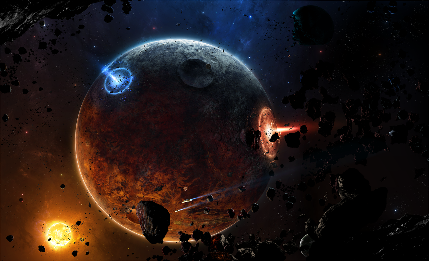
Published: 2010-12-06 11:51:24 +0000 UTC; Views: 24730; Favourites: 579; Downloads: 1218
Redirect to original
Description
Finally something new...I really went for quality and detail in this piece, I hope you enjoy it.
")
Inspiration was `taenaron
A bunch of thank to:
`hameed - for his asteroids
~Lyridae - for his help and asteroids
~Xenofish - for his help from the beginning to the end
~Ov3RMinD - for his help
*kire1987 - for his well thought and helpful critique
and the space art channel. Those guys gave me some feedback, too^^
EDIT:
Wallpapers added! Following sizes:
1280x1024
1440x900
1600x1200
1680x1050
1900x1080
1900x1200
If you like my work, please don't forget to watch me
 (Wink)")
This and many other works in my gallery are avaible for commercial use. Contact me for prices and wishes.
Related content


Comments: 77

thanks a lot for your cool critique. But I don't really get your point with the light, sry. Could you eventually mark the bad parts and show it to me? Because I don't see any lines, sry
👍: 0 ⏩: 1

Okay, I just realized after looking at the image from a different screen, the scan-lines aren't there. My bad; faulty screen.
")
👍: 0 ⏩: 1
^^
ok, thats good for me xD
Because while making the work I really wanted to look for it, that there aren't such lines (in some of my other works, there are some and I always hated them)
👍: 0 ⏩: 1
Eh, sometimes even technical errors can hinder great artwork.
👍: 0 ⏩: 0


Vision
Originality

You've really outdone yourself with this one. e.deviantart.net/emoticons/w/w… " width="15" height="15" alt="
I can see where the inspiration is coming from. You got the typical `taenaron color scheme here and it is working really well.
The details and quality of effects in your scene are astonishing. They seem to be very carefully placed, yet there's enough action to enjoy everywhere. Also the craters and the planet texture itself are among the best I've seen in a while.
My one and only concern here would be the asteroids. Actually I really like the rough structure you gave them, but since there are so many and all of them with very sharp textures they kind of distract from your focal point.
(If you compare your asteroids with actual photos from asteroids in space you will also notice that they usually have much softer moon-like textures and they become rounder the bigger they are because of their gravitation. This point may be over the top, I just felt to mention it. e.deviantart.net/emoticons/s/s… " width="15" height="15" alt="
 (Smile)")
Another issue I see here is that they don't seem to be properly affected by your light sources. Some orange colored highlights on the left and maybe some tints of blue on the right can't hurt, I think. e.deviantart.net/emoticons/w/w… " width="15" height="15" alt="
A spectacular work nontheless. Good job!
👍: 0 ⏩: 1
hey,
thanks a lot for this awesome critique
I now what you mean with the asteroids. I like these rough - structured roids because they look kinda demonic (name: daemon). But you're right, there are too much spiki roids. But I've got so many layers with little asteroids(those in the background) which have kind of a rough silhouette and I would be more work to edit all those than make a new one
I also added some colour highlights on the roids and I think it looks kinda better now
👍: 0 ⏩: 0


Oooohh me and my friend are writing an alternative Doctor Who script for ourselves because we don't like the way it's turned and this gave me a really chilling idea for an episode it gave me goosebumps. Thanks
👍: 0 ⏩: 0


thx, freut mich, dass es dir gefällt.
👍: 0 ⏩: 0

Why did the song pop into my head be; 'the primary colors are 1, 2, 3; red, yellow and blue'?
Very nicely done though; it's like it really is a real place.
👍: 0 ⏩: 1
thank you
👍: 0 ⏩: 1
You're welcome, my good sir (or woman)!
👍: 0 ⏩: 0


u gta post a tut for how u do such epic scenery. i wanted to do stuff like this with Bryce but i stopped before i got anywhere
👍: 0 ⏩: 0
ur definitely getn a special folder fo ur art in ur group
👍: 0 ⏩: 1


A very gorgeous piece of work Zword its complexity with its destructive power is appearant and amazingly beautiful you have some very amazingly wonderful pieces and I am looking forward to seeing more from you these are simply astonishing
👍: 0 ⏩: 0


sehr schönes space-artwork! gefällt mir sehr gut
weiter so!
👍: 0 ⏩: 0
sehr schönes space-artwork! gefällt mir sehr gut
weiter so!
👍: 0 ⏩: 0


OMG !!!!!
i can see some skills n talent right there....
Keep up the good work....
wish i could do something like theseeee.......
👍: 0 ⏩: 0

Reminds me of the "ravening planet-busting beams" of the old Lensmen series by "Doc" Smith!
👍: 0 ⏩: 0


astonishing... I like to take an X-Wing and fly around it...
👍: 0 ⏩: 0


The yellow brightness on the planet should be stronger though mate! You took some of the taenaron's piece ideas and mixed them with yours, that's a nice thing
👍: 0 ⏩: 0

Fantastic Work !
Don't you have a 1920x1080 version ?
👍: 0 ⏩: 0


Mir gefällt besonders, wie Du die Primärfarben verwendet hast <3 Geniales Bild
👍: 0 ⏩: 0


Hey zwordi
Schöne Arbeit die Farbe finde ich sehr gelungen bis auf die blaue Explosion sieht nicht so real aus
GL
👍: 0 ⏩: 1
muss sie auch nicht, solche bomben gibts nämlich noch garnicht
thx^^
👍: 0 ⏩: 2
| Next =>