HOME | DD
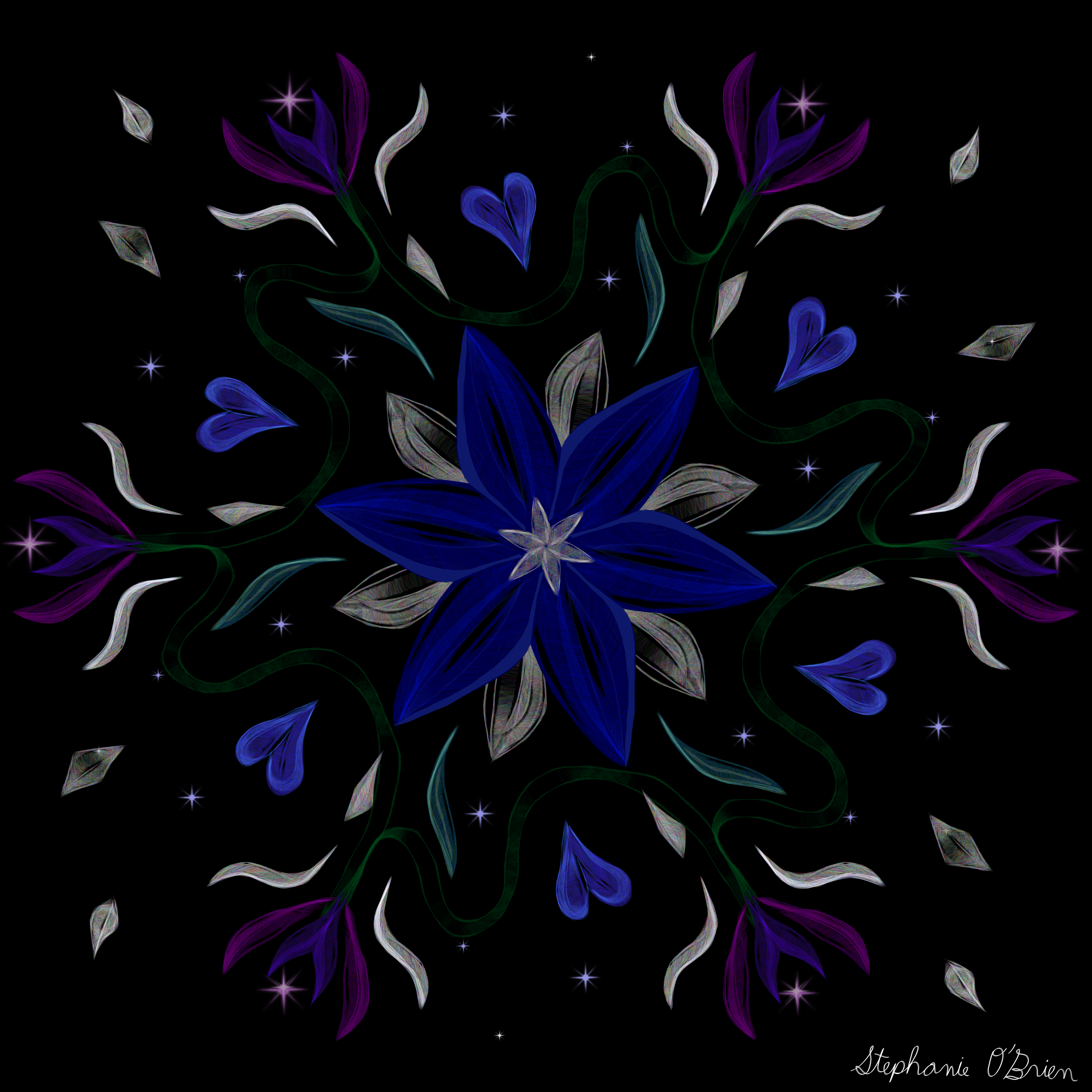
 StephOBrien — Symmetric Pattern: Blue Starflower
#floral #floralart #floralpattern #symmetrical #flowerart #patternart #symmetricalpattern
Published: 2019-03-25 02:32:49 +0000 UTC; Views: 389; Favourites: 25; Downloads: 0
Redirect to original
Description
Man, these symmetric patterns are fun to draw. And this time I made it at print resolution, so I can share it in my Society6 store and my RedBubble store !I tried to remake my first symmetric pattern at print size, but one of the main brushes I used for it simply refuses to function at that size (its maximum size is a grand total of one pixel), so I had to put that one on the back burner until I can find a substitute for that brush.
")
Here are a few products I think it looks particularly good on:
Tote bags
Art prints
Wall clocks
Wallpaper
Throw pillows
Duvet covers
Shower curtains
Coffee mugs
Travel mugs
Beach towels
Cutting boards
I hope you see something you like!
Here's the Tumblr link, in case you want to reblog it: stephobrien.tumblr.com/post/18…
If you want to learn how to draw patterns like this, check out my tutorial here .
If you want to help me make art faster, get early access to completed art, and get exclusive access to works in progress, please consider supporting me on Patreon . If you want to help me without the monthly commitment, you can also support me with a one-time donation on Ko-fi.
Related content


Comments: 28

Fantastic pattern!! Although I can't quit feel what I want to do with this pattern, it is certainly something that calms my mind as the image reminds me of the night blooming flowers. I didn't think a blue could glow in the dark this well and this pattern certainly proved me wrong. Although the colours are cold and in black background, it is very nice to look at as it (to me) presents a very nice image of cool beauty. I can just imagine the flower growing on top of a hill under starry sky during a cold night.
The most I love about this image is the textures of the flower presented in the image. Most digital drawings nowadays presents blends that are too smooth and have lost the texture that a piece of work should contain. From the surface of it, this did not seem complicated but it did make me wondered how you have created such a colourful grey. Upon enlarging the image, I cannot believe how much strokes, colour and effort you have put in to presenting such a simple but beautiful pattern. Originally the start I thought of this as a repeat pattern, but knowing the details, one large one is simply sufficient.
There are also few other points I love about this pattern:
- the shape of the heart is done in a way that can be either pedals or hearts
- the flower will always be in the centre no matter how and where you look.
- the hint of purple on the side simply just makes the overall image more vibrant but does not take any attention away from the centre.
Unfortunately, I personally do not have an suggestions for this pattern nor further improvements I want from this as I would take the pattern as it is.
Thank you for sharing such a beautiful pattern  (Smile)")
👍: 0 ⏩: 1

Thank you so much for the detailed and well-thought-out compliments! I really appreciate you taking the time to share your thoughts.
👍: 0 ⏩: 1
No Problem, really love your patterns. They are very inspirational!!
Look forward to see more !!
👍: 0 ⏩: 0

Hello, good day, I'm from ProjectComment .
The pattern looks great by the way. I like how it radiates out from the flower, with the blue flower being in the center. Everything radiates from it so I’m guessing you used some sort of replicating feature on Krita to achieve this effect. Looking at your earlier design, I do see you improving quite a bit from that- there’s more going on in pattern in this one than the last one. The cool colors go well with each other, along with the neutral ones you’ve used in this one. It’s not easy to tell were the center point of repetition is, as the flower looks a lot more complex than the rest, and overall it looks great.
As for techniques with brushes and what not, I’m not sure what to suggest since you seem to have a basic grasp of using what is already available, the scratchy look the brush provides, especially zoomed out adds a nice contrast to shading and lighting already, so I think you’re on the right track.
If there is something that I would suggest it would be to add in some warmer colors here or there to pop out some things in the picture, or to balance it out more since its mostly cool colors. Also the dark shade of green that connects the stems of those purple(ish) flowers (at least I think they’re flowers) are kind of difficult to see, and may not come up when printed, so try to brighten them up a bit so it’s easier to see them.
Overall this looks fantastic, and I can easily see this being printed on things.
Keep up the great work.

👍: 0 ⏩: 1
Thank you very much for the compliments and advice! Sorry it took me so long to reply; it was a busy month, and several of my deviations got added to one of ProjectComment's contests at the same time, so the resulting flood of comments outpaced the time and mental energy I had for replies for a while. >_<
I agree that the green vines are a bit too dark to be as easily visible as they should be. As for balancing warm/cool shades, I usually aim more for a consistent theme than for balancing multiple color themes, but it sounds like something worth watching out for in patterns where I have more than two or three colors.
Thanks again!
👍: 0 ⏩: 1
You're Welcome.
No worries, it happens.
👍: 0 ⏩: 0

This painting is cool. It looks almost like the background from earthbound.
👍: 0 ⏩: 1
Thanks! I haven't played that game yet, but I seem to recall hearing it was a strong influence on Undertale, which I really enjoyed.
👍: 0 ⏩: 1
Thank you! I am getting better at this with each new pattern I make.
👍: 0 ⏩: 1

I can see that! Keep this up!
👍: 0 ⏩: 0

")

Hi! I love the design, especially the sparkles! It adds a really nice touch, with the hearts and plants making a simple yet complex pattern. My only thing would be, let your designs show a little more! They’re a bit translucent, and the darker colors make them sort of blend into the background. I feel like this piece would just be a notch more amazing with that one thing.
(btw love the chalkboard effect!)
👍: 0 ⏩: 1
Thank you for the feedback! I agree, it is a bit dark, and making it lighter would probably make it pop more. I'll keep that in mind for future patterns.
👍: 0 ⏩: 1


Thank you! It is kind of like a colorful flower snowflake, haha.
👍: 0 ⏩: 0

This piece has a chalk style look to it.. I love it!!
Very nice indeed!!! love this on the black background!!!
👍: 0 ⏩: 1
I hadn't though of it as chalk before, but now I can't unsee it, haha. Thank you so much for the compliments!
👍: 0 ⏩: 1