HOME | DD
 stevesm — King Prawn - Print Version
Published: 2003-05-01 13:34:10 +0000 UTC; Views: 438; Favourites: 4; Downloads: 74
Redirect to original
Description
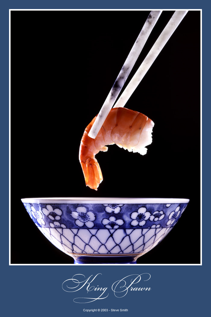
For my second print, I thought I'd try scanning from the original 5x4 transparency for quality. Unlike the original submission: King Prawn this is the pure shot, not hand-coloured. I did do a few bits of retouching for hairs and changed the levels to give the contrast a bit of biteShot on a 5x4 view camera back when I was at college for Photography/Design.
.
Related content


Comments: 19

Very very nice, like how you managed colours from the other original shot  (Wink)")
")
👍: 0 ⏩: 0


beautiful lighting, beautiful props -- I want those chop-sticks!
👍: 0 ⏩: 0


Agree much better than the original post. nice work!
👍: 0 ⏩: 0

i love this piece... i don't even exactly know why, but something about it just 'fits'. great piece of art!!
👍: 0 ⏩: 0

i like how everything is very clear and sharp against the black background. the lighting is interesting as well. ad the subject... very cool
mm... prawns....
cheers
~jk~
👍: 0 ⏩: 0


I don't see very much changes with your previous one, only the colors are more natural. That makes it better, definately..
David
👍: 0 ⏩: 0

Mmm, this one looks alot better then the other one...
I do not know why exactly ...
Very interesting capture.
Very nice colours and the idea is realy nice.
The one thing that I mis the bottom of that cup.
👍: 0 ⏩: 0

Interesting how you barely notice the difference at first glance. I quite liked the hand coloured one, as it's appears to be smoother and the colours seem more pure in a way. The difference is very minute though and the shot itself remains one of your best. Again, I think the inner border could've been just a little thinner, but all in all I'd say this would make a great print. I like it a lot
👍: 0 ⏩: 0

geeze this could be an add for something! Wonderful shot. I want that bowl *L*
and mmmm yum I love shrimp *L*
👍: 0 ⏩: 0

again, the translucent quality of the chopsticks and prawn, brought out by the back/side-lights, is exquisite. nice, simple, detailed, stylish...
you is gonna be rich wif all them prints, duuude
btw: love the font you're using for your titles...pray tell, what is it ?
👍: 0 ⏩: 0


I really like this.
It looks better than your original post.
Catches your eye... Nice work!
👍: 0 ⏩: 0

Very nice. Simple yet effective. Looks like something that would be hanging in a hotel restaurant or something. Good job.
👍: 0 ⏩: 0
