HOME | DD
 stevesm — Sepia Field - Print Edition

Published: 2003-05-08 12:20:50 +0000 UTC; Views: 150; Favourites: 1; Downloads: 41
Redirect to original
Description
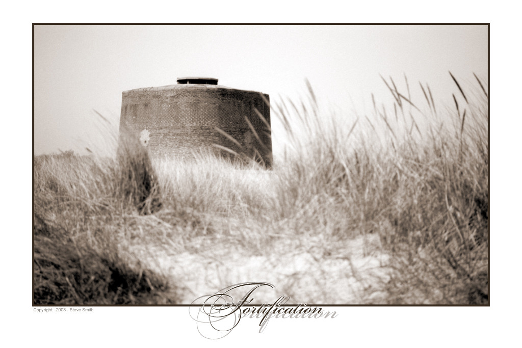
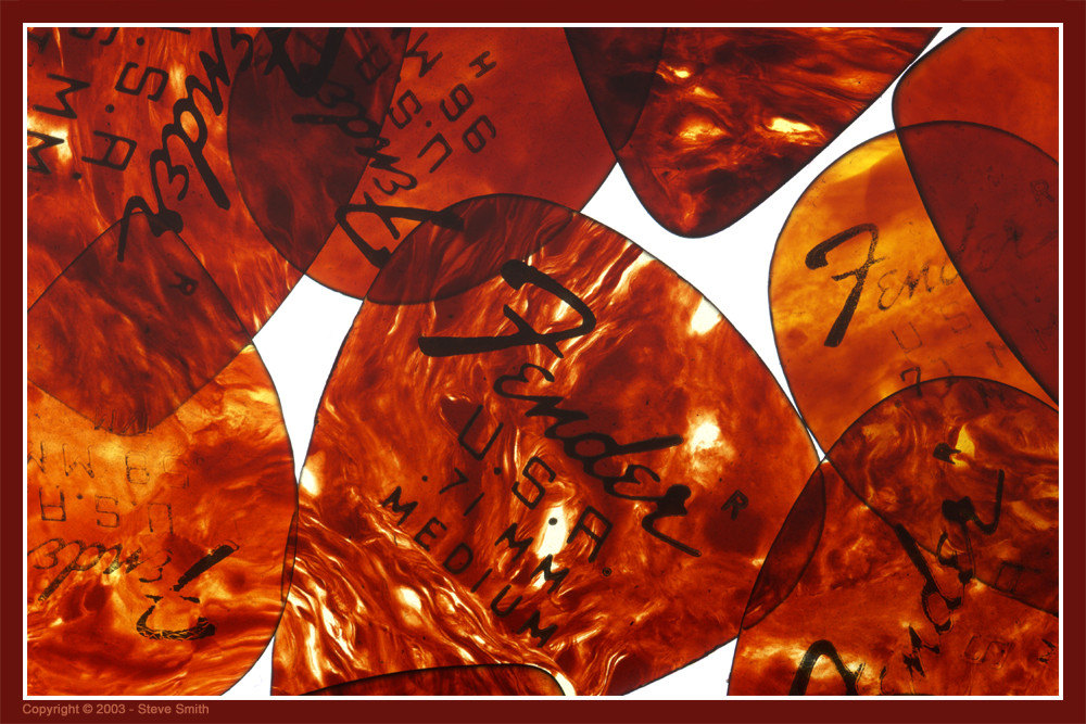
Another take on a previous submission of mine Field 1 Specifically for dAPrints. I couldn't decide if I liked the Sepia or the Blue version so I'm going to upload both.
Related content


Comments: 4

My personal fav colour for this shot would be the sepia. Makes the shot look old, which works very well together with the deep contrasts and the softened appearance in making this look like something straight out of a storybook. I like this one a lot
👍: 0 ⏩: 0

I think that both versions are very good, but I like this one just a little bit more! It's lovely!
👍: 0 ⏩: 0

I think the sephia works a lot better for this photo...and i really like the softness to it. I like the way you are doing the type too...it looks really good! I wish I would have thought of it *lol!*
👍: 0 ⏩: 0

I personally like the sepia tone better. I think that sepia always gives a better quality to a photo. Nice work Steve!
👍: 0 ⏩: 0