HOME | DD

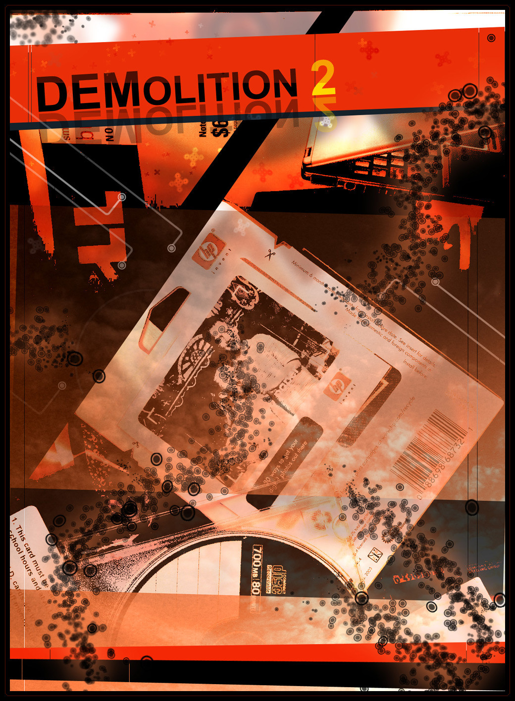
SystemOverload — DEMOLITION 2

Published: 2004-03-25 22:35:10 +0000 UTC; Views: 359; Favourites: 4; Downloads: 105
Redirect to original
Description OK.. well a while back I made a piece that everyone seemed to like. I decided to make another version because it was so fun to make. It was made from throwing a bunch of trash I had laying around, onto my scanner.


You can find the original here:
DEMOLITION
Related content
Comments: 21

3mil30 [2004-12-31 14:30:27 +0000 UTC]

the colours are really lovely

👍: 0 ⏩: 1

SystemOverload In reply to 3mil30 [2004-12-31 19:30:41 +0000 UTC]

thank you very much!

👍: 0 ⏩: 0

Celia-TheOutlander [2004-12-05 03:47:55 +0000 UTC]

Oh, i like that! *Adds to favs*

👍: 0 ⏩: 0

l1b3rat3 [2004-12-03 20:34:08 +0000 UTC]

Very cool man, love the kind of grungish technique used, nicely done

👍: 0 ⏩: 1

SystemOverload In reply to l1b3rat3 [2004-12-03 21:27:28 +0000 UTC]

thanks buddy.. I appreciate it!

👍: 0 ⏩: 0

r-on3 [2004-12-03 20:33:53 +0000 UTC]

I like it, the color scheme is very nice, you could make an internet website with it

👍: 0 ⏩: 1

SystemOverload In reply to r-on3 [2004-12-03 21:28:42 +0000 UTC]

haha indeed you could

👍: 0 ⏩: 1

r-on3 In reply to SystemOverload [2004-12-05 13:02:35 +0000 UTC]

hehe, you could give it a try too

A portfolio is always a good thing to promote yourself, with this picture you can do a flash based website using the circles as icons etc

You know what i mean

👍: 0 ⏩: 1

SystemOverload In reply to r-on3 [2004-12-05 17:02:32 +0000 UTC]

indeed.. a very good idea

👍: 0 ⏩: 0

xx1cexx [2004-03-27 05:12:28 +0000 UTC]

love that kind of work !!! good job

👍: 0 ⏩: 0

basic-hater [2004-03-26 22:33:23 +0000 UTC]

reminds me of the background off Tony hawks underground gmae

👍: 0 ⏩: 0

h16 [2004-03-26 19:55:08 +0000 UTC]

Good stuff bro, Love the colors and presentation. keep at it.

👍: 0 ⏩: 0

nickick [2004-03-26 09:17:09 +0000 UTC]

damn those colors play so well together great work bud!

👍: 0 ⏩: 0

phoenix07 [2004-03-26 07:40:33 +0000 UTC]

fuck that looks good! well done!

👍: 0 ⏩: 0

skargrim [2004-03-26 06:26:40 +0000 UTC]

Yep, it's cool, nice random style.

👍: 0 ⏩: 0

TwilightEmbraced [2004-03-26 04:25:36 +0000 UTC]

Nice!!! ^.^ just like the other versino. aswesome!

👍: 0 ⏩: 0

bullseyepimp [2004-03-26 01:05:20 +0000 UTC]

Very cool and original, i love the colors

👍: 0 ⏩: 0

l1b3rat3 [2004-03-26 00:26:45 +0000 UTC]

damn man awesom piece love the composition awesome!!

👍: 0 ⏩: 0

darkicefx [2004-03-26 00:13:20 +0000 UTC]

haha nice....notice the school ID over there (looks around for everything else he notices)...*walks away*

👍: 0 ⏩: 0

nightcom [2004-03-25 23:37:29 +0000 UTC]

Very nice

👍: 0 ⏩: 0

realization [2004-03-25 23:17:35 +0000 UTC]

Looking good mate,liking the colors

👍: 0 ⏩: 0