HOME | DD

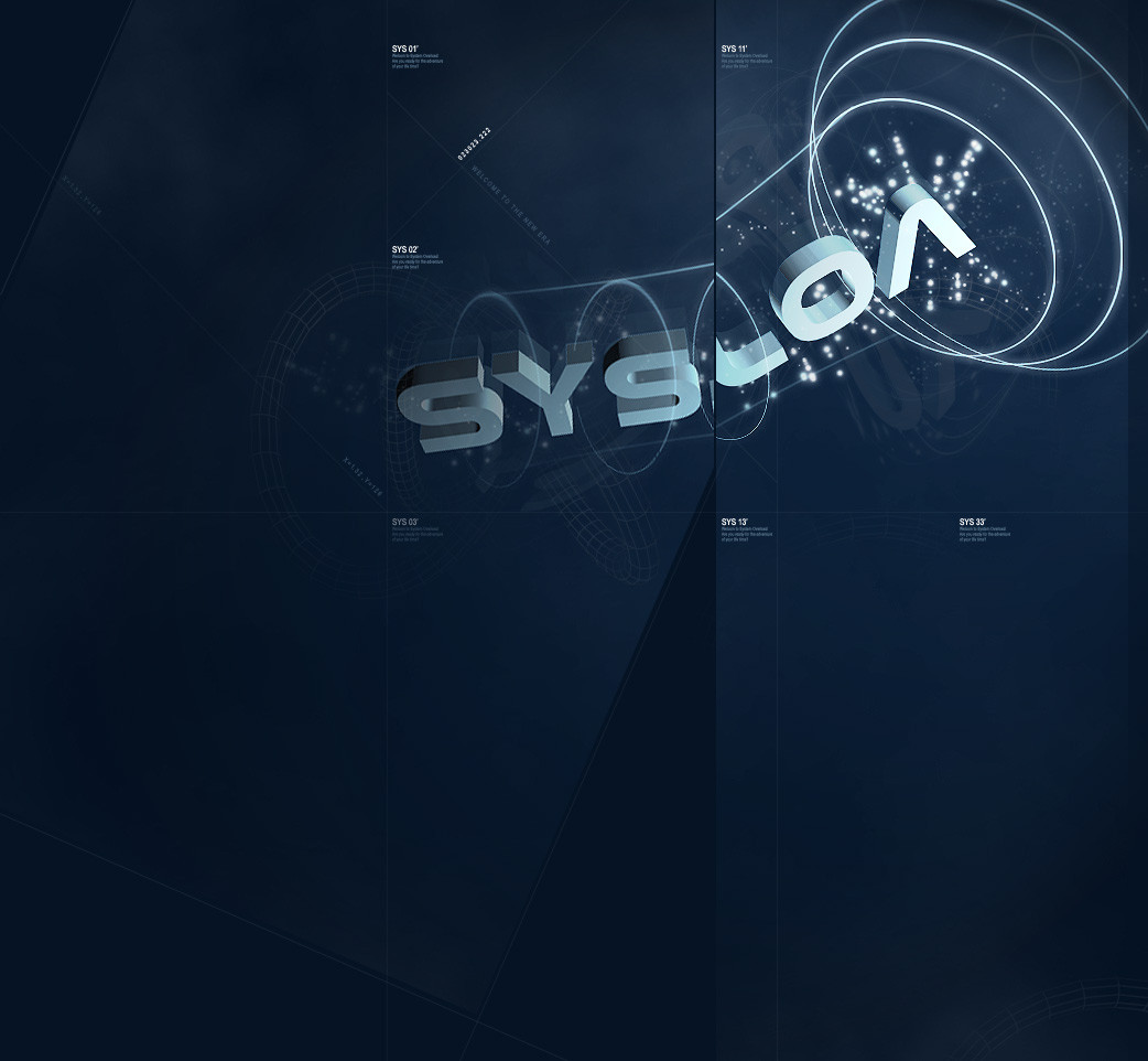
SystemOverload — SYS.LOA

Published: 2004-02-17 22:02:23 +0000 UTC; Views: 639; Favourites: 5; Downloads: 380
Redirect to original
Description Just messing around with different designs for System Overload.. that is if the site ever comes back
Related content
Comments: 27

EAG5 [2005-05-02 13:41:29 +0000 UTC]

-
-

nice design , love that color blue
great job

-

👍: 0 ⏩: 1

SystemOverload In reply to EAG5 [2005-05-16 14:37:11 +0000 UTC]

thank you very much!

👍: 0 ⏩: 0

gunshydaffodil [2005-04-30 12:01:30 +0000 UTC]

Awesome work. Looks so professional dammit.

👍: 0 ⏩: 1

SystemOverload In reply to gunshydaffodil [2005-05-01 06:00:11 +0000 UTC]

thank you very much!!!!!!!!!

👍: 0 ⏩: 0

phoenix07 [2005-04-23 11:25:26 +0000 UTC]

that is awesome, very complex but very simple at the same time. its relaly unique style.

👍: 0 ⏩: 1

SystemOverload In reply to phoenix07 [2005-04-29 16:19:19 +0000 UTC]

hey thanks a lot buddy!

👍: 0 ⏩: 0

nickick [2005-04-20 07:11:00 +0000 UTC]

pretty sweet bud

👍: 0 ⏩: 1

SystemOverload In reply to nickick [2005-04-22 16:09:46 +0000 UTC]

thanks a lot buddy!!!!!!

👍: 0 ⏩: 0

redniet [2005-04-18 23:24:51 +0000 UTC]

cool design, i like it

👍: 0 ⏩: 1

SystemOverload In reply to redniet [2005-04-22 16:10:10 +0000 UTC]

thanks a lot buddy!

👍: 0 ⏩: 0

OwNz [2005-04-18 17:08:23 +0000 UTC]

very very purdy

👍: 0 ⏩: 1

SystemOverload In reply to OwNz [2005-04-22 16:08:36 +0000 UTC]

thank you very very much!

👍: 0 ⏩: 1

OwNz In reply to SystemOverload [2005-04-23 23:13:10 +0000 UTC]

no problemo

👍: 0 ⏩: 0

realization [2005-04-18 16:10:45 +0000 UTC]

Now that's better,but remove the small slightly vertical text and there's some jaggies on the small rings,keep going

👍: 0 ⏩: 0

affekt [2005-04-18 15:12:39 +0000 UTC]

Pretty cool. I like the cut. The dark blues are nice too.

👍: 0 ⏩: 1

SystemOverload In reply to affekt [2005-04-18 15:14:49 +0000 UTC]

hey thanks buddy

👍: 0 ⏩: 0

keo-0 [2004-04-13 02:08:11 +0000 UTC]

very nice designindeed, it reminds me of 2Advance Studio's style slighly

👍: 0 ⏩: 0

l0natic [2004-03-21 21:24:44 +0000 UTC]

great design, i love the fact that it gets cut up at one point, very nice

👍: 0 ⏩: 0

phoenix07 [2004-02-20 11:42:54 +0000 UTC]

omg... speechless _ you are now my fav. artist for sure


you and Sr-27 because you 2 guys make the exact style of art i want to make technical yet very poewrful ...

your so cool man.

👍: 0 ⏩: 0

stiangodo [2004-02-20 07:15:16 +0000 UTC]

like it!

👍: 0 ⏩: 0

xx1cexx [2004-02-19 02:03:47 +0000 UTC]

cool design !!!

👍: 0 ⏩: 0

luck22 [2004-02-18 21:23:10 +0000 UTC]

great design! i like it

👍: 0 ⏩: 0

realization [2004-02-18 12:20:31 +0000 UTC]

Cool

👍: 0 ⏩: 0

skargrim [2004-02-18 08:28:03 +0000 UTC]

Slick... I like it, interesting design.

👍: 0 ⏩: 0

h16 [2004-02-18 04:08:02 +0000 UTC]

Good stuff bro, like the effects and the 2d work here, keep at it.

👍: 0 ⏩: 0

hoshiboshi [2004-02-18 01:52:19 +0000 UTC]

interesting... I like it!

👍: 0 ⏩: 0

darkicefx [2004-02-17 23:25:43 +0000 UTC]

pretty nice

👍: 0 ⏩: 0