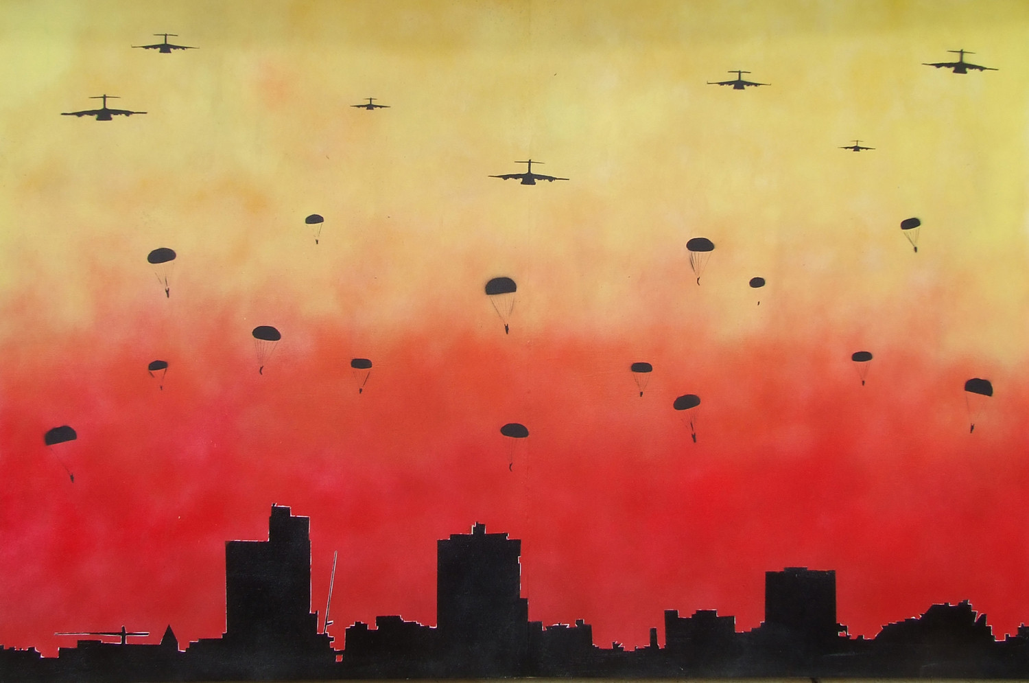
HOME | DD

T-freak — Paranoid

Published: 2006-01-31 09:44:09 +0000 UTC; Views: 1090; Favourites: 28; Downloads: 101
Redirect to original
Description um big ol' canvas job
all spray paints. its betta in person cause is bid and the colours r pretty intense but hey... i like it
Related content
Comments: 24

spurer [2007-02-16 16:33:11 +0000 UTC]

really nice one

👍: 0 ⏩: 0

thoughtsblack [2006-10-28 22:49:33 +0000 UTC]

i wish i could see this in person, but it looks still looks awesome on my computer screen.

👍: 0 ⏩: 0

re-evoltn [2006-10-08 20:45:15 +0000 UTC]

overall i like it, was the white line around the buildings intentional? i cant decide weather i like it there or not ha

👍: 0 ⏩: 1

T-freak In reply to re-evoltn [2006-10-09 05:25:25 +0000 UTC]

lol yeah, it wasnt but likie u i could decide whether to fix it or not so i left it, mixed response to that

👍: 0 ⏩: 0

ThePpeGFX [2006-10-05 08:23:53 +0000 UTC]

I don't think the fade is too harsh, as someone says earlier, it gives it a nice atmosphere. A small shame about the city line not matching up but that's nothing big.

Good stuff.

👍: 0 ⏩: 0

lightcube [2006-07-02 21:45:20 +0000 UTC]

I love the concept and idea behind this.

👍: 0 ⏩: 0

cleardefination [2006-06-26 04:18:19 +0000 UTC]

this is one is really :cool:

👍: 0 ⏩: 0

disastrous [2006-06-25 22:33:54 +0000 UTC]

Beautiful!!

👍: 0 ⏩: 0

ozzybozz [2006-06-25 16:54:11 +0000 UTC]

this is really cool

👍: 0 ⏩: 0

Maugin666 [2006-06-25 16:09:41 +0000 UTC]

Awesome work ^^ Fav.

👍: 0 ⏩: 0

strangemuse [2006-06-25 16:03:26 +0000 UTC]

That's freaking awesome.

👍: 0 ⏩: 0

greasemunkey [2006-03-05 11:13:47 +0000 UTC]

hay that is realy good.and its ems little bro

👍: 0 ⏩: 0

EmaRyan [2006-02-16 05:34:21 +0000 UTC]

That's awesome... I shall steal it from you, Mwahahaha!

👍: 0 ⏩: 1

scorch87 In reply to EmaRyan [2006-02-19 13:37:49 +0000 UTC]

not on my watch! its above my computer!!! LOVE U TOM!

👍: 0 ⏩: 1

EmaRyan In reply to scorch87 [2006-02-20 09:06:42 +0000 UTC]

a HAH! I'll hold Tom ransom for it...

👍: 0 ⏩: 0

ZyR0 [2006-02-11 05:56:16 +0000 UTC]

oh shit, thats ill! dont throw any text on it, it might ruin the feeling of it.

👍: 0 ⏩: 1

T-freak In reply to ZyR0 [2006-02-11 06:33:23 +0000 UTC]

thanx bud!

👍: 0 ⏩: 0

T-freak [2006-02-01 12:11:54 +0000 UTC]

does ne one think i should add some text to add meaning and stuff?

👍: 0 ⏩: 0

moshiah [2006-01-31 13:17:51 +0000 UTC]

Killer. Nice work.

Fix the white outline and it's gold.

👍: 0 ⏩: 0

truemarmalade [2006-01-31 13:16:27 +0000 UTC]

Looks very dramatic, nice job!

👍: 0 ⏩: 0

boomhouse [2006-01-31 13:00:32 +0000 UTC]

wow... i dont know... its wonderful!

👍: 0 ⏩: 0

Wendellnz [2006-01-31 10:10:11 +0000 UTC]

This looks pretty cool, but I think the fade between the red and the yellow is way too harsh.

👍: 0 ⏩: 1

T-freak In reply to Wendellnz [2006-01-31 10:13:53 +0000 UTC]

hmm.. yeah i was originally gunna put the red lower 2, but this looked sorta more firey. thanx 4 the comment man it helps heaps!

👍: 0 ⏩: 1

Wendellnz In reply to T-freak [2006-01-31 10:19:54 +0000 UTC]

No worries, keep it up.

👍: 0 ⏩: 0