HOME | DD
 Tallowick — Dragonslayer Ornstein
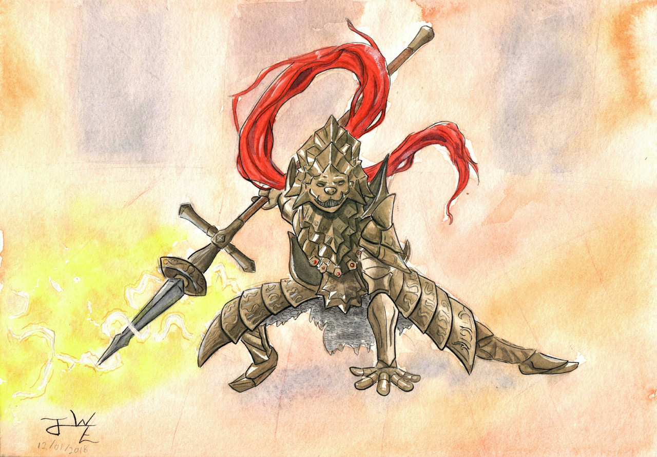
#darksouls #dragonslayer #fantasy #ink #spear #traditional #watercolors #watercolours #ornstein #fanart #dark_souls #darksoulsfanart #dragonslayerornstein
Published: 2019-01-12 20:58:17 +0000 UTC; Views: 863; Favourites: 39; Downloads: 0
Redirect to original
Description
Another month, another Fanart of the Month!Another iconic boss from Dark Souls, and the last fanart of the series for the foreseeable future.
When drawing Ornstein it's practically mandatory to exaggerate the length of his plume. And who am I to go against this convention
")
For some reason I couldn't get the lightning as defined as I would have liked and the pose gave me a bit of trouble as well.
As ever, any kind of critique and feedback is most welcome!
Done in watercolours, India ink and a little bit of gouache.
Related content


Comments: 22

I don't know anything about Dark Souls, but I think you did an awesome job with shading the armor and the lightning effects! I particularly like the shading in the red mane (I forget what it's actually called XD).
👍: 0 ⏩: 1

Aye, thank you so much!
Luckily I find drawing highly detailed things mildly therapeutic instead of tedious XD
Ah, yes, the plume. As mentioned in the description, I think it's impossible to draw Ornstein without completely exaggerating it, and in a composition like this it helps a lot, because it's basically the only part of the armour that isn't that bronze-ish hue and makes the piece less monotonous. And the shading isn't nearly as glorious as you make it sound; I just mixed that red with a bit of purple and made a few lines XP
Thanx, man!
")
👍: 0 ⏩: 0

AHHhhh this is even better in its completion!
The plume and the subtle details in the armor just too perfect! The pose is perfect and as Balim said the pose is so dynamic! Also like Balim I am jealous of your ability to draw detailed armor X3
👍: 0 ⏩: 1
Thank ye kindly!
The plume did come out rather ravishing, I must confess
Well, I on t'other hand am jealous of your ability to draw characters with a balanced center of mass XP
And your critique helped SO much! Thank you, from the bottom of my heart  (Smile)")

👍: 0 ⏩: 1
No problem man! And drawing balanced centers of mass in characters is easy, just draw in Plantigrade >:3
👍: 0 ⏩: 0

")
Thanks! I had a lot of trouble with it, so I'm glad it looks good ^^
👍: 0 ⏩: 0

Woah that metal armor is spot on! Metal texture has always been a challenge for me and armor is super complex so whenever someone pulls it off I'm impressed. Also the plume looks so natural in it's movement, makes the piece feel even more dynamic!
👍: 0 ⏩: 1
Thanks, mate! 
And the plume is what makes this armour set, I agree
👍: 0 ⏩: 0
The longer the plume, the better ^^
Amazing art, you did really well and I love the pose ^^
👍: 0 ⏩: 1
YES! Feel the plume-y POWER XD
Thank you kindly ^-^
👍: 0 ⏩: 1
I headcanon it as his actual hair ^^ And it gets longer and longer and longer in my head!
👍: 0 ⏩: 1
When I first got his helm and saw it didn't have the plume I was seriously confused and I did consider the hair theory. But I kinda let it go when they added it in DS 3. I think they just didn't have decent enough cloth mechanics in one?
👍: 0 ⏩: 1
The plume in DkS3 was only added after the fans of the game signed a huge petition and it looks so much like old withered hair to me, that I adopted it as a headcanon, that our dear Nameless King cut off the hair of the deceased Ornstein and made it into the plume ^^
👍: 0 ⏩: 1
Oh yeah, I heard it was added in a later update, but I didn't know it was because of a huge petition (otherwise I would have been part of it! XP )
Ok, that theory makes so much sense, it's scary. Totally headcanoned here as well now!
👍: 0 ⏩: 1

Well, the thumbnail sure isn't doing any justice to that helmet. I never play Dark Souls, and admittedly my interest in the series is rather lackluster (despite being an avid gamer otherwise), so in general I can say that this is good 
As for your complaint about the lightning, personally it's more because the ambient background is rather too bright that the lightning can't pop out as well as it would have otherwise. Either that, or the color of the lightning just happens to be of relatively similar hue to the background (yellow vs cream), causing a lack of contrast which may contribute to the problem. As for the pose, I think it's already well done. If I have to nitpick, the left hand (a.k.a, the one not holding a weapon) feels hanging; The hand shape suggests that he's touching the ground, but the positioning as seen here shows that the hand is off the ground and thus the hand shape (spread out) looks a bit odd.
All in all, good job. I think I should also consider trying to do something more detailed like what you've been doing here (well, there was one time I tries drawing something from Bayonetta and the details needed scared me
👍: 0 ⏩: 1
That helmet... so intricate... so much detail... never again
Very true... I think you have unearthed one of the key components of drawing fan art that is generally done unconscious!
I think lack of contrast is the problem here, yes. I think I should have made a larger area around the lightning white and the arc themselves yellow. Always next time
That hand and I had some pretty heated disputes, let me tell you! In the end I settled for the result that displeased me the least out of the few I attempted. But yeah, it doesn't feel entirely grounded; probably should have put more thought into shadow placement
Thank you so much for the feedback, pal!
I happen to think your work is fairly detailed as it is. This thing is more along the lines of... complicated XP But I'd be interested in seeing how you tackle something like this.

👍: 0 ⏩: 1
About the lightning, what do you think if instead of your plan, you try to darken the overall background instead? I know, the biggest obvious problem is that you then need to slather a lot of dark colors on the paper which may not be practical, but lightning, as a light source, should cause scenery darkening to the viewer (although having said that, I don't quite remember if my eyes have indeed behaved like all those cameras which dim their own view if something incredibly bright shows up on screen
And well, thank you ^^ I still need to learn and practise a LOT about shadings, especially the subtle shadings of fold, creases and embossing, which thus makes me feel my drawings generally tend to feel relatively flat. But yeah, I think I should try doing something complicated again
👍: 0 ⏩: 0

Darn nice wickus, you really nailed the pose is awesome, the armor overall looks super great, yet the chest doesn't look like it's turned a bit while he has a arm going back.
👍: 0 ⏩: 1
I'm glad you think so!
Ok, this piece was borderline overambitious for me, I admit 
👍: 0 ⏩: 1
yeah it's really good it like it,
I totally get you really gave this artwork everything you have.
well now you explain it, yeah it's really messing with you.
i'm glad i could have been helpful.
👍: 0 ⏩: 0