HOME | DD
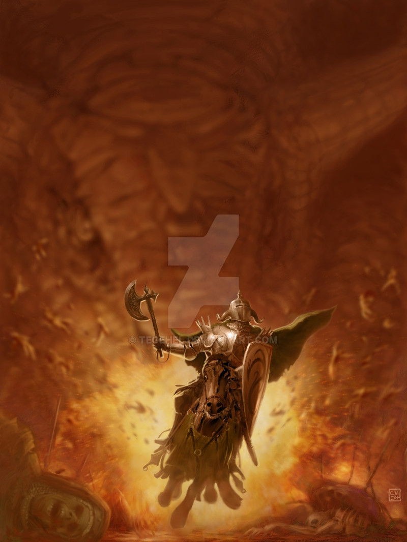
 tegehel — Soft-Shell Knight
Published: 2005-08-29 02:03:39 +0000 UTC; Views: 51105; Favourites: 832; Downloads: 3170
Redirect to original
Description
The name, Soft-Shell Knight comes from a Japanese delicacy called Soft-Shell Crab, a special kind of crab which has a soft shell and is lightly fried. Delicious! And now, you see the analogy, right?*** Prints available here: [link]
Related content


Comments: 88

")


It took a while to see the dragon in the background, very nice blurring to focus on the knight first.
👍: 0 ⏩: 0

mmm... the dragon in me agrees--- an absolutely delicious idea....
👍: 0 ⏩: 0

your brilliant use of focus and depth in this image are mind blowing. brilliant.
👍: 0 ⏩: 0

Oh wow, it took me a minute to see the dragon there!
Great work!!
👍: 0 ⏩: 0


I didn't even see the dragon until having read the discription. I then began to laugh profusely. I like it!
👍: 0 ⏩: 0

Beautiful use of light, colour and composition. Your talents for knowing where and what to put in detail really do this picture justice, the clever way you've silhouetted the horse's legs, the change in contrast depending on what you want the viewer to focus on is amazing. There is a lot to be learnt from this picture for those who are up and coming in digital art, like myself.
👍: 0 ⏩: 0

Amazing!!!!!!!!!!!! Strong!!!!!!!!!!!!!! GREAT!!!!!!!!!!!!!!!!!!!!!!!!!!!!!!!!!!!!!!!!!!!!!!!!!!!!!!!!!!!!!!!!!!!!!!!!
👍: 0 ⏩: 0


so the soft shelled knight's getting fried.......
👍: 0 ⏩: 0

It looks like Frank Frazzeta art. I forgot waht series they were.
👍: 0 ⏩: 0

Sorry, i never realised 'critique was discouraged'
👍: 0 ⏩: 0
Seems on the edge of being a romantic piece, but its missing some grandreur to the knight.
Make it more heroic?
You may also want to think about making the background shimmering, like when something looks like it shimmers when it is very hot. (Do you know what I mean?)
Besides that it's quite nice.
👍: 0 ⏩: 0

hmm delicious yes~oishi~
but i stil dun get ur title's name lol!~ anyway the renderin of the knight is very nice~ (Smile)")
👍: 0 ⏩: 0

oh wow, depth work and colors are SOOO nice... this is awesome
👍: 0 ⏩: 0


Superb, would love to see your take on the Warhammer 40k universe!
👍: 0 ⏩: 0


Bwahahaha ... this showed up on my devwatch and I thought: "Put him on a sandwich!!" It never occured to me that you were actually referring to that ... ^^
Ahahaha, that's priceless
And, by the way, an excellent piece of work
-Phae

👍: 0 ⏩: 0


The drawing is great, of course, but I think the description is my favorite part.

👍: 0 ⏩: 0


man your rendering and focal points thru colour are amazing.
and the title rox.
👍: 0 ⏩: 0

Awesome...love the only vaguely focused dragon in the background that gives the picture its context.
Raven
👍: 0 ⏩: 0

This is stunningly gorgeous.. I love your use of depth of field, amazing. Love the colors as well.
👍: 0 ⏩: 0

")

Lol hes about to get fried!
👍: 0 ⏩: 0
<= Prev |