HOME | DD
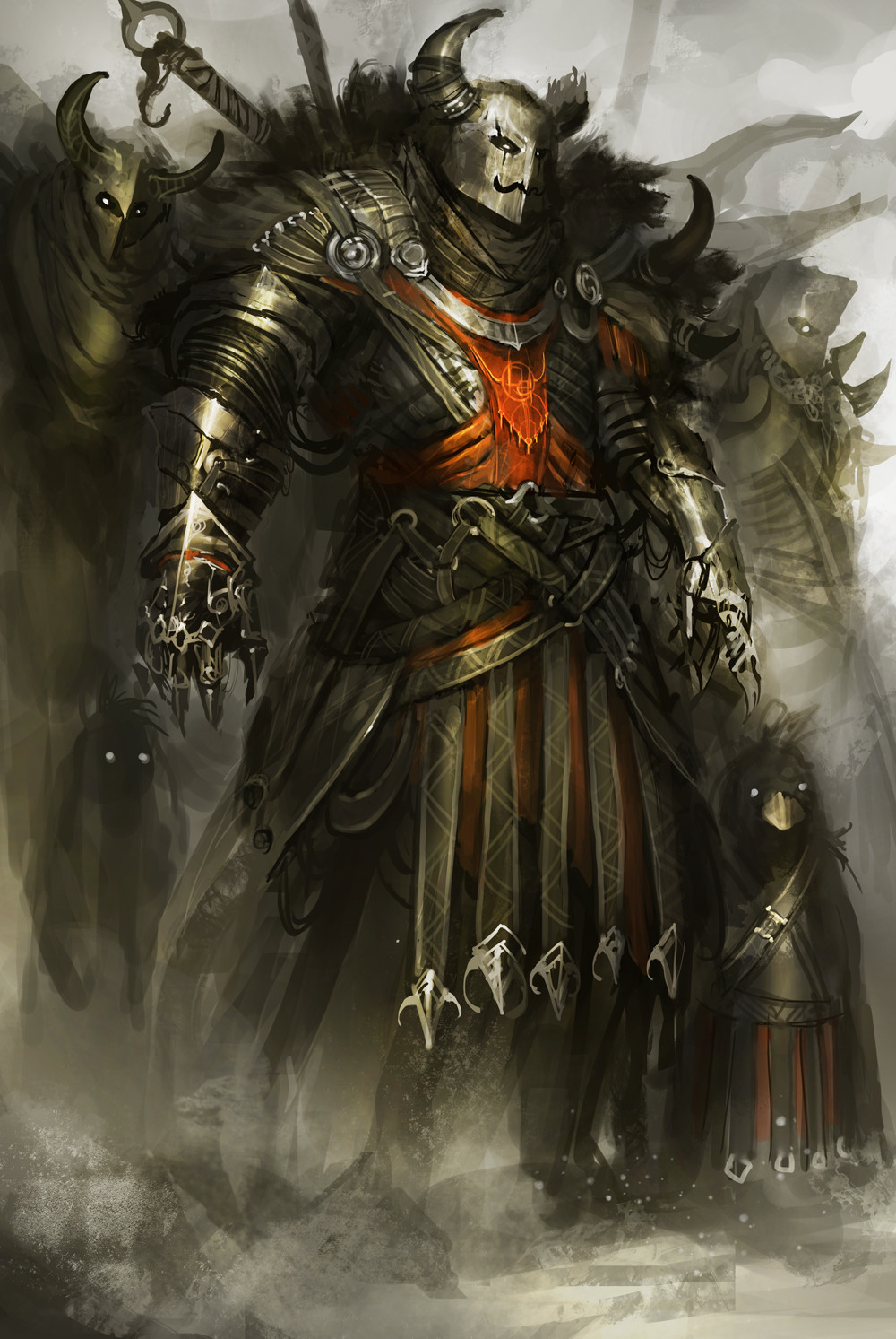
 theDURRRRIAN — Behold, my backup sword

Published: 2014-11-13 07:36:14 +0000 UTC; Views: 78768; Favourites: 3020; Downloads: 0
Redirect to original
Description
attempting the warhammer aesthetic. still nowhere near but i'll get there eventually")
anyway, hope you guys like it
Related content


Comments: 164

Screw Warhammer, this is much more epic! The blue and gold is a really nice touch
👍: 0 ⏩: 0

that name tho.... 0_____0
i'd hate to see his primary sword. xD
👍: 0 ⏩: 0

Man I can't figure I'll ever get on this level. Like some random things in the picture that totally make the image I would never think of that.
👍: 0 ⏩: 1

ah thats your design sense. dont worry mate, it develops the more you look at and understand things
 (Smile)")
👍: 0 ⏩: 0

The title on this makes me think of that Commisar meme. "Drive me closer! I want to hit them with my sword!"
👍: 0 ⏩: 2

I was thinking the same thing!
👍: 0 ⏩: 0
OMG i love that meme!! XD
👍: 0 ⏩: 0

i think you hit your goal, Warhammer 40k was the first thing i thought at, when i saw this picture^^
👍: 0 ⏩: 2
Indeed. Those skulls over the knee and belt were totally Warhammer 40k.
The body armor is a little bit mroe proportional than some of the warhammer artwork. Better, in my point of view
👍: 0 ⏩: 0
its just the color scheme
👍: 0 ⏩: 1
Are you just trying to tighten up the detail more? Because I'd say that as it stands, it really stands out from the other Warhammer 40k stuff—in a good way.
👍: 0 ⏩: 1
yea tighten up and make it cleaner. plus it lacks the overkill in the design. in short, it needs to be more metal XDD
👍: 0 ⏩: 3

No reason to make it cleaner, insane battle and gore is very normal in that situation, plus the so called "messy" asthetics looks awesome.
More metal is not the case, its should be more exaterated, not so well fitting armor( if u know what i mean)
If you want more Warhammer 40k, then you need to make huger, rougher armor, since that armor style(awesome as it is) looks like Nightmare from soul calibur series.
Color and the skulls are one of the things that make it space marine-ish.
I like your picture because its not your average big ass armor Warhammer-esque picture, but something different
Love the chars pose.
Pose is says exactly. ZUP bitches, i have another sword to fuck u all up.
👍: 0 ⏩: 0
I suppose if he was actually holding up the sword threateningly, rather than resting it on his shoulder, it would have that more dynamic feel. Alternately, standing on a pile of corpses, Ciaphas-Cain-style!
👍: 0 ⏩: 0
I suppose if he was actually holding up the sword threateningly, rather than resting it on his shoulder, it would have that more dynamic feel. Alternately, standing on a pile of corpses, Ciaphas-Cain-style!
👍: 0 ⏩: 0
<= Prev |