HOME | DD
 thejason10 — Layout test - Villain
Published: 2008-01-21 06:37:56 +0000 UTC; Views: 272; Favourites: 3; Downloads: 8
Redirect to original
Description
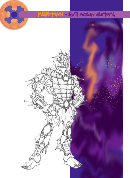
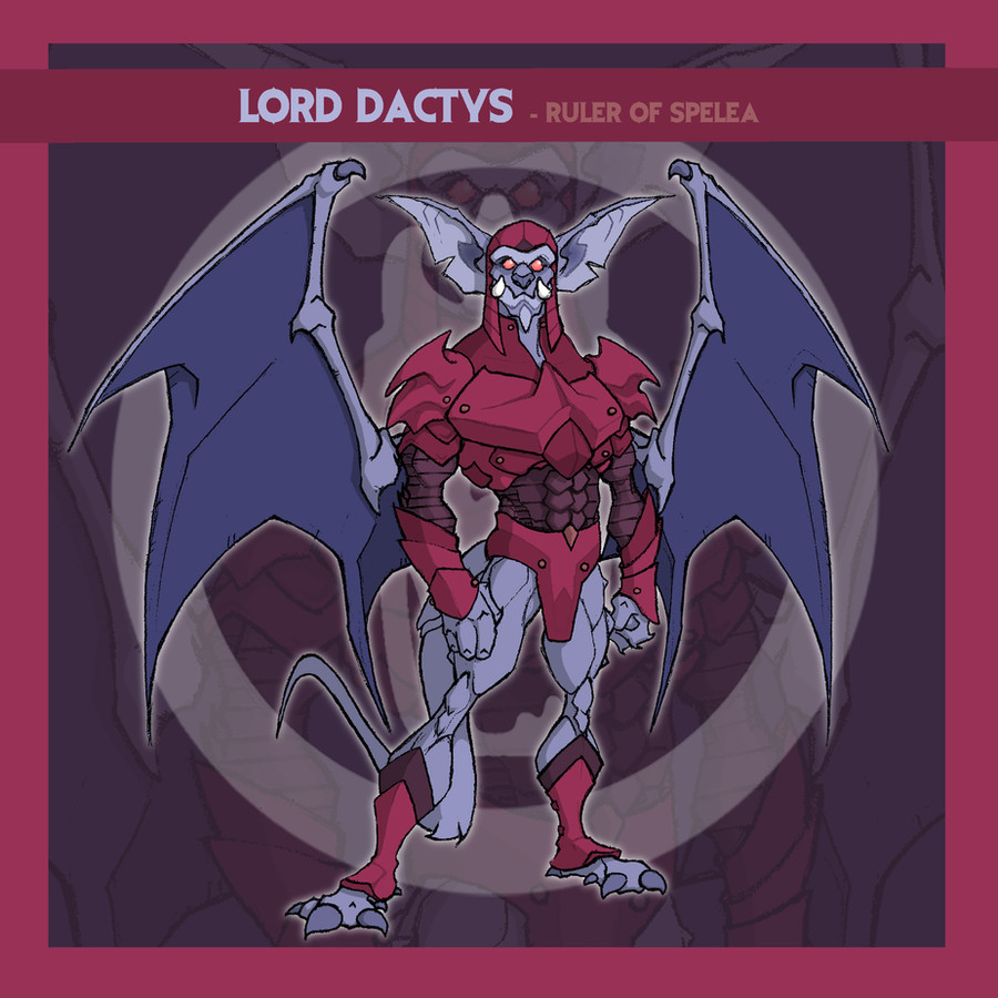
Testing out some ideas for layout ... if this is what I decide on, I'd do a better picture of Snake Mountain for the vertical, and tweak some other things.Basically, looking for input/constructive criticism on layout, elements, and color-scheme.
Thanks in advance.
Related content


Comments: 8

So I tried the black background instead of the white, and unless I do color-hold versions, it's not as sharp (because some of the line-work seems to vanish; especially the tips of area's like Mer-Man's head fins), so if I do this particular background, I'll stick with white.
I did try a version with a solid-color vertical bar (as opposed to a picture of Snake Mountain), and I can't decide whether it works better or not: check it out here .
I can't decide if I want a more generic/uniform layout or if I want it to be more customized for each character (like this ).
Any input?
👍: 0 ⏩: 0

Layout is looking alright s far. Maybe make the Snake Mountain side one colour, so i doesn't overpower the character who is the main focus.
👍: 0 ⏩: 1
Yeah, I wasn't sure about that. Of course, if I'd used a character I'd actually colored, that might make a difference too.
Thanks SMB (and everyone else) for the input.
👍: 0 ⏩: 1
LOL true.
Keep at it, its good that you're constantly testing yourself.
👍: 0 ⏩: 0

It might look a little better if the image of Snake Mountain was cropped so that it comes up to Mer-man's ankle. Also, maybe the figure should take up more of the image space.
👍: 0 ⏩: 1
I kind of prefer Snake Mountain going top to bottom, but I might try a larger figure relative to the space as a whole. Thanks for the input.
👍: 0 ⏩: 0

Layout would work imo. Trying out a black backdrop instead of white might also be worth trying.
Perhaps if you don't include every character holding their "accessory" weapon in hand, having an image of it on the left (or is that reserved for info-text on each individual character)?
👍: 0 ⏩: 1
There are no plans for info text, so if I do weapons/accessories, that could work. I might see what black looks like too. Thanks!
👍: 0 ⏩: 0