HOME | DD
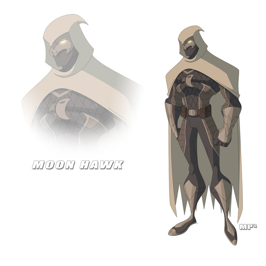
 TheShadowFade — MoonHawk Commission VI

Published: 2010-08-07 02:47:42 +0000 UTC; Views: 2608; Favourites: 42; Downloads: 35
Redirect to original
Description
The wonderful and amazing lines by mbond3 [link]He did a great job on this pierce and I cannot wait till I have a match up between Scorpionida and him. Stay tuned!
Also, I am thinking about changing his emblem on his chest. I have gotten a lot of people telling me it's a BATMAN rip off.
What do you guys think? You know I love the feedback.
Related content


Comments: 65

I like the logo it is different I think. I think you should change it. No matter what you come up with people are going to try to compare it to something else. It is kind of their way of saying you are not being original and taking something away friom you.
👍: 0 ⏩: 1

Very true indeed. I just want my character to be original and classic. But I understand what you mean. Everybody these days think everybody stuff is a knock off from somebody elses stuff.
Thank you for the encourgment and support.
👍: 0 ⏩: 1
I think that you should leave it the way it is as a homage to "Bats". No matter what you come up with there will be the same critique.
👍: 0 ⏩: 1
That's very true. I think I am still going to play around with the logo though. Thank your for the encourgement an the support.
👍: 0 ⏩: 0

I think you're already on the right track. I'm definitely on the same page with you with regard to the first design (it was too wide, and a little too vague as well) -- but the second design could be made to work with minimal tweaking. I also am with you on the size of the logo, I don't think blowing it up to the size of the chest plate would be a very good idea. The size and position your using now works well.
So, IMHO, your instincts and overall ideas are very sound. I just thought I'd toss out the mythology/heraldry suggestions to make you aware of other sources of potential inspiration if you decided you wanted some.
👍: 0 ⏩: 0
Very cool -- this piece does an excellent job of showcasing the new MoonHawk design.
As for the logo, I like your new design here: [link] -- it's simple and straightforward, but cool and evocative as well.
But if you're still exploring other designs, I'd suggest looking at mythology (look for symbols/icons/etc. linked to hawk gods like Horus, Ra, etc.) and/or medieval heraldry (falcons, hawks, etc. were common elements on shields, banners, etc.) for inspiration.
There are also a couple of cool African hawk masks here [link] [link] that could serve as the springboard for a MoonHawk symbol design.
👍: 0 ⏩: 1
Thanks my friend.
I think so too, but I still going to play around with the logo to see if I can make it more unique in appearance.
Thank you for the suggestion. I will definitely been looking into mythology for hawk related symbols. I will let you know what I find.
👍: 0 ⏩: 0
Yeah I know. What do you think about this logo? [link]
👍: 0 ⏩: 1

The link isn't working for me bro...
")
👍: 0 ⏩: 1
I will send you note instead.
👍: 0 ⏩: 1
Check out my gallery I posted the two new logos I am trying to choose from. Let me know, what you think?
👍: 0 ⏩: 1
I checked 'em out and left you a message bro!
 (Smile)")
👍: 0 ⏩: 1
Thanks my friend. Message sent.
👍: 0 ⏩: 0

Ive got a few ideas you can try(great pic btw). Try a front view of a hawk or a side view with a crecent moon wraped around it......i could do ya some rough sketches if ya like......i love trying to figure out logos and stuff......lemme know........love the idea though................................Rick
👍: 0 ⏩: 1
Yeah if you don't mind. I would love the extra help with my character. Sweet deal! Thank you Rick.
👍: 0 ⏩: 1
No problem, i gotta few days off later this week, i'll see if i can come up with a good chest logo for ya......peace.......Rick
👍: 0 ⏩: 1
Thank you for all help. Sounds good to me!
👍: 0 ⏩: 0

I love this piece! (and absolutely, the emblem is too batman-ish  (Wink)")
👍: 0 ⏩: 1
Thank you, my friend. Yeah I have heard. Any ideas?
👍: 0 ⏩: 0

It does have a batman feel to it. Maybe you can do a full chest emblem as opposed to the smaller one.
👍: 0 ⏩: 1
I did a full chested emblem once in one of the early sketches with another artist and it looked weird. It overpowers his metal plated armor.
👍: 0 ⏩: 1
Ah...Well keep working on it.
👍: 0 ⏩: 1
Thanks man. I will. It's the only thing I don't like at the moment and I want it to be more unique and original.
👍: 0 ⏩: 1

Very cool new art for MoonHawk - the emblem on his chest is very close to Batman - may want to do the Hawk head (though that may be too close to Hawkman - if it is profile)
👍: 0 ⏩: 1
Yeah. See where I am having the problem with. Any ideas?
👍: 0 ⏩: 1
I would go to Cyphre - he is a master of design. Perhaps he can help - post on the workshop and state that you are concerned about the emblem.
👍: 0 ⏩: 1
I am posting my character, MoonHawk on the workshop tonight if you want to check him out. Thank you for letting me know. I will make sure to bring it up in the post.
👍: 0 ⏩: 1
Cool - I will look out for him
👍: 0 ⏩: 1
So are you posting MoonHawk on the workshop?
👍: 0 ⏩: 1
Yes I am. I was having a hard time posting the word document file into the white box. Any ideas?
👍: 0 ⏩: 1
There is a paste from word document that is in the area next to normal paste it has a "W" in it. If that does not work, you can paste into notepad and then copy from the notepad and paste there. If you do the notepad you will have to reformat.
👍: 0 ⏩: 1
Nice. I saw it last night. I am really going to try to post it. I am working on the grammar and spelling. I like it to do great before I post it. I believe fully in first impressions. Plus, this week is busy with work and I get married in 11 days. So, you can image the craziness I am going through. Thank you for the support and helping me out.
By the way I really enjoy the new commission of Green Kaoz. You should check out Tremor from The Peacekeepers, I heard he is creating bio sheets for characters. Something for you guys to look into for the group.
👍: 0 ⏩: 1
I'll look into it. Good luck (even with the best of plans) getting married is crazy. I know that Cyphre connection with PKs gives him some insight into some of their stuff.
I am in the process of altering his bio some, but it should effect any art that I want done.
👍: 0 ⏩: 1
Yes it is. But thank you for the support for the marriage. That's always a good thing.
I am it won't effect any art of your character. Please, let me know if you decide to update the bio on him. I would really like to read it.
👍: 0 ⏩: 1
It is on our website of the Others. I meant to say that the art would not be affected by the changes. Though I am considering using 2 guns and a fedora - I was really impressed by LJ drawing on DCUOsource.
Anyway - I do think it is a good idea to post in the workshop - you can get valuable feedback from both Cyphre and Rev.
👍: 0 ⏩: 1
Nice. Let me know.
I just posted my character's biography on the website.
Go check it out, my friend.
👍: 0 ⏩: 1
You did a very good job putting it all together - to bad you're on PS3
👍: 0 ⏩: 1
I know. Sorry about that. It is one of the down sides to having a Mac computer.
But I am glad that I put everything together well. Question about tomorrow's chat, what time is it at and how do we all chat? Aim, Msn messager, or Skype?
👍: 0 ⏩: 1
On the Others website there is a chat button (just click on it) near the top. 9:15 CST. Look forward to seeing there...
👍: 0 ⏩: 0

Thank you! What do you think about the emblem on the chest? Are we still on for a commission together? Send me a note about it.
👍: 0 ⏩: 0

What do you think about the character design?
👍: 0 ⏩: 1
| Next =>