HOME | DD
 thundercake — Candlelight

Published: 2008-10-04 22:44:01 +0000 UTC; Views: 6668; Favourites: 192; Downloads: 121
Redirect to original
Description
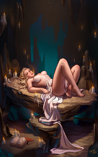
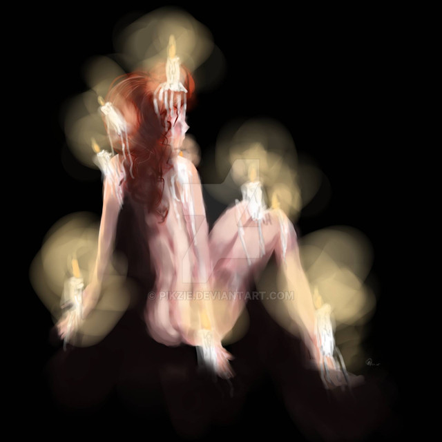
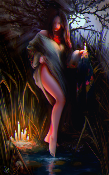
I really don't like this.. but I felt I should upload it anyway so I can bitch about it...The whole mood I was going for was lost after the sketch stage. It was originally set by the composition but the color just stole the limelight, and the color isn't strong enough to carry the piece. Plus there are the perspective issues and anatomy issues that inevitably crop up when I don't use any references. The candlelight gave me multiple light sources which I have discovered I am not good at handling and screwed up the atmosphere considerably. Is this a dark room? Are the rocks red or just absorbing a lot of red light?
On top of all that, I couldn't seem to decide what style I was going for. The rocks were supposed to be a mix of volcanic rocks, but they just ended up looking like sloppy goo and sticks. Is the style supposed to be realistic or stylized? I don't know.
This is one type of painting that might have benefited from using two layers, but I stubbornly paint directly onto the background, so the figure looks squished onto the rocks.
Anyway, I'm annoyed at it, but I don't feel like putting any more time into this painting. It's time to scrap and start anew. But it's not like the concept was all that revolutionary to begin with, so maybe this will just go into my "Abject Failures" folder.
So, how is everyone's weekend coming along?


Related content
Comments: 78

The lighting does seem kinda off, but hey, imo you cant go wrong with hot curvy chic wearing only a sheet. The girl is awesome.
👍: 0 ⏩: 0

Sometimes artists are not happy with what they did (I know how that feels 

I fell in love with your paintings but this one is really, really amazing ^^
👍: 0 ⏩: 0

You only paint on one layer?? Oh my god, that's awesome. I rarely see artists who do that.. Most (including me) take advantage of layering that they get a hard time painting traditionally..
👍: 0 ⏩: 1

Layers make it more difficult for me. You have to remember which one to paint on.. confusing!
👍: 0 ⏩: 1

you've got a point but you can you can also rename them..
👍: 0 ⏩: 1

I just find it simpler to deal with a flat plane 
👍: 0 ⏩: 1

are you using a wacom? i find the strokes similar to my genius'
👍: 0 ⏩: 1

oh. so I'm still alone then.
👍: 0 ⏩: 0

I think its beautiful. It is actually one of my favorites of yours.
👍: 0 ⏩: 0

That is just gorgeous. The colors, form and overall feeling is just awesome.
👍: 0 ⏩: 0

I know you don't like this piece, but i'm very glad you still put it up. There's a lot of good image left in there without looking at the technical flaws, and even the with you saying that the feel you were going for was lost this image still has a great feel. I agree with your points on what you pointed out, but at the same time however off it might be, the lighting color and composition work beautifully together.
👍: 0 ⏩: 1

Thank you very much, some time and distance has allowed me to have a bit more affection for it
👍: 0 ⏩: 0

I'm so glad I'm not the only perfectionist making themselves crazy in the world.
👍: 0 ⏩: 0

D< YUUSOCRAZEY. I think it's fabulous, and you've put in excellent atmosphere. Maybe not how you wanted it, but I think it had a great outcome! :]
👍: 0 ⏩: 0

WELLLLL, i think you did a wonderful job on the rocks :'D and im loving her hair for some reasson. All the red in this picture seems to compliment the piece nicely, i think thats what i like best C:
👍: 0 ⏩: 0

Did you want helpful critique on the lighting? Or are you basically done? Because the comp. on this is still quite nice and the figure still has a nice serene, contemplative mood, if that's what you're going for. You're lighting of her is just dicking with how she fits.
But again, if you're done, I won't go into it.
👍: 0 ⏩: 1

I'm probably not ever going to touch this again, but if you want to critique it, be my guest
👍: 0 ⏩: 1

Alright, coo'.
You've made a lovely use of warm and cool hues for the wrap she's wearing around her hips, and you've got that lit pretty well in terms of the effects of candlelight. On her skin though, you've gone much more delicately with the blue, and this keeps her tone very warm all over, which would probably not be the case in a cave like setting with only a few candles for lighting.
You also seem to have been going more by what you know happens under a single light source, more so on the skin and to a lesser extent on the cloth. Try not to think about what you already know, and go with observation, like putting on a bunch of candles like you've got them there, or, if you're lazy like me, you can always do a yellow blotch whereever you know you'll need to do a warmer tone, and then reduce or raise the amount as you see fit.
What we can see of her torso on the left of your image is pretty well handled, but the right is too cool if its right by a candle like that. You'd started to work with that observation, but then seem to have lost it. You have some definitively warm colours there, which works, but they are not light enough where they need to be, like in the shoulder blade and edge of her side, and not cool enough to add the same drama of contrast you have on the cloth.
...
Phew~! I think that's it. Hope it was somewhat helpful.
👍: 0 ⏩: 1

It was! Thank you very much for taking the time to critique my work, I appreciate it.
👍: 0 ⏩: 1

Oh you're welcome. Considering this is an art site, there's never really enough constructive critique to go around. So I figure I should do my part where I can.
👍: 0 ⏩: 1

I agree, it's a real shame there aren't more deviants like you!
👍: 0 ⏩: 1

Awwww, thank you! That's really sweet.
👍: 0 ⏩: 0

I think it's good to let your art evolve as you make it, whether it turns out how you wanted it in the begining or not. The color and concept are fantastic. Actually the only part part kinda bugged me was that her head seemed a bit too big for her body, but you covered that up pretty good with her hair. Good work!
👍: 0 ⏩: 1

Hehe yeah all my people have big heads.
👍: 0 ⏩: 1

Well in that case it's just your style.
👍: 0 ⏩: 1

Well, that's not really an excuse ^^l This piece isn't stylized enough to warrant any anatomical liberties on my part. I just flubbed!
👍: 0 ⏩: 1

Oh well, next time, it's still beautiful.
👍: 0 ⏩: 0

I always lose something in the transition from sketch to final piece, don't know why. Maybe because I'm more free during the sketch stage, I loose that care free attitude when I go to the finished pencils.
I think this looks amazing, you're a nut.
👍: 0 ⏩: 1

No you
I wish I'd posted this sketch instead of this painting..
👍: 0 ⏩: 1

I would definitely like to see it, post it up yo!
👍: 0 ⏩: 0

Excuse me, I think my computer just had a petit-mal.
What I meant to say was for a single-layer quickie like this (or at least, as you seem to have described it), this is a very eye-tasty piece. I initially thought the subject was a piece on a stage, because the lighting is somewhat theatrical (like Technicolor films where a candle gives off multiple shadows, etc). And compared to your other work, I think you're allowed to have one not-quite-mind-blowing piece.
👍: 0 ⏩: 0

I can see what you are saying with the light sources, she doesn't look like she fits with the current setting, her back seems to match though...Perhaps she's been put in too much light? I don't know if what I'm saying makes sense. Anyway, I think in your defense it was a pretty difficult thing you set yourself up for....
I have that same problem with sketches. I always love how I handled the lines and such in my pencil sketches and then when I translate it to the computer it has a completely different feel and then I hate it. D:
👍: 0 ⏩: 1

It's not always like that for me.. some sketches I just care too much about :/ (I should post the original of this, it makes more sense)
👍: 0 ⏩: 1

Yea I get what you mean, posting the original might help people see where you are coming from though.
👍: 0 ⏩: 0

Nobody can make every piece of art they do a success every time... One of the animators on Beauty and the Beast said once that he draws twelve bad drawings for every good one. I realize it's frustrating with the time you invested. But just don't worry about it and keep going
👍: 0 ⏩: 0

The shoulders seem slightly off, and like others mentioned, the short arm. Despite that, it's really gorgeous, and I love the colors. Great job.
👍: 0 ⏩: 0

Duuuuuuuuude. Ok, you might have wanted it to turn out differently, but honestly?
...holy shit. The colours here... skintones, rocks, candles, wrap... zomg.
I can has lessons? :B
This is really, really awesome to look at.
~K@
👍: 0 ⏩: 1

My favorite part is the peek of the legs through the cloth thanks to the lighting. That is a very realistic detail and well done. I like the upper rocks as well but the bottom ones do look a bit drippy. The tops of the candles are where the perspective kinda hits hard. I think next time if you introduces so blues/muted grays it might help offset the colors rather than make them all bright, maybe.
👍: 0 ⏩: 1

Thank you for the crit! Yeah, I tried bringing the shadows down with some grey, but the red was just so overwhelming. This is an example of why you should never go with the FIRST color rough you do
👍: 0 ⏩: 0

I think it's rather nice to look at. I like her pose and the way you colored the cloth around her waist. And the candles are killer. Just saying.
👍: 0 ⏩: 0

I can see what you mean, regarding your self-criticisms, but I still think this is beautiful. <3
And at least you've learned some things from it. A lot of art is about process, not product.
👍: 0 ⏩: 0

I see a boobie. 8 D
Stupid comment a side, I think it looks great.
I find the lighting a bit off, like you said and the one arm is a little off.
But great none the less.
Just one of those things you learn from for the next one I guess. xD
👍: 0 ⏩: 0

jeez you're hard on yourself. i'm totally impressed by this. it's not a failure to me, but, of course, i would do the same with an image others liked too.
👍: 0 ⏩: 1

I'm really not hard on myself 
👍: 0 ⏩: 0

Bleh, I don't like the shoulder...
My weekend's been good so far. I had fun today.
👍: 0 ⏩: 0
| Next =>


