HOME | DD
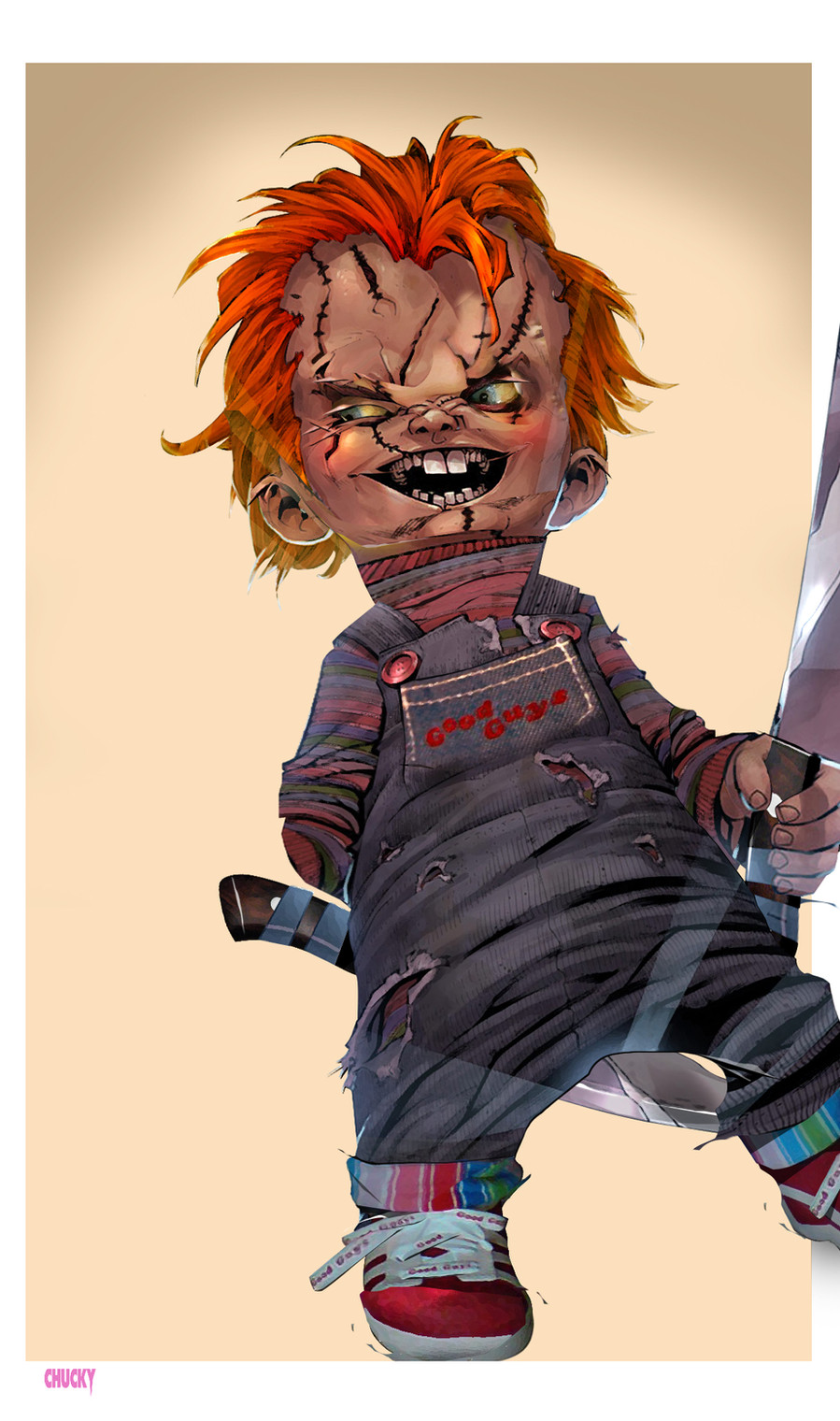
 titaniumgorilla — Chucky's Baaaaaack

Published: 2007-01-20 22:24:09 +0000 UTC; Views: 40773; Favourites: 183; Downloads: 101299
Redirect to original
Description
This is the alternate cover to Devil's Due's new Child's play title. I tried stretching my painting limits with this one....I feel confident that I havn't lost my coloring skills yet...LOL.
Pencils=
Colors- me
Hope you guys dig it!
Related content


Comments: 44

👍: 0 ⏩: 0

I would love to purchase this from you to make a shirt for my kids for halloween .. do you sell! Love it!
👍: 0 ⏩: 0

FYI: Someone is selling your art claiming to be his own. Read this: [link]
👍: 0 ⏩: 0


if chucky would do a HERE'S CHUCKY, than this film would be awesome
👍: 0 ⏩: 0

I saw the comic advertised in Horrorhound Magazine, man I hope that comic will be at the store near me xD
👍: 0 ⏩: 0


Damn! That Chucky looks even more evil than the one in the movies! The liquid coloring, the highlights on that twisted, leering little face, the jagged teeth...you can't get creepy quality like that from celluloid. Who says you've lost your touch? It looks pretty healthy to me!
 (Smile)")
👍: 0 ⏩: 0

this is extremely awesome, something about the teeth really freak me out. Almost makes me forget the last 2 movies didn't exist.
 (Wink)")
👍: 0 ⏩: 0


WAH!!!!!!!!!!!!!!!!!!!!!!!!!!!!!!!!!!!!!!!!!!!!!!!!!!!!
👍: 0 ⏩: 0


Shit I can't even look at it. Awesome work.
👍: 0 ⏩: 0


Thanks! Glad you like it!
👍: 0 ⏩: 0

Down right helluva good job, man!
Your wicked coloring and smooth tones has captured the horrific persona that is Chucky 
👍: 0 ⏩: 1
Thanks man! With a grade like that, I wish you were my art teacher when I was still in school...lol.
👍: 0 ⏩: 1
You're welcome, dude 
Heh, I know how you feel 

👍: 0 ⏩: 0


Be afraid! Very afraid...lol.
👍: 0 ⏩: 0

Ha!....No, I just happened to be at the right place at the right time to be able to get the lineart and a small stamp sized colored version to work from. I think Jay Fotos did the original cover colors.
I'm still waiting for practice submission pages from them...lol.
👍: 0 ⏩: 1

totally brilliant work, V2 is good too but i like the colours on this better, maybe u could combine the two and have the blood from V2 on those colours
I cant seem to find the lineart on the link on WyA
Great work! keep it up dude
")
👍: 0 ⏩: 1
Thanks man! I tried the blood with the colored version and with a desaturated version, but I wasn't feeling it for some reason...lol.
The lineart hasn't been released to the public to my knowlege, but I do have the lo-res lineart that I had to modify. Shoot me a note with your email address, and I'll send it to you.
👍: 0 ⏩: 0

Nice job indeed. Reminds me of the other Chucky image where he fights Cassie Hack for the upcoming Hack/Slash Chucky crossover.
👍: 0 ⏩: 1
My money's on Chucky...lol.
👍: 0 ⏩: 0

Fantastic work. Ryan did some amazing linework, and those colors are fantastic. My favorite bits of color are his overalls and the knives.
Great job!
KAB
👍: 0 ⏩: 1
Thank's Kurt!
Invincible is a good book, don't get me wrong....But I think Ryans best work is when he changes from his more cartoony style and lets the detail go wild.
👍: 0 ⏩: 1
I agree! When "Invincible" ends or if Ryan leaves (God forbid), he should definitely cut loose in a lot of other directions.
KAB
👍: 0 ⏩: 0

Thanks! Glad you approve!
👍: 0 ⏩: 0

Colors look great man. And they arn't tight pencils, I HATE tight pencilling. That is actually inked.
👍: 0 ⏩: 1
It wouldn't be the first time that I was wrong...lol.
Great job none the less!
👍: 0 ⏩: 0

Thanks Trin! I had fun doing it..
👍: 0 ⏩: 0

Thanks Muddy! I 'preciate it!
👍: 0 ⏩: 0
