HOME | DD
 ToasterStrooder — Demora: Steampunk Time Sorceress

#characterdesign #sorceress #steampunk #gianthammer #looking_for_constructive_criticism
Published: 2018-04-12 01:41:46 +0000 UTC; Views: 178; Favourites: 2; Downloads: 0
Redirect to original
Description
EDIT: Good (time) lord, that quality was inexcusable! The coloring, inking, and photography were awful. Hopefully that's just a one-time thing. Anyway, back to the original description."I was going to make a joke about time here, but telling it would have been too time consuming."
So, if you read that really sudden and really comprehensive status update that I wrote a couple of days ago, you know that I've been working on something that I've been a little more enthusiastic about than I am about most other things that I make. That thing is this drawing. Why did I show such enthusiasm? Well, That's because I'm planning to start writing web-comics soon, and unlike my other comic ideas, this one is actually getting somewhere! And by getting somewhere, I mean that I'm drawing more concept art for it than I usually do and am holding a decent amount of confidence in my ability to not procrastinate on it. So... I guess not much further than usual, now that I think about it. ._.
Well, that killed the mood.
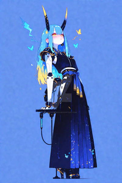
Anyway, that's where this character comes in: Demora is the planned main protagonist of this comic work-in-progress-that-I-swear-is-actually-in-progress. She's basically a steampunk super-hero with a giant hammer that lets her manipulate the flow of time. The specifics on that are something that I plan to cover in either a character reference or in the comic itself.
Truth be told, my feelings on this specific drawing are oddly mixed. I'm unhappy with some small sections of the line-art, such as Demora's left shoulder pad, but I'm generally very pleased with how the line-art came out, especially on the head. The top hat came out nice looking, the tuxedo mask-goggles ended up looking precisely how I wanted them too, the eyes are nice and expressive for my standards - although they were better when they weren't inked - and to top it all off, the head shape and hair actually make the character look somewhat female! I was worried that I wouldn't be able to convey that super well.
However, my feelings on the colors aren't quite as positive. There are some color choices that I am happy with, like the dark brown trench coat and the orange lenses in the previously mentioned goggles. The top hat's color has started to grow on me as well. I feel that the rest of the scheme is very hit-or-miss, though. Making the pants the same green color as the cape might not have been the best decision, and some of the grey bits might have benefited from different color choices. Although, as I'm typing this, the overall color scheme is starting to grow on me. Feel free to tell me what you think; I'm perfectly open to suggestions.
It was fun to design another steampunk design, as I do love the steampunk look, and it helps that I tried to do something different from the steampunk norm. When I looked up steampunk photo references, I noticed that quite a few of the designs that I found relied on cybernetic attachments and old-school clothing that you'd expect to see in the 1800's. I definitely took the 1800's clothing cue here, but I wanted to deviate from the "super prominent cybernetic attachments" part. Making this look steampunk without said attachments wasn't easy, but I think that I pulled it off.
Of course, I'm open to feedback. In fact, I'm hoping to get more feedback than usual so that I have more ideas thrown at me for where this design could go.
So, of course, any and all constructive criticism is greatly appreciated!
~Toaster B. Strooder.
P.S. "Demora" is actually just the Spanish word for "delay."