HOME | DD
Published: 2005-04-11 00:17:28 +0000 UTC; Views: 3820; Favourites: 37; Downloads: 2494
Redirect to original
Description
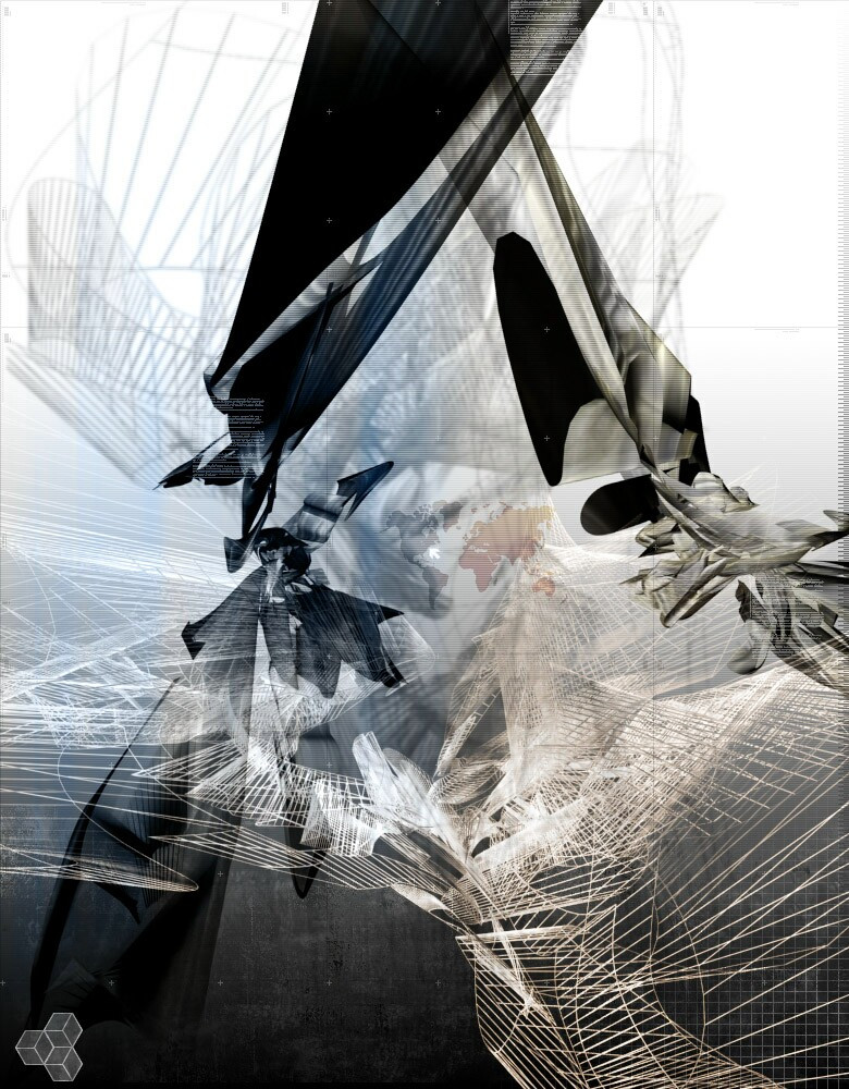
So non-LinearLove it or hate it, Im sure people will be on both sides. I never use this much color, but things are changing...
Come visit The After11Abstract Chat! Meeting time is 11pm EST everynight, we're looking for many people to join for great discussions!
[link]
[link]
[link]
[link]
Related content


Comments: 66

toThePixel In reply to skter4938 [2005-04-17 01:08:36 +0000 UTC]
For this I used 3dsm6 and Photoshop.
👍: 0 ⏩: 0

 (Smile)")

toThePixel In reply to cweizhen [2005-04-17 01:09:14 +0000 UTC]
heh, cool, always happy to please a desktop
👍: 0 ⏩: 0


")
toThePixel In reply to Jooon [2005-04-14 18:31:00 +0000 UTC]
Thanks, and thanks again for the +fav!
👍: 0 ⏩: 0


super work! Love the neutral colour scheme, great work with the circles and stuff, neat background work too. Love this!
👍: 0 ⏩: 0


toThePixel In reply to DIGITLASSASSIN [2005-04-12 04:52:33 +0000 UTC]
Nasty as in good or bad?
👍: 0 ⏩: 1


i absolutely LOVE it. i love the way you brought realistic and non-realistic together. it's also nice that you added the line because somehow it balances the composition out and makes everything more interesting. i don't think it's out of place at all.
👍: 0 ⏩: 1
toThePixel In reply to art-shmart [2005-04-12 04:54:02 +0000 UTC]
Heh, me either, Im happy someone liked it, you have a good eye for Art
 (Wink)")
👍: 0 ⏩: 0

I think it's a great work... but I will loose that line that crosses all over... you're working with circles al the way... and that line seems a little out of place to me...
Maggical
👍: 0 ⏩: 1
toThePixel In reply to Maggical [2005-04-12 04:54:59 +0000 UTC]
Its not exactly how I wanted it, it was kinda gonna be part of the render, that was my vision but it didnt happen
👍: 0 ⏩: 1


completely kick ass piece here man i wish youd make a tut on how to do that blur stuff
👍: 0 ⏩: 1
toThePixel In reply to OsirisMoon3 [2005-04-12 04:55:42 +0000 UTC]
Thats easy, but the Gaussin blur in Photoshop
👍: 0 ⏩: 1
really? ... it must be the same image flipped thas on a layer behind it then ... ")
👍: 0 ⏩: 0

this one really kicks asses ... but a little less gradient inside the stripe would be better
👍: 0 ⏩: 0


looks very nice....nice use of colours....normally I dont really like blur, but in here it looks very good...
👍: 0 ⏩: 1
toThePixel In reply to R3veal [2005-04-12 04:56:54 +0000 UTC]
Heh, yea me either, using blue is either hit or miss.
👍: 0 ⏩: 0


interesting work and style man very unique
could use some 2d typo and tech line work
👍: 0 ⏩: 0

I really like the 2d or little strip things youve been doing lately. They are different from the usual stuff(that i see at least) The blur strip is the only thing i dont really like, its a little too blurry.
👍: 0 ⏩: 0

thats very cool, different to the usual abstrac wallpapers I see, very nice
👍: 0 ⏩: 0

I really like the sense of depth in this man. Awesome work
👍: 0 ⏩: 1
toThePixel In reply to Psilovibe [2005-04-11 01:32:20 +0000 UTC]
Come to A11A Tonight mann! [link]
👍: 0 ⏩: 1
I would dude, but i gotta watch something on TV for once. I should be around there some time soon though man 
👍: 0 ⏩: 0

toThePixel In reply to blacklabelwood [2005-04-11 01:12:54 +0000 UTC]
You, come to A11A tonight!
👍: 0 ⏩: 0

toThePixel In reply to ToKeR101 [2005-04-11 01:14:09 +0000 UTC]
You gonna be in the chat tonight?
👍: 0 ⏩: 2
| Next =>